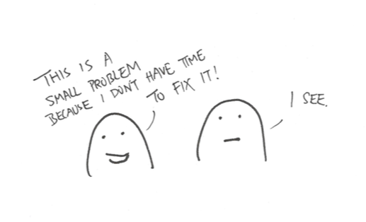
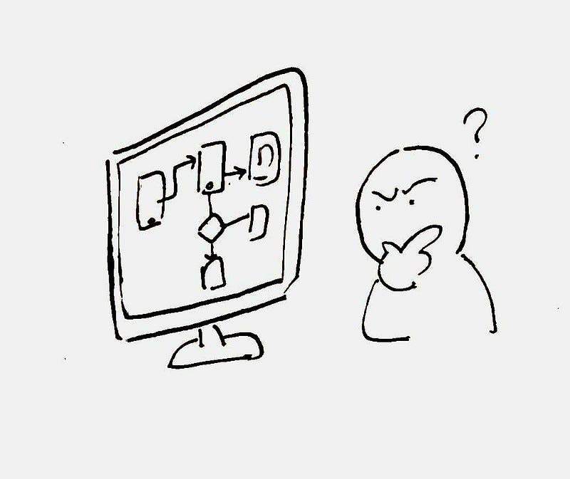
Imagine joining a UX team as the new designer wanting to learn about the product. There are two ways you can do it without taking your colleague’s time: you study the live product, or you read documentations about it. The most common form of design documentations are Wireframes. However, a wireframe only tells you part of truth, it tells you what design decisions has been made, it tells you the what, but it doesn’t tell you the why.
When we work on a project, we would have made a lot of design decisions based on user needs, stakeholder needs, research findings, time constrains, technology limitations.. the list goes on and on. If we don’t document these decisions down, we will be in a dangerous position where important project knowledge exists only in some designer’s memory. If that designer has moved on, the knowledge will be lost forever.
Without understanding the why, designers are forced to guess why things were designed that way. Every time we make a change, it is a gamble. The only solution is to systematically document project decisions, such that if future designers decides to make a change, they will have the right tools and context to help them make an informed decision. Let me introduce a tool that not only minimize design risks, but can also help you build a more mature UX organization — The Decision Log.
Benefits of a Decision Log
A decision log helps us to:
- Remember things — When we write decisions down, we made sure we will have a reliable source of truth we can always refer back to it without forgetting it
- Save time — By documenting what worked and what doesn’t, we made sure future designers will not waste time exploring dead-ends
- Avoid going into circles — When we are exploring design options, it is easy to go back to square one and forget why we discarded it. When decisions is clearly documented, we made sure this won’t happen
- Past on knowledge to others — When knowledge is written down, we are slowly building a library of knowledge where everyone can benefit and absorb it on demand
How to create a Decision Log
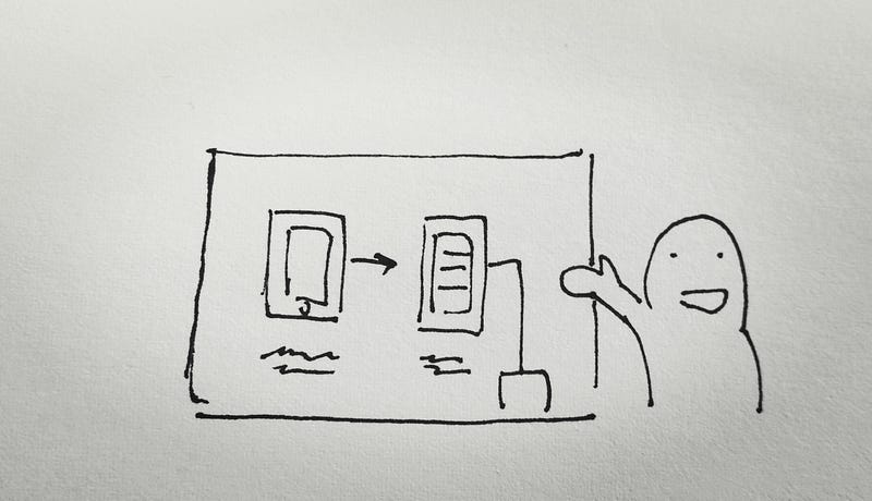
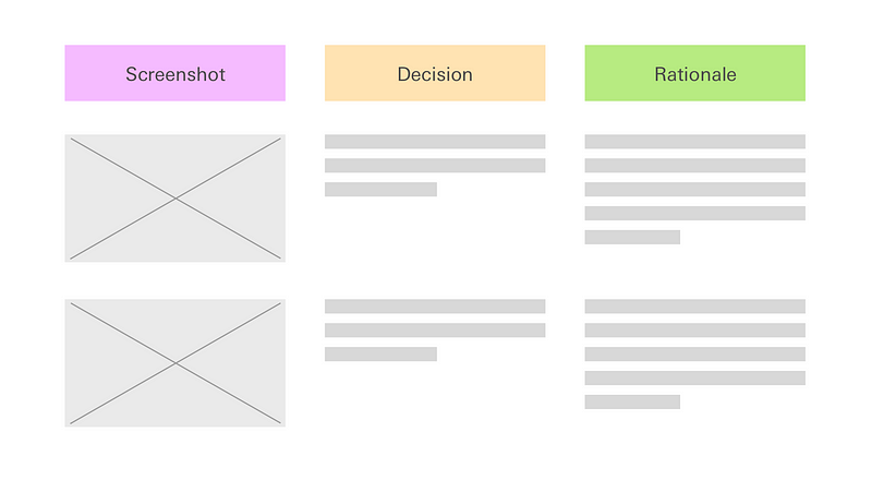
A decision log is a simple one pager document that sits inside the project folder. It has 3 components:
- Screenshot
- Decisions made
- Rationale
That’s it. It really is that simple, now that every design you made is traceable and other people will no longer need to guess why you made that decision. The concept is not novel, our best friend — Developers does it all the time when they add comments to their code. Similarly, you should start writing a Decision log entry whenever a decision is made that will significantly impact the design, and you continue to do it through the project.
When in doubt, err on the side on over communication. The bad case scenario of writing something obvious is that readers ignores your sentence. The worse case scenario of not documenting a rationale is that you also forgot why you made that decision, then that information is lost forever.
Conclusion
As agile development and the introduction of Sprint has became the norm in every technology company, people seems to forget the true essence of the methodology is to learn quickly, not just do things quickly. The most efficient way to record and pass on that learning is to write it down. I hope you give this method a try and I can’t wait to hear from you the results!