A case study on designing loading state
I like to consider design as a spectrum. On the left hand side, you have the Minimal Viable Product (MVP), the absolute bare minimum you can do to ship the product. On the other end, you have the Dream UX design, where I define it as the “If I have infinite time and resources this is what will I do” kind of design.

The challenge for every designers is to push their design towards the right hand side as much as possible while considering about the constrains. In a company, this typically means time and resources. How one can embrace this constrain and thrive in this environment is what separates novice and seasoned designers.
In today’s article, I want to walk you through how I designed loading states for Vyond, a start up I previously worked for. Where we slowly tweak our designs based on different constrains and finally coming up with something that strikes the balance between UX and available resources. Lets get right into it.
Background
When we were redesigning the Vyond product the Video Maker a year ago, we took a lot of shortcuts to hit the schedule. As a result, we didn’t create any loading states and is causing some frustrations to our users. Now that we have time, we decided to fix this.
Why is loading state important?
Loading states is a way for a system to tell users that it has received their command and is now working to make things happen for them. Without a loading state as a feedback, users won’t know what is going on and it violates one of the top 10 principles of usability design — Lost of control.
Understanding the problem — Talking to Engineers
To create good loading states, first we need to understand how things are loaded in the back-end. At this stage, you basically ask 2 questions:
- Can it be done?
- If yes, at what cost?
Here is an example, in the below UI, we are going to display a row of templates for the customer to use. We want items to load one by one from left to right. Can it be done? The short answer is yes. However, developer told us that there is no way to control which item to load first because items comes with different file size, and they will appear as soon as they are rendered. Which means item 3 might show up before item 1 if the file size is smaller.

The only way to load item from left to right visually is to wait for all items to finish loading, then displaying them one by one from left to right. This means users will spend more time waiting and staring at the blank state. This goes against one of the purpose of the loading state, which is to mask waiting time!
The importance of talking to Engineers
As you can see from the example above, understanding whether our ideas is feasible up front saves us time from designing something that will never see the light, and we can spend our time to focus on something that can actually work.
Another important thing from this exercise is helps us to have a better understanding roughly how long each component will load, so we can design appropriate on each scenario.
In case you are curious, for the above example, we decided to use skeleton loading in the end to help mask loading time.
Continue iteration
Let me show you another example. In the below UI, when user clicks an item from the left panel, the item will show up on the blank area on the right hand side.
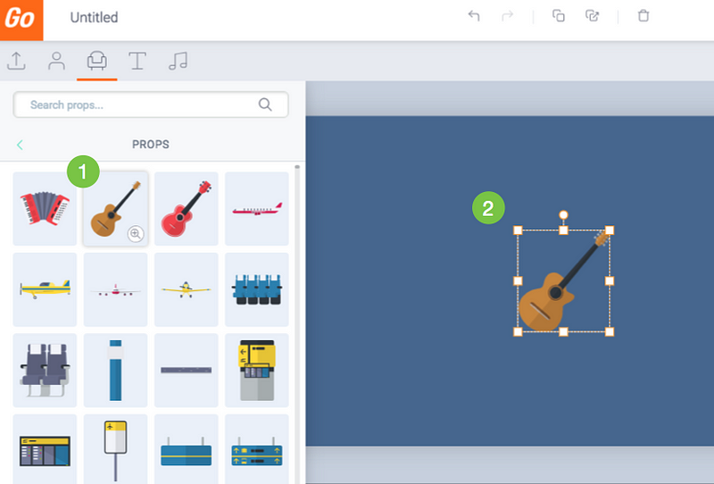
Here is how the interaction works:
- Click an item from the Library.
- After a short loading time, the item is shown on the Stage.
Originally when you click an item, nothing happens. You will be staring at a blank canvas for 2 seconds before the item finishes loading and pop up. The delay and lack of feedback makes user feel the system is not responsive and triggers user to repeat their action. Which causes user to add multiple items unintentionally, and they have to wait even longer.
The Dream UX vs Reality
To approach this task, lets start with the dream UX, the holy-grail:
In an ideal world, when you click an item, item is shown immediately on the blank area.
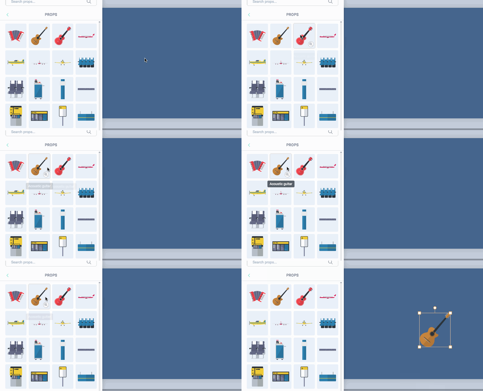
Of course in the real world, items can’t appear instantly because it takes time to load them, but I don’t take “impossible” for an answer until it was proven, so I decided to ask the question:
Is it possible to render items immediately when we click on it?
The answer is yes…with a cost. Item takes time to load, if we want to have the appearance that items is shown immediately when we click on it, we have to preload the items in the backend. It is similar to when you download a big file, you decided to browse Facebook for the duration. Since you are preoccupied, you have the perception that you are not waiting for it to download, but the file is still taking its time behind the scene.
To achieve the “immediate response” effect, we need to “hide” the preload time somewhere such that users don’t feel like they are waiting for us. When user enters the Vyond app, we show them a loading screen before the app is fully loaded. Can we add this loading time to the loading screen?
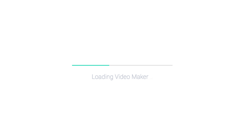
Yes we can! This is how we imagined the flow would look like, after the “Item loading” time has been absorbed by the “App loading” time:

Here is the catch, we have more than 20,000 items in our library. If we preload all these contents in the loading screen, this will take us more than 5 minutes. That’s quite a long time to wait, compared to the time to loading an item which only takes about 2–3 seconds.

Someone on our team suggested that can we preload only the items “above the fold” — items that are visible to users without them scrolling. The problem is that having instant access to those items doesn’t help us to achieve our goal of having 0 loading time, since this approach only benefit only roughly 100 items that is above the fold.
This is a time for us to pause and ask ourselves the big question —Is it worth to keep thinking about this direction?
As product designers, it is always important to keep asking yourself this question. Because you always have limited resources and a lot of problems to tackle, spending more time on this problem means you will spend less time on another problem.
In the end, we decided that we have tried our best for this 0 loading time direction and it didn’t work. Let’s find another way.
Building the gap
OK so we can’t show items instantly on the canvas, but we can try to do other tricks to mask the loading time. Below are some ideas:
Idea 1 — Real size selection box
- When user selects an item, show its selection box but without the item inside it, the selection box has the same size as the item the user selected.
- Display the real item when it finishes loading
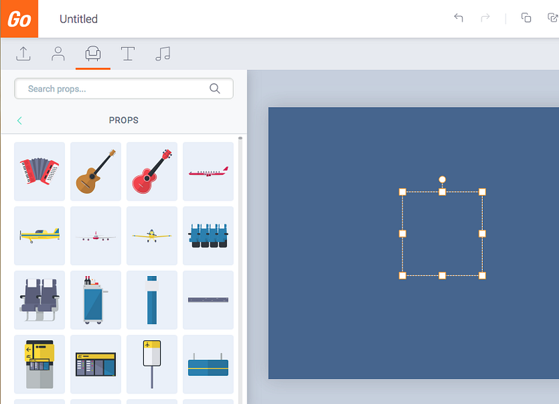
What I like about this idea — It is clear that the item is loading and it helps to mask loading time
Why this idea does not work — Showing a real size selection box requires the server to load the size data of the item, this means until it can get that data, users are still staring at a blank screen and the loading time remains unchanged.
Idea 2 — Fake selection box
- When user selects an asset, show a fake selection box. The fake selection does not represent the size of the Real item.
- The fake box is replaced by the actual item when it finishes loading.
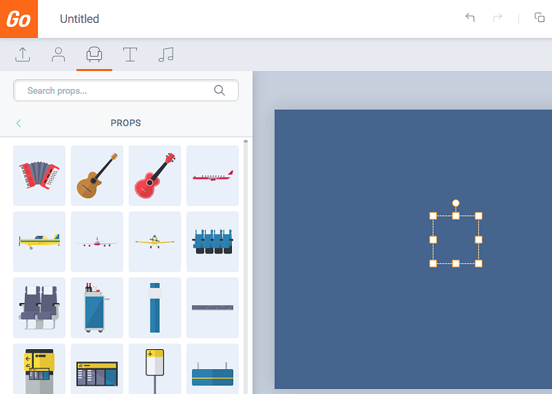
What I like about this idea — It gives instant feedback that the item is loading.
Why I don’t like this idea — After all, the selection box is fake and does not represent the actual size of the item being selected.
Idea 3 — Thumbnail images
When user selects an asset, show its thumbnail. Thumbnail is replaced by the real asset when it finishes loading.
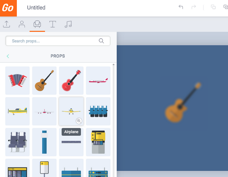
What I like about this idea — It gives instant feedback and gives users a preview of the real thing as early as possible.
Why this idea was shut down — This idea seems really good on paper, however when I took this idea to the development team, I was told it would take more time to code it then we had planned. Which brings me back to the topic of this article — How to design under constrains.
Design is about trade offs. On one hand, we have and ideal solution that might deliver 90% of value to the user, but it will take 5 days to code. On the order hand, we have an Okay idea that will deliver 70% of value to the user, and takes 1 day to code.
In our case, time is limited, so we have to choose what is the best design within the constrain. Not what is the best design.
Making a choice
In the end, we went for Idea 2. We chose a box size that represents 80% of all item’s size. Which means that in 80% of the cases, the fake selection box is the perfect size and it represents the actual size of the item selected. I was actually surprised that it looked way better than I thought. Another reason why you should do prototype.
Here is what it looks like in the end:
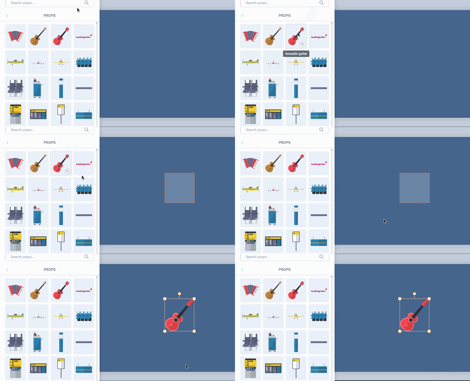
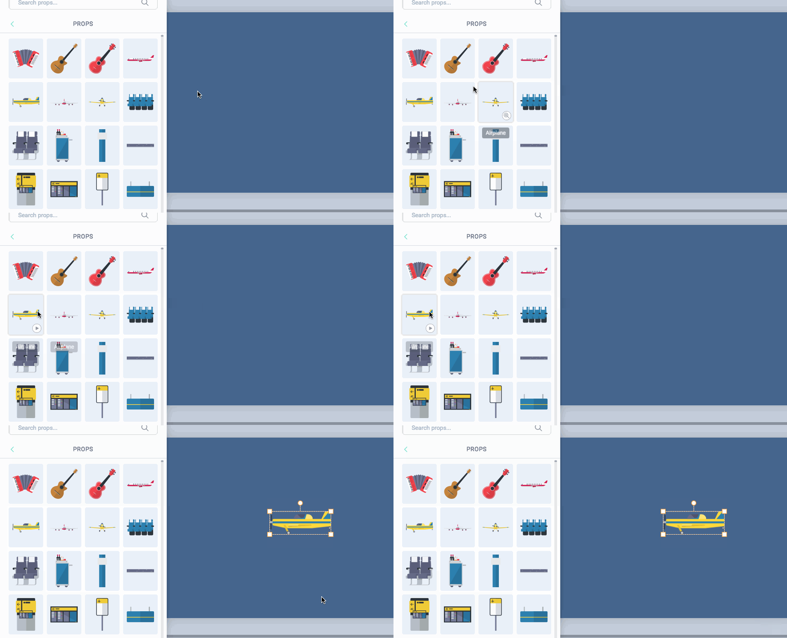
The constrain of time forces us to focus on what really matters, it forces us to make a choice. We chose Idea Two that takes 1 day to code versus the other option that will take 5 days. It is the best design based on the given constrains because we want to solve customer’s problem tomorrow, not 5 days later. For us, delivering value to customers is the only thing that matters.
Sometimes we might think: “If only we had more time, we would have the perfect design”. The question is, perfect for whom? Perfect for the company? Perfect for the customer? Did customers really asked for perfect? Or is it for our own designer ego? In the end of the day, giving your friend a present on their birthday is way better than the “perfect” gift that is late. Embrace imperfection. Embrace constrains.
Conclusion
A dream design is just that — A Dream. The real world is a place full of constrains and a lot of things is beyond our control. We as designers, are problem solvers, not dreamers. The sooner we understand this, the better we will become. I would like to end this article from a quote from General Patton:
“ A good plan, violently executed now, is better than a perfect plan next week.”
The perfect design is the one that makes users pain point go away today, not tomorrow. Until next time, may your constrains helps you become a better designer 🙂
Disclaimer: I am no longer a Vyond employee and I’m not posting on behalf of Vyond.