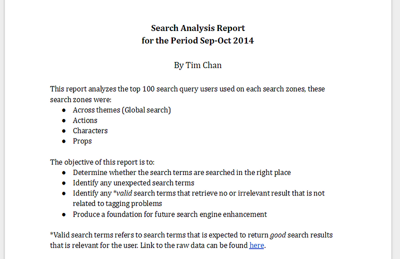
If you are working in digital products, chances are you’ve heard about the term Microinteraction, but what is it and why is it important to us? If you are new to microinteraction or want to have a better idea of what it is about, read on.
What is a Microinteraction?
Microinteractions are “invisible” designs that help users to complete their tasks seamlessly. The word “Invisible” is in quotes to convey they are not really invisible. Most of the time microinteractions has minimal UI, and when it was done right, users should rarely notice it existed because they will be so focused on their task. You will recognize a microinteraction when you see it, famous examples includes: Autocomplete, Autocorrect and Drag & drop.
Why is Microinteraction important to us?
As Charles Eames once said:
The details are not details. They make the product.
Microinteractions are, despite their small size and near-invisibility, incredibly important. The difference between a product you love and a product you tolerate is often the microinteractions you have with it. They can make our lifes easier, more fun, and just more interesting if done well.
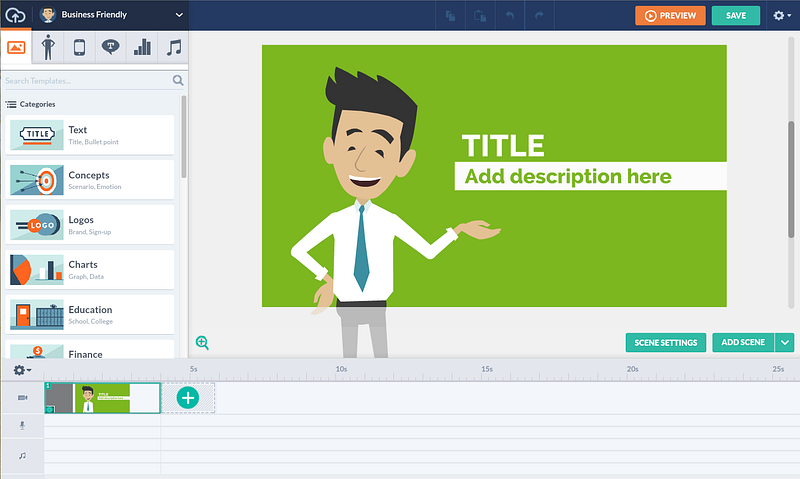
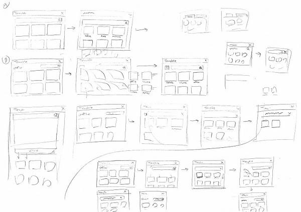
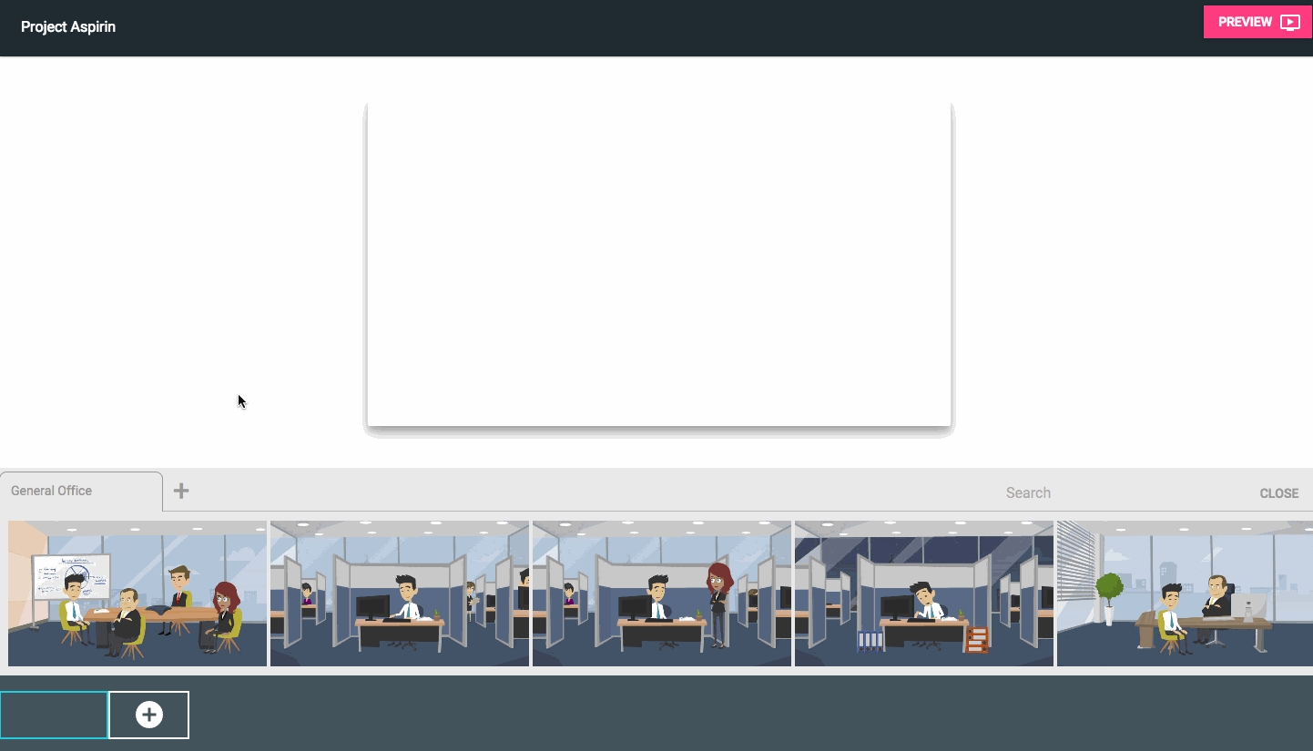
In this article, I am going to walk you through — step by step — on how I designed micro-interactions for GoAnimate. Let’s get right into it!
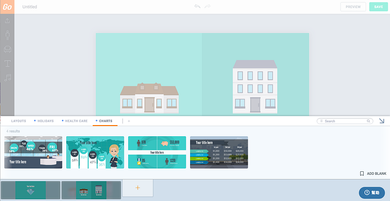
Case study : Designing interactions to resize objects in GoAnimate
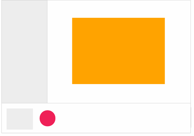
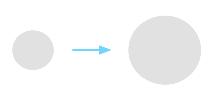
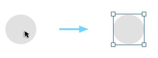
Suppose you are working on a graphical software, something like Photoshop. You want to make this circle just a little bit bigger, how do you do it?
Most people would say “Easy! Click on the circle and drag its corners”. Let’s break this down, there are actually 2 steps involved in here.
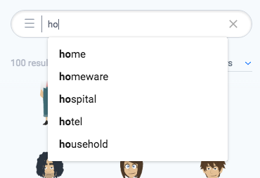
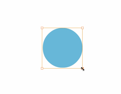
1. First, you knew that if you click on the circle, you would probably see something that looks like this:
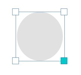
2. Then, you knew that dragging the boxes on the corner will make the circle bigger or smaller.
Wait, how do you know all this stuff? How did you know how to control this circle without reading a menu on how it is supposed to work?
You knew what to do because you have seen or done something similar before. Within a split-second, your brain quickly recognizes the pattern and tells you what to do, it becomes “intuitive” to you.
Why is it important to understand this?
There is no such thing as “intuitive”
The truth is, there is no such thing as “intuitive” in digital design. For something to be intuitive — by definition — it has to be something that you knew what to do instinctively without being taught.
Nobody knew how to use a mouse when they first saw it because the thing that makes it useful (the cursor) only exists on a digital screen, there is no cursor in the real world. Once you are trained, controlling a mouse becomes natural and intuitive to you.
Let me introduce our first principle for designing microinteractions:
Principle # 1 — Don’t start from zero
Always start with what users already know. This is important because it saves you time from reinventing the wheel, helps you to reduce the design complexity, and also lowers the learning curve for the user.
Designing the interaction
Let’s go back to the resizing circle example I gave earlier. We can break down what most people would expect on how to resize the circle in the following steps:
- Click on the shape to display its control points.
- To resize the shape, drag any control points.
These are the basic rules from the user’s perspective. For us, that is all we want the user to know. Anything beyond that is too complicated for the user. However, on our side, we have a lot of details to think through. Let’s zoom in to point 2 together:
To resize the circle, drag any control points.
How does this work exactly?
Decision #1 — Resize in real time or not?
Do you resize the circle while you drag or do we resize the circle after you finished dragging (Continue to show the original size of the circle before you mouse up)?
For GoAnimate, we considered 2 things: a) Since we are not a graphical design tool, we see little value of showing the original size of the object. b) resizing in real time feels more responsive. So, this is what we went for in the end.
We now have our updated rules:
- Click on the shape to display its control points.
- To resize the shape, drag any control points.
- The shape is resized in real-time.
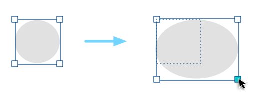
Decision #2 — Should the object be resized proportionally?
In most applications, users can hold the Shift key while they resize to retain the proportion of the object. Otherwise, the object can be resized freely and can be distorted. This kind of interaction has become a convention.
If we go with that, the rule becomes:
- Click on the shape to display its control points.
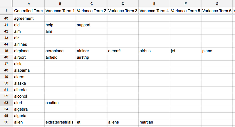
- To resize the shape, drag any control points.
- The shape is resized in real-time.
- To retain proportion, hold Shift while you drag.
Most of the time we will err on the side to follow conventions. However in our case, since GoAnimate provides a library of pre-made content to our users (such as Characters), those contents look pretty bad when they are distorted. There is also no strong use case to support the claim that distorted content will be useful in helping our users to tell stories. So, we broke the convention of holding Shift to scale proportionally, instead, we did the opposite: By default, all objects resize proportionally, and hold Shift to resize freely.
Here are the updated rules:
- Click on the shape to display its control points.
- To resize the shape, drag any control points.
- The shape is resized in real-time.
- The shape resizes proportionally unless you hold Shift while you drag.
We have considered that holding Shift to distort an object may be hard to discover. However, we are okay with it because our primary goal is to help users resize proportionally. This is one of the choices we got to make in order to make the interaction customize to our primary use case.
Decision #3 — How does the drag interaction works?
Our goal here is to figure out what kind of interaction feels the most comfortable and natural to the user. Here is what I immediately came up:
Since the control point exists in the corners, drag in 45 degrees to resize.
To make it easier to drag, let’s make the drag-able area 20px, meaning as long as your cursor is within that area, we count that as a dragging action. Now we have something like this:
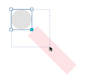
Needless to say, this is going to cause some serious usability problems because the limited draggable zone is going to cause a hard time for most motor functions. Users will probably be expected to do something like this when they want to enlarge the circle:
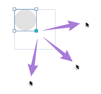
This makes more sense. Can we do better?
Let’s try the following:
To resize the circle, drag any corner outwards enlarges it, dragging it inwards shrinks it.
All we need to do now is to define where is in and where is out. It should behave something like this:
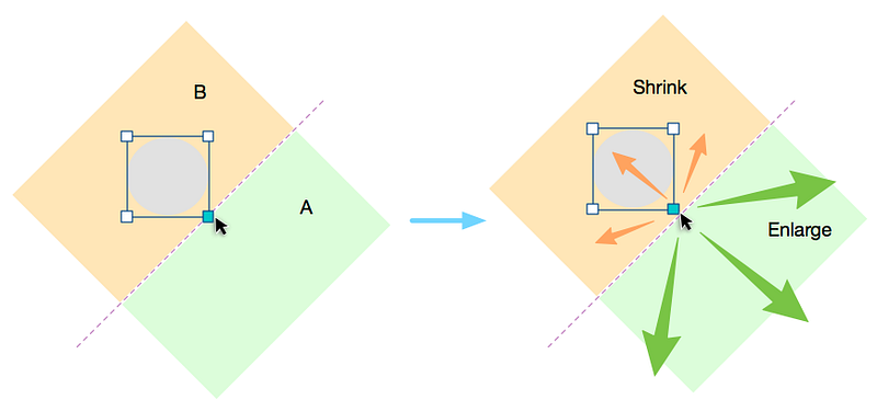
The idea is that whenever the user drags the corner, we are going to draw an invisible line perpendicular to the corner. If the cursor is then moved “outside” of this line, the shape enlarges, when it is moved “inside”, the shape shrinks.
If we add all these up, our final rules become:
- Click on the shape to display its control points.
- To resize the shape, drag any control points.
- An invisible line is drawn perpendicular to the control points, if the cursor is in the outer area of the line, enlarge the shape. If it is in the inner area, shrink the shape.
- The shape is resized in real-time.
- The shape resizes proportionally unless you hold Shift while you drag.
As you can see, resizing a shape might just be simply “Dragging the corners” to the user, but behind the scene, there are 5 rules working closely together to make this happen. This brings us to our next principle:
Principle # 2 — Absorb complexity
Remember 2 things, a) people didn’t come here to use your product, they came here to get something done. Learning how your tool works were not part of that goal, and b) user cannot read the rules of the microinteraction you designed. The only way they can understand the rule is to take an action, see what happens through the feedback, and adjust their mental model accordingly.
In the case study I provided, you can see that although there is a lot of logic going on behind the scene, all the users need to know to resize an object is boiled down to 2 rules:
- Click on the shape to display its control points.
- Drag any control points to resize.
As designers, it is our job to absorb the complexity of our product and enable users to do the things they need to do without having to think about how to do them. The more we can absorb, the more the users can focus on their goals.
Conclusion
Well, this has been a long article to talk about the basics of microinteraction. Making something intuitive takes hard work, but in the end, it is the little things that separate an okay product and a great product.
If you are interested in learning more about microineraction, I strongly recommend you check out the book by Dan Saffer, the title — unsurprisingly — is Microinterations. Even if you don’t see yourself designing mircointeractions anytime soon, this book will give you a fresh view on how to approach design problems and I guarantee you will learn something from it.
Until next time, may your microinteractions be intuitive.
Disclaimer: I am no longer a GoAnimate employee and I’m not posting on behalf of GoAnimate.