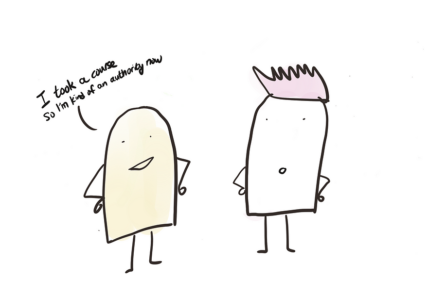
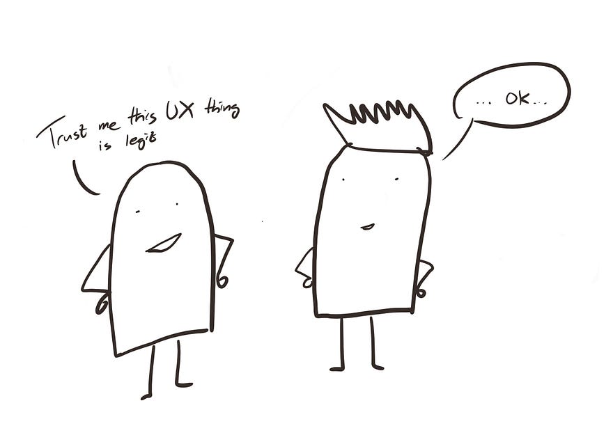
As designers, we have been told we should “learn to choose which battle to fight” because we can’t win every argument. However, no one has taught us how to choose which battle to fight.
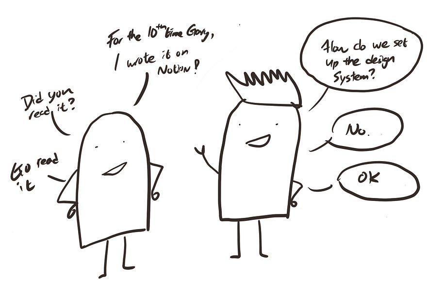
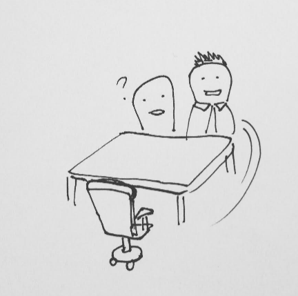
When I first became a design lead managing a group of designers, I found myself in meetings all day with designers trying to figure out how we should react in different situations.
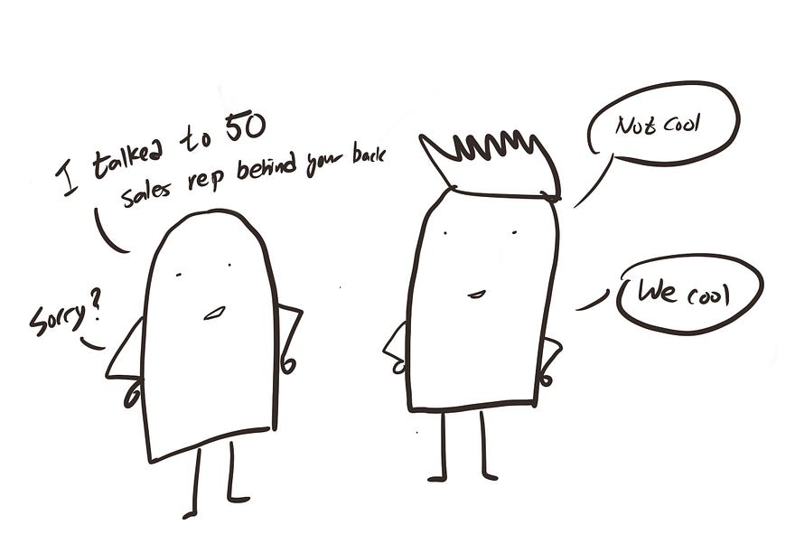
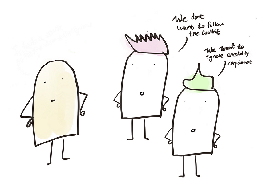
Team A did not follow the design system, team B insisted to push for a design that hurts the UX and team C decided that accessibility does not matter. Every scenario seems unique and we have to come up with a response every time.
Without a framework, we felt like we are constantly fighting fires. We became reactive. We wasted mental energy figuring out how we should react. It was unsustainable.
Eventually, I found a way. In this article, I will share a framework that helped me solve this problem and gain back my sanity — I call it the “Rules of Engagement” framework, it helps you clarify:
- When you should fight a battle
- How much effort to spend on each battle
- How to fight effectively
Let’s get right into it.
Rules of engagement
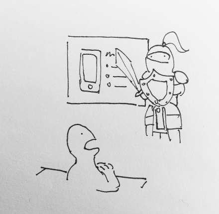
In military speak, “Rules of Engagement” refers to official orders that describe when and how a soldier should engage enemies in a combat situation.
The idea is to proactively think ahead of how you would react when different situations occur, instead of passively waiting for it to happen and then figuring out what to do. This way, you avoid knee-jerk reactions and can focus your limited mental capability on truly unique matters.
When to engage & effort to spend
Imagine your design team as a country under siege by design-related issues. You have limited resources, so you have to prioritize which cities to defend using a tiering system. For example:
- Tier 1 city would be your capital. Spend all blood and sweat defending it at all costs. This is the hill to die for, DO NOT retreat!
- Tier 2 cities are important. Put up a strong fight and only retreat when the casualty is too high.
- Tier 3 cities are the outer-rim territories, you don’t want others to take over them too easily. Put up a decent fight then retreat when the attack is too strong to conserve energy.
Applying to design, this would mean figuring out “How do we categorize our issues and How should we respond”?
Your tier list might look something like this:
The beauty of this framework is twofold:
- It forces your team to align on which area is important versus which is not. You conceptualize what matters. There is no individual guesswork, nor a designer going rogue debating stakeholders on things that just don’t matter.
- It is liberating to not have to think each time. Since you have done the hard work upfront to decide how you would react ahead of time, you know what to do 90% of the case. You avoid getting sucked into endless debates that don’t add value to your work. You conserve your energy to focus on the 10% outliers.
How to implement this framework
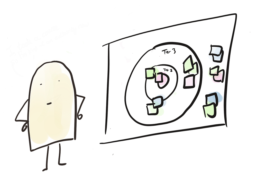
- Get a whiteboard and draw 3 rings with a bullseye in the middle, label them Tier 1 to 3 starting from the center.
- Write down common issues you face on sticky notes, then put them on the rings according to their importance level. Obviously, developers missing the checkbox by 2 pixel does not count as a Tier 1 issue. Well, at least in my team.
- Decide the appropriate response per tier. e.g. Tier x means putting in y amount of effort to argue with stakeholders before you escalate.
- Do this exercise with other designers and document the rationale so you can reference it in the future.
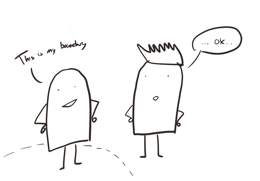
You are going to have disagreements and debates on which area is important, but that’s okay! It is much better to have an internal fight now than wait until the issue occurs and scramble to find the right response.
Multiple tier list
You might find it beneficial to have multiple tier lists depending on your situation. In my previous role, the company was organized around international markets. The strategic importance market — the one that makes the most revenue — gets the most attention from stakeholders, so it made sense for us to consider this in prioritizing our responses.
I had two tier lists, one for the market and another for the nature of the issue.
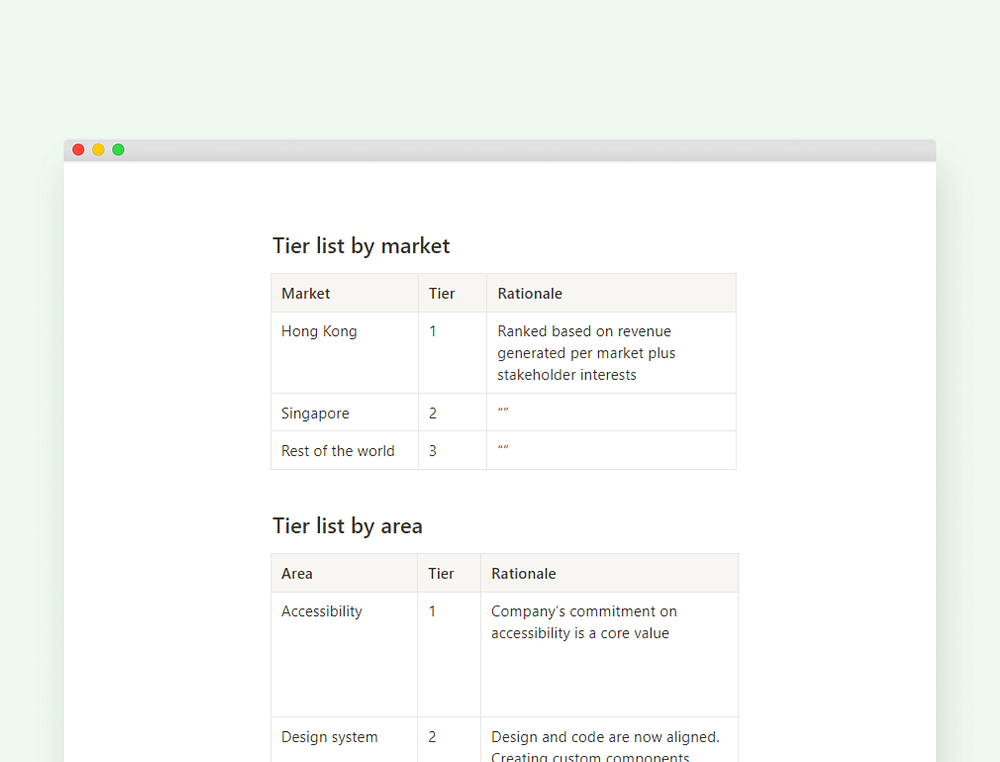
When an issue arises, I will follow this procedure:
- First, look at the market — Which market does this issue come from? Is it from a strategically important market? i.e. Hong Kong or Singapore?
- Next, I will look at the nature of the issue — What does this issue fall on? Accessibility? Design alignment?
Then I simply respond according to the pre-defined action.
How to engage effectively
From cold call scripts to product FAQs, the most successful teams would actively seek out repeatable solutions and systemize them. From my experience, the most effective way to help the design team engage with stakeholders is to provide them with the following:
- Sample response scripts— These are successful scripts used in the past collected from wise designers that one can plug and use according to different scenarios. For example, a sample script on “ how to deal with stakeholders that don’t want to follow design pattern”. Constantly ask your designers to provide feedback on the scripts so you can continuously improve them.
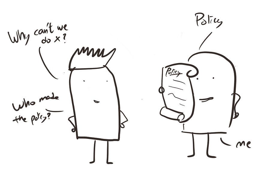
- Design policy & rationale — Decisions the design team made that designers can refer to. For example, to handle the situation where stakeholders don’t want to follow the new design pattern, you can say “Our policy is to apply a NEW design pattern on every new design”. Then if stakeholders continue to push, the designer can give out the rationale.
Don’t have a policy yet? Just start making one up now. I am serious. “Policy” is just a fancy name for how your team makes decisions based on grounded rationale. Once you have referred to your rationales enough times, it will become a de facto policy. You just have to start writing it down now so others can refer to it later.
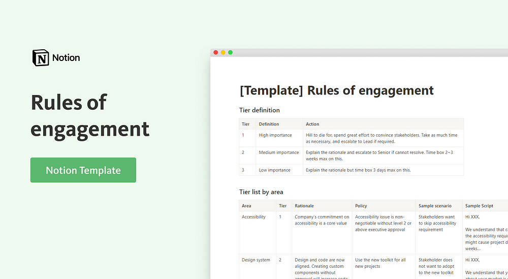
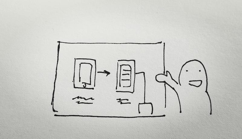
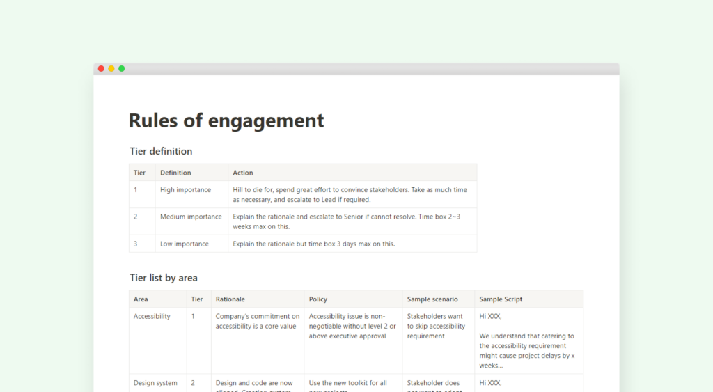
I have included an example of what your rules of engagement document might look like. You can visit this Notion page and create a template for yourself.
Now whenever an issue arises, you can look at the table to identify how important it is, how much effort to put into it, and know exactly what to say.
Benefits of this framework
To recap, the “Rules of engagement” framework benefits the design team in the following ways:
- Provides clarity — You know exactly when you should fight, how much effort to spend, and how to fight effectively. No more guesswork.
- Empowerment — Your team feels empowered as they know how to handle different situations on their own. You can delegate decision-making to your team and free yourself from becoming the bottleneck.
- Consistent response — Everyone on your team can act on your behalf and provide a high-quality response. You remove the scenario where Designers A and B will give different answers under the same situation.
- Saves time — You can avoid unnecessary meetings since your team doesn’t have to come to you every time for answers.
I hope you give this framework a try. If you do please let me know how it turns out for you!