• Skip to primary navigation
  • Skip to main content
  • Skip to primary sidebar

UXwanabe

Learn the softskill of UX and grow your design career

  • Home
  • Blog
  • Podcast
  • About

Why I write

March 1, 2019 by Tim Chan

Last week my friend Costin asked me why I write. It was at that moment I realized I have never gave this question a deep thought that it deserved. So in the spirit of understanding myself a bit more, I have decided to find out why I write. I hope if you read it to the end, I would have somewhat convinced you to give writing a shot. Seriously, it is really fun!

This article serves 2 purposes:

  • To give me clear purpose on why I write
  • To remind myself why I started and motivate me even when I don’t feel like writing (which is every single day!)

Why do I write?

1. I want to contribute to the community

When I was a wanabe designer trying to break into the UX field, there were a lot of resources out there that helped me started and I eventually got into where I am today working in a profession that I am proud of. I am really grateful for those who shared their knowledge before me because if they didn’t, I might have never became a designer.

As I became a more seasoned designer, I came to realize that if no one continues to share what they learn and contribute to the community, the cycle of knowledge will die off. The responsibility now falls onto me to help those that were in the my shoes and help them succeed, such that our community will continue to thrive and our accumulated knowledge will be greater than those before our times.

2. Writing makes me think more clearly

As I experience life, I form observations and I form opinions. Sometimes I figured an explanation to something. Some ideas are insightful and I want to share them to the world. The problem is, such thoughts are disorganized in my head, it requires massaging. If I try to communicate my raw thoughts to the public, no one will understand me and I have wasted an opportunity.

If I want to communicate better, I have to organize my thoughts. Writing is a powerful tool to help me achieve that because writing demands structure and clarity. It forces me think hard on how to sell an idea to an audience where they can’t ask follow up questions. After reading my words, the reader either gets it or they don’t. I have one shot.

The act of writing my thoughts down forces me to solidify the fuzzy concept in my head, which in turn trains me to think more clearly in the long run.

3. Writing is good for my career

When I write online, I am demonstrating the following skills and attribute to my future employers:

  • I am a disciplined person and I am passionate about design. Publishing articles consistently takes a lot of time and commitment (1 article every month), it is not an easy task and one must therefore be very passionate and disciplined about it. My collection of design articles is the result of the standard I set for myself. I am a man for my word so you can trust me to hit deadlines.
  • I am knowledgeable about business & design. By sharing everything I know about business and design openly, my readers will have a clear idea on the knowledge I have in these areas. After all, one must thoroughly understand the topic before one can talk in depth and explain it in a laymen-friendly way.
  • I am a good communicator. Each pieces of article is my attempt to sell my thoughts to my readers. It is perfect demonstration on my ability to make arguments, explain concepts and sell ideas.

4. Writing helps me practice for interviews

Sometimes during interviews, I would get asked insightful questions that I have never thought of. That does not mean I am not smart enough, it just means I have never gave those question any thought, or I have never considered things from a different lens.

Now if I spend time to write down my answers here, it allows me to explore the answer a little bit deeper and it becomes more memorable to me. If I ever felt the need for rehearsals before an interview, I can also come back to look for things I wrote.

5. Writing makes me happy

Humans are most happy when we encounter a state of flow. As a creative person, writing puts me in the state of flow where I am so immerse of the task and have totally neglect my surroundings. I felt constantly challenged in finding different ways to express myself, while in the same-time making sure I can make my point across to my readers. It is a perfect challenge that matches my ability.

It is especially rewarding to know when someone has found my writing useful, or even reached out to me to ask for more advise. This means that I have successful achieved my goal to add value to the community, this makes me a very happy person 🙂

6. Writing offloads my memories

I have a lot of ideas, and a lot of answers to a lot of questions. If I don’t write things down, I have to come up with an answer to the same question over and over again. Keeping all my answers in the brain slowly turns them into fuzzy, messy and disorganized thought, it gets lost very easily.

The brain is not built for remembering things, it is for solving problems. When I document my thoughts down, I am putting old problems that I have solved aside such that my brain has space for new problems that comes to my way.

7. Writing is good for my personal brand

I come from Hong Kong, a place where UX is still in its infancy. Most knowledgeable UX person in Hong Kong are westerners. That is understandable because UX originates from those countries.

Almost all my knowledge about UX were acquired from leaders from the west and I look up to them, but they don’t just magically become leaders overnight. They were leaders because they share everything they learn through articles, books or talks. They slowly build up their brand one step at a time.

In order for the UX scene to grow in Hong Kong, we can’t constantly rely on oversea experts to teach us what to do, that would only carry us so far. If we truly want to grow the UX scene and has a chance to catch up with the west, we need thought leaders of our own. We need someone local. This is where I see as an opportunity for me to come in.

Once I share everything I know and have added value to the community, over time, I would be seen as an expert and have build up my personal brand. It would open more doors to opportunities, it will give new comers someone to aspire to, and we as a community would be in a better position to drive changes in the Hong Kong UX scene.

Who do I write for?

I write for 2 targeted groups in my mind.

1. Wanabe designers

They are interested into UX and have probably read some books or have taken a lesson or two about UX. For this group, I want to teach them how they can become an UX designer, but I won’t teach them the basic knowledge of UX, that is their job to figure that out.

This group of people want to know that it is possible to become an UXer and they want someone that can guide them through the process. My focus would be to teach them exactly what steps they should take that can help them land their first UX job. Some topics that will benefit this group:

  • how to prepare for your portfolio
  • how to job hunting and find the right UX jobs
  • how to prepare for the interview
  • how to networking
  • how to be confident even if you think you are not qualified — A mind set that would help you succeed.

2. Seasoned UX designers

The second group is seasoned UX designers. They have been working in the field for 2-3 years now and they are looking for knowledge that can help them climb the rank. This group wants to become a better designer such that they can take on more responsibility. Some topics that will benefit this group:

  • How to gain management support/ buy in from stakeholders
  • How to create and communicate your design process
  • How to advance to Senior UX/ Management
  • How to drive organization change
  • How to align design vision
  • How to create design principles
  • How to communicate better with programmers

Conclusion

This article is written mainly for the benefit of myself, but if you have made it this far to the article, I hope I have made you understand the benefit of writing and how it will help your career. And if this inspires you to start writing, Haleluia! Leave a comment and share with me what you wrote!
Filed Under: Personal Tagged With: UX

How to interview for an UX position

February 1, 2019 by Tim Chan

Insights from a designer that became an interviewer.

Last week, I interviewed someone for the first time. It was for a junior UX designer position and for all my professional careers, I have been in the interviewee’s seat. Being in the opposite end of the table has been an eye opening experience for me, and I have learned few things that I wouldn’t have otherwise.

In this article, I want to share some insights I learnt that would help you interview better for an UX position, so here it goes.

Insight #1 — Your interviewer is on your side.

Look, I might have a Senior in my title, but I am just a designer that is looking for another designer to help me with my job. As an interviewer, I am not here to test you or throw you a challenge. I am actually on your side. Why? Because…

Company hires to solve a pain.

When a company decides to hire someone, they are in pain. They are at a point where they either A) Figured out putting the designers on over time just wouldn’t produce the same kind of work Bob did before he left 3 months ago or B) Needed to do something but they don ’t have the knowledge or time to do it themselves.

Hiring people costs a lot of time and money. Especially in the time where everyone can take a weekend course and slaps a “UX designer” title on their LinkedIn profile. It takes a tremendous amount of time just to figure out whether someone actually does UX or UI, or is just simply does not have a clue there is a difference.

The interviewer’s job is not to screen out people — screening out people is just a by-product. His job to find someone to fill a role that they desperately need as soon as possible, so he can get back to do his work, the work he is paid to do and hopefully get a raise he deserved.

This is were you come in.

Insight #2 —The interviewer wants you to be THE ONE.

Any decent company gets hundreds of resume sent to their mailbox when they post something on the web. By nature of normal distribution, 80 % of them are mediocre, 10% of them are terrible. The hiring manger have to sort through the pile of resumes and hopefully find those 10% that is qualified, then persuade them to work for him.

Imagine being a hiring manager. You start screening for potential match, finding and arranging time that works for both sides, coming in at 7 a.m or staying late after work because your candidate can’t take a day off, then during the interview, the candidate does not show up. Or when they do show up, they completely blew it and have no idea what they were talking about. Maybe you found someone that was really good, but you don’t have the budget for what they asked for. In other cases, after a few rounds of interviews and an offer was given — just before you think the dust is settled — the candidate turned you down and has accepted an offer from a competitor.

Most interviews takes at least an hour, realistically you can only do 3 to 4 interviews a day. Sometimes a bad interview just completely ruins your mood and you start to question whether there are still good people out there, and you can’t focus on your work for the rest of the day.

The point is, interviewing people takes a lot of energy from the hiring manager. It is exhausting. In the end of the day, the hiring manager just wants to go to his boss and say “This is our guy, give him an offer”. This means that he is secretly hoping that this interview — the one you are having right now — would be the last one he has to give. He wants you to be the one.

Why am I going so lengthy about the hiring process? Because I want you to have empathy. Hiring managers is people too, they have their own hopes, fears and dreams. As an UX designer, you should already know what empathy is don’t you? Once you start to treat your interviewer as a person and understand their pain-points, you will start to operate in a total different level.


Now off to some tips about how to interview for an UX role.

Tip #1 — Defend your work, not yourself.

When the interviewer asks you about the design decision you made on your project, it is easy to get defensive because you see it as an act to question your ability in delivering good work. You are defending you instead of your work.

In fact, I would argue you shouldn’t even defend your work. Defend implies having your guards up and fighting off anything that is coming to your way. Once you start doing that, you put yourself in a disadvantage. You are not ready for a discussion, you are ready for a fight. You are now fighting to justify why you should be in this room instead of selling why you should be right fit.

Here is a little trick to avoid being defensive: Assume good intentions. This means assuming the interviewer is genuinely interested in understanding how you make decisions.

Think of the interview process as an usability study and the interviewer is your user. Examine questions coming out from the interviewer with a scientific lens and treat this as an opportunity to improve your presentation skills. He is confused about something you said or did. Why is he confused? What doesn’t he understand? What does he mean by saying that? Why is he asking this question? Does he have other ideas about the project that you haven’t thought of?

Tip #2— Answer the question

It is easy to get defensive when the interviewer asks you about certain choice you made. When you haven’t thought about it, it puts you off guarded. You don’t want to be seen as a designer that hasn’t thought through things, so you start going in circles and making things up, but you are not really answering the question.

This puts the interviewer in a weird spot because he will start to wonder if he ever asks you to justify your decision, will it take him 15 minutes every time to get to the bottom of things?

Its OK to not have answers to things. We have all worked for someone and we understand that in the perfect world we want to do everything “properly” such as running analytics to see whether our design performs better than the old one, or run surveys to record users satisfaction about the new design.

Of course the world is not perfect and business is full of constrains, so an answer like “No we did not measure whether the new design perform better because the problem was urgent and we needed some fixes real quick. Our new design was based on our own experience and industry best practices. We hope that we can go back to revisit it when we have the budget in the future.” is sufficient in most cases.

Tip #3— Lead the interview

When the interviewer asks you to walk through your portfolio, he is asking you to lead the presentation. He is no longer leading the interview now, you are. You own the stage, so start act like a leader and act like you know what you are doing. For the next 10 minutes, the stage is yours.

Tell them what the problem was, and the kind of research you did to uncover things you didn’t know before. Tell them the surprises, then tell them the kind of designs you tried and how you picked the final winner.

This is the part you should not screw up. I will give you the benefit of the doubt when I am the one asking you questions that is not related to your portfolio, because you might not have thought about it. But questions about your portfolio? It is your work and you should know it by heart. I assume you have practiced your presentation at home. You should know your stuff inside out, you should expect when and what the interviewer is going to ask you and be able to answer any questions with confidence.

Don’t literally walk through your slides pages by page though, you should adjust your presentation based on the audience. For example, the Head of Marketing might want to focus more in the before vs after and the results, while the UX manager might focus more on the process you went through. Adopt your pitch such that you keep your interviewer engaged.

Tip #4 — Make it hard to say NO to you.

As mentioned in Tip #2, in the end of the day, the hiring manager just wants to go to his boss and say “This is our guy”. What this means is that as an interviewee, you should do everything you can to make it hard for the interviewer to say NO to you.

How?

By removing all hesitations the interviewer might have about you. As an UX designer, apply the technique you learnt from UX and treat yourself as a product, then identify your flaws and solve them one by one. Ask yourself; “If I were in the interviewer shoes, what kind of questions will the interviewer have in his mind that I need to address as soon as he meets me? What are his biggest concerns? Which part of the interview process will he likely to drop-off (decides I am a NO-GO)?

Sometimes you don’t have to be the best designer out there to get a job, you just have to be better than everyone else that came to the interview, and this simple thought exercise might give you the extra edge.

Conclusion

While we as UX designers are good at designing user experience for digital products out there, it is easy to lose sight that we are in fact a product too. And how we position ourselves, and how much we understand about our users — determine whether the product — us, will sell or not.

If you can get an opportunity to interview someone, or just simply sit-in quietly and take notes, do it. It was a truly eye-opening experience for me and I guarantee you will learn a lot about how to become better at interviews. Until next time, may you apply empathy to everyone around you.

Filed Under: Career development, Job interview, Most popular Tagged With: Interview, Product Design, User Experience, UX, UX Design

2019 The Year of Taking Control

January 4, 2019 by Tim Chan

This is the second of my yearly review posts. I want to actively assess my life rather than just watching years slip by. Last year’s post: 2017 in review

2018’s goal

A quick recap on the goal I set up for last year

1 Find a new job — Update portfolio, actively looking for jobs/ natural networking, prepare interview questions. DONE! This is one of the greatest success in my goals, as I have been able to obtain a UX manager title and have a considerable increase in salary.

2 Gain a six pack — Work out 3 times/week, hire personal trainer. FAILED. This went extremely poorly, as I stopped working out and actually got a bigger belly 🙁

3 Have at least 8 hours of sleep, every day — Set up alarm clock at 23:00. Make myself accountable and have to lose something if I didn’t meet this goal. FAILED. This had a cascading effect on my health and relationship on people around me. As I constantly stay up late at night, I was unable to give 100% focus when I hangout with friends and in multiple occasions a lost my temper and had fights with my girlfriend.

4 Publish 12 articles — Set up schedule on calendar to publish every month.FAILED. I have only published 2 articles in 2018. I actually wrote a lot of articles and they all sit in the backlog. My writing was a little bit all over the place and I weren’t able to complete any of them.

5 Make 24 Origami models — Set up Origami time on my calendar. FAILED. I had set up systems to remind myself to create origami, but ultimately I created 0 this year.

6 Start a UX teaching course.FAILED. I did not complete any steps that would put me in a position to teach others about UX.

Reflection

Last year, I made 6 commitments at the start of the year, but I only followed through on 1 of them. I believe the main reason is that there is a lack of focus on the goals, they seem scattered and it seems like there is no strong reason for achieving them, it just made me felt good by writing them down.

This year, I’m setting 4 goals— but each goal are carefully picked to help me achieve a bigger goal, a big piture, a theme, and the theme for this year is:

The year of Taking control

I am going to implement 3 mechanism that will help me take . They are:

  • Do things NOW — This means that whenever there is something I want to do, I will sit done and set up systems that will make sure I will do it
  • Deadlines — Everything must have a deadline to avoid procrastination
  • Focus on ONE thing at a time — Distraction is the main reason that cause me to unable to finish a task.

Goals for 2019

  1. Gain a six pack — Gain control back to the shape of my body. I will start off by going to the gym 2 times a week, then slowly move to 3 times a week. I will commit to run at least 1 time a week.
  2. Have at least 8 hours of sleep everyday— Gain control back to my health and temper. I will start off my turning off my lights at 12pm, then slowly move on to 11pm.
  3. Publish 12 articles —Gain control back to something I committed. I felt a lost of control when I spend so much time writing but is unable to finish my articles. I plan to publish articles every month even NO MATTER WHAT. I will aim for consistency over quality and building a writing habit. I will do so by setting a weekly reminder to allocate time for writing,
  4. Create 2 side projects — Gain control back to something I wanted to do, and had said I wanted to do it, but is unable to follow through. I will allocate 3 hours per week to work on my side projects
  5. Bonus: Publish rabbit comic every week — This is a side goal that I enjoy doing on the side, and I hope I feel passionate continue doing it.

Filed Under: Personal Tagged With: New Year Resolution, Resolutions

2017 in Review

January 3, 2019 by Tim Chan

Another year complete. Time for a year in review post! This is the first of what I hope to be many review posts. I want to actively assess my life rather than just watching years slip by.

What Went Well

Health

I signed up from a gym member ship this year and I have been consistently going to gym 2 times a week. It is a good thing that it has now become part of my life and stuck as a hobby.

Gym 2 time/week @ Tue/Thur

Relationship

I am involved in a romantic relationship this year. My girl friend and I are currently been together for 9 months and is currently very stable. I consider having a healthy relationship as part of my Tripod of stability (Health, Relationship, Work), without those, I cannot pursue something greater.

Travel

This year, I went to Japan with my girl friend. This is the first time I plan a trip without my parents help. I enjoyed the time in Japan and I learned a great deal about what my GF likes and dislike, I believe this trip and strengthen our understanding with each other.

Finance Automation

I finally got my finance automated. It might come as a shock to someone that I did not hold a credit card under my name as I was 26 of age. The truth is I have been procrastinating about this since I was 21. The effect it has on me has been daunting. Liberating would not be enough to describe how I feel to finally did something that I should have done long time ago. Here is what I did:

  1. Set up credit card.
  2. Set up auto-pay for credit card.
  3. Set up auto-pay for Octopus.
  4. Set up auto saving account.

Writing

This year, I have published 3 articles on Medium that got quite a few attentions from the readers. I spent a lot of effort to write those articles and I consider them high quality. I am happy that someone actually read it, gave comments and liked my post, that made me feel happy and I am actually more motivated to write more this year.

Cooking

This is a great year for cooking. I started to take my cooking passion more seriously and committed to cook twice per week. The arrangement of aligning when the house maid is off (such that no one will cook at home) and my cooking schedule made it harder for me to slack off. I also met someone from the card game I played who happened to be a cook. I should consider asking for guidance from him from time to time.

What Did Not Go Well

You will see that a lot of things that didn’t go well is overlapped with things that go well, as I see there is always areas that I can do better if I push myself harder. This is the only way to be a top performer and become world class in my life.

Health

I have been staying up too late at night, for more than I wanted. I am most efficient when I get at least 8 hours of sleep and my current sleeping habit fails to achieve my goal.

Writing

In this year I have only published 6 articles. Far less than the ideal goal of 2 articles per week, and is only slightly better than last year’s 5 articles. The truth is that I had a lot of articles that I started in my backlog, but I lacked the discipline to finish them. Good things is that I do receive some positive responds from my reader.

This would be something I would continue to improve this year. I aim to double the amount of articles I published.

Origami

This was a poor year for Origami. I only created 2 turtle when my girl friend is around. When I look back I believe the reason for this is because I didn’t delegate specific time for this hobby. I should put origami as part of my calendar if I want to continue to pursuit this passion.

Work

Non of my goals of increasing salary nor getting a promotion has been met. To be honest I felt a little bit set back by the fact that the work I did was’t being valued.

I no longer feel passionate about going to work. Everyday I feel frustrated, annoyed and sometimes angry. The truth is, I have already decided that I wanted to move on, so whether I can reach my goal was more as a pride than something I really want.

On a plus side, I did learn a great deal of how to run projects and how to apply design principles in my work. I have been growing a lot in terms of design, and I do hope that the knowledge I have acquired is going to help me to find a job that I would enjoy.

Goals for 2018

  1. Find a new job — Update portfolio, actively looking for jobs/ natural networking, prepare interview questions.
  2. Gain a six pack —Work out 3 times/week, hire personal trainer.
  3. Have at least 8 hours of sleep, every day — Set up alarm clock at 23:00. Make myself accountable and have to lose something if I didn’t meet this goal.
  4. Publish 12 articles — Set up schedule on calendar to publish every month.
  5. Make 24 Origami models — Set up Origami time on my calendar.
  6. Start a UX teaching business — Go through ZTL course.

Filed Under: Personal Tagged With: New Year Resolution, Resolutions

Designing bank’s money transaction UI

December 24, 2018 by Tim Chan

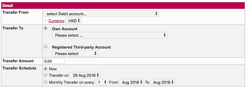
A while ago I worked on a redesign project of a banking website. One area of the website in particular has caught my attention. Here is what it looks like:

This is a money transaction form, the purpose of it is to allow users to transfer money to another party. First you select which account you want to transfer your money from, then to whom and how much. Finally, you select when you want to send it, which the bank calls it the Transfer schedule.

Transfer schedule comes with 3 options:

  • Now
  • Transfer on [-Specific date-]
  • Monthly transfer on every [-Date-] from [-Month-] to [-Month-]

The first 2 options seems pretty straightforward. If you want to transfer money, you can either do it now or do it later (i.e. on another date). However, the third option feels weird to me on first glance. I couldn’t say why until I put in some dummy dates and read it aloud:

I want to “Money transfer on every 5th between August and December”.

This statement is logically correct and I understand what it means. However, something doesn’t feel right. Why?

Because nobody talks like that.

This is why this form sounds weird when you read it. It slows me down and let me wonder “What does this option mean?”

I decided to fix this.

Why does this matter

You might wonder why does this matter? Can’t user figure things out eventually?

You are probably right. Users probably can figure things out on their own if you give them enough time. The thing is, this kind of things adds up, when people say a website or an app is hard to use, most of the time they are not referring to one particular feature, but with all the tiny annoyances or inconveniences such as the above example as they experienced it.

Users are here to get things done, they want to come in, do what they want to do, get out and get on with their life. Our job is to translate what the business needs into an interface that users understands, such that they can input what is needed, and get on with whatever that they wanted to do.

Lets see how we can make our user’s life a little bit easier this time.

The approach

When it comes to transaction, there are only 2 things the bank needs to know.

  1. The date
  2. Whether you want to repeat the transaction. If so, until when.

One trick I like to use is to imagine how things would happen in real-life. This helps to design the form in way that it feels more like a natural conversation. Lets say we are having a conversation with the clerk at the counter. The conversation probably goes like this:

Hi there, what do you want to do? — I want to transfer money.

How much? — $1000.

To where? — This account.

When do you want to do it? — 5th August.

Anything else? — Yes, I want to repeat the transaction until December.

The redesign

Here is my updated version on the “When” part.

Couple things is happening here. First, I added an option where users can quickly select the date of Today since it covers a majority of the use-case. Second, I added a simple checkbox that says “Repeat monthly”, once checked, it reveals another drop-down where user can select the end of the monthly repeated cycle.

The last part of the money transfer conversation becomes:

When do you want to do it? — 5th August.

Make this a monthly transaction? — Yes, until December.

Doesn’t this sound better? Feel free to comment and let me know what you think!

Filed Under: Case study Tagged With: Design, User Experience, User Experience Design

How to design for constrains

September 3, 2018 by Tim Chan

A case study on designing loading state

I like to consider design as a spectrum. On the left hand side, you have the Minimal Viable Product (MVP), the absolute bare minimum you can do to ship the product. On the other end, you have the Dream UX design, where I define it as the “If I have infinite time and resources this is what will I do” kind of design.

The challenge for every designers is to push their design towards the right hand side as much as possible while considering about the constrains. In a company, this typically means time and resources. How one can embrace this constrain and thrive in this environment is what separates novice and seasoned designers.

In today’s article, I want to walk you through how I designed loading states for Vyond, a start up I previously worked for. Where we slowly tweak our designs based on different constrains and finally coming up with something that strikes the balance between UX and available resources. Lets get right into it.

Background

When we were redesigning the Vyond product the Video Maker a year ago, we took a lot of shortcuts to hit the schedule. As a result, we didn’t create any loading states and is causing some frustrations to our users. Now that we have time, we decided to fix this.

Why is loading state important?

Loading states is a way for a system to tell users that it has received their command and is now working to make things happen for them. Without a loading state as a feedback, users won’t know what is going on and it violates one of the top 10 principles of usability design — Lost of control.

Understanding the problem — Talking to Engineers

To create good loading states, first we need to understand how things are loaded in the back-end. At this stage, you basically ask 2 questions:

  1. Can it be done?
  2. If yes, at what cost?

Here is an example, in the below UI, we are going to display a row of templates for the customer to use. We want items to load one by one from left to right. Can it be done? The short answer is yes. However, developer told us that there is no way to control which item to load first because items comes with different file size, and they will appear as soon as they are rendered. Which means item 3 might show up before item 1 if the file size is smaller.

← Expectation: we want items to load from Left to Right | Reality: items shows up in whatever order they want depending on its size→

The only way to load item from left to right visually is to wait for all items to finish loading, then displaying them one by one from left to right. This means users will spend more time waiting and staring at the blank state. This goes against one of the purpose of the loading state, which is to mask waiting time!

The importance of talking to Engineers

As you can see from the example above, understanding whether our ideas is feasible up front saves us time from designing something that will never see the light, and we can spend our time to focus on something that can actually work.

Another important thing from this exercise is helps us to have a better understanding roughly how long each component will load, so we can design appropriate on each scenario.

In case you are curious, for the above example, we decided to use skeleton loading in the end to help mask loading time.

Continue iteration

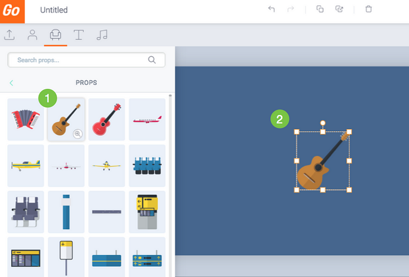
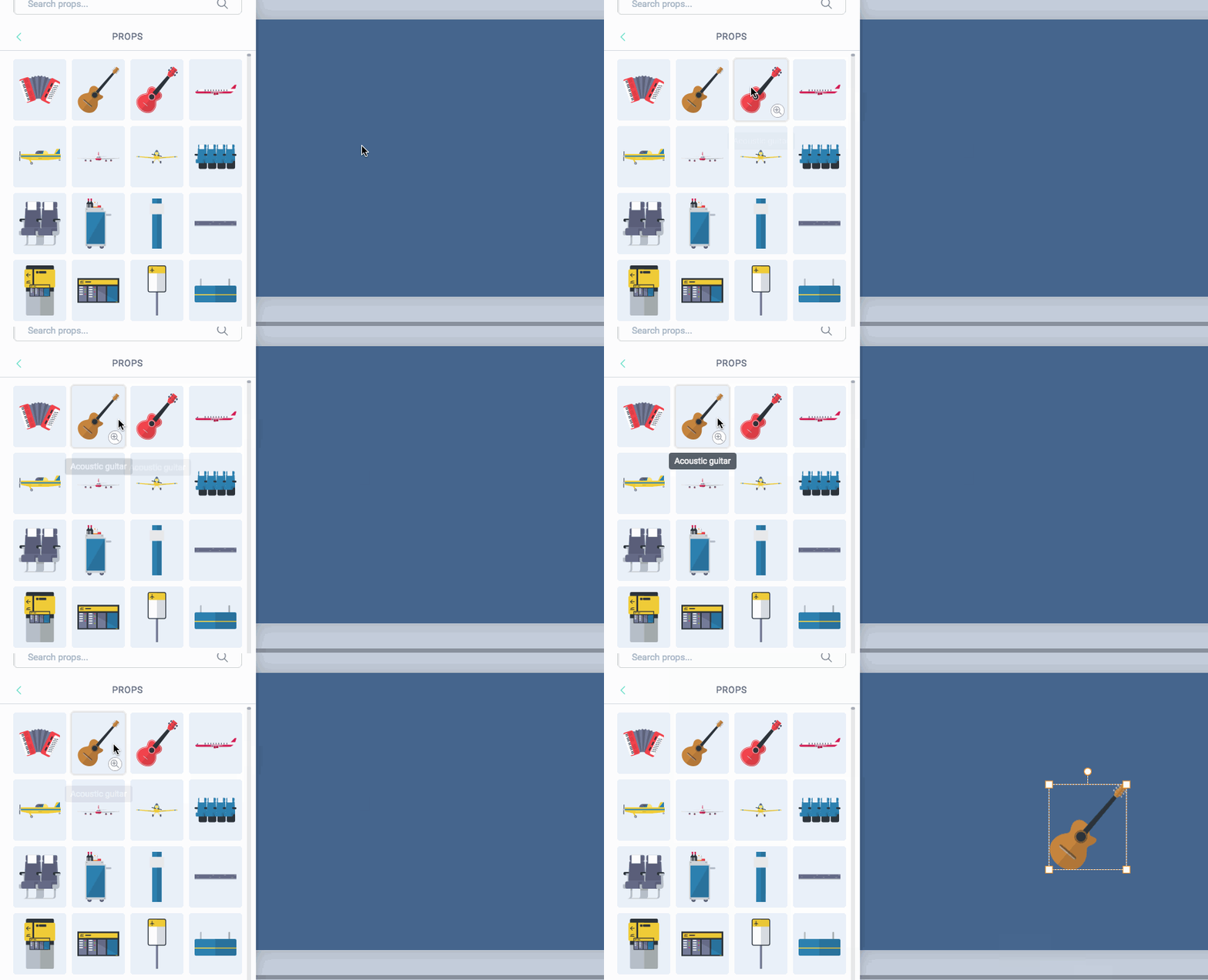
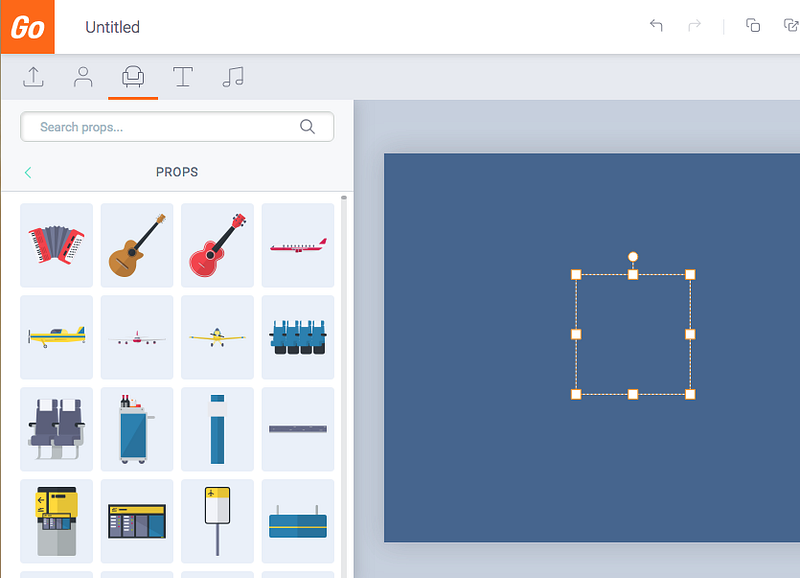
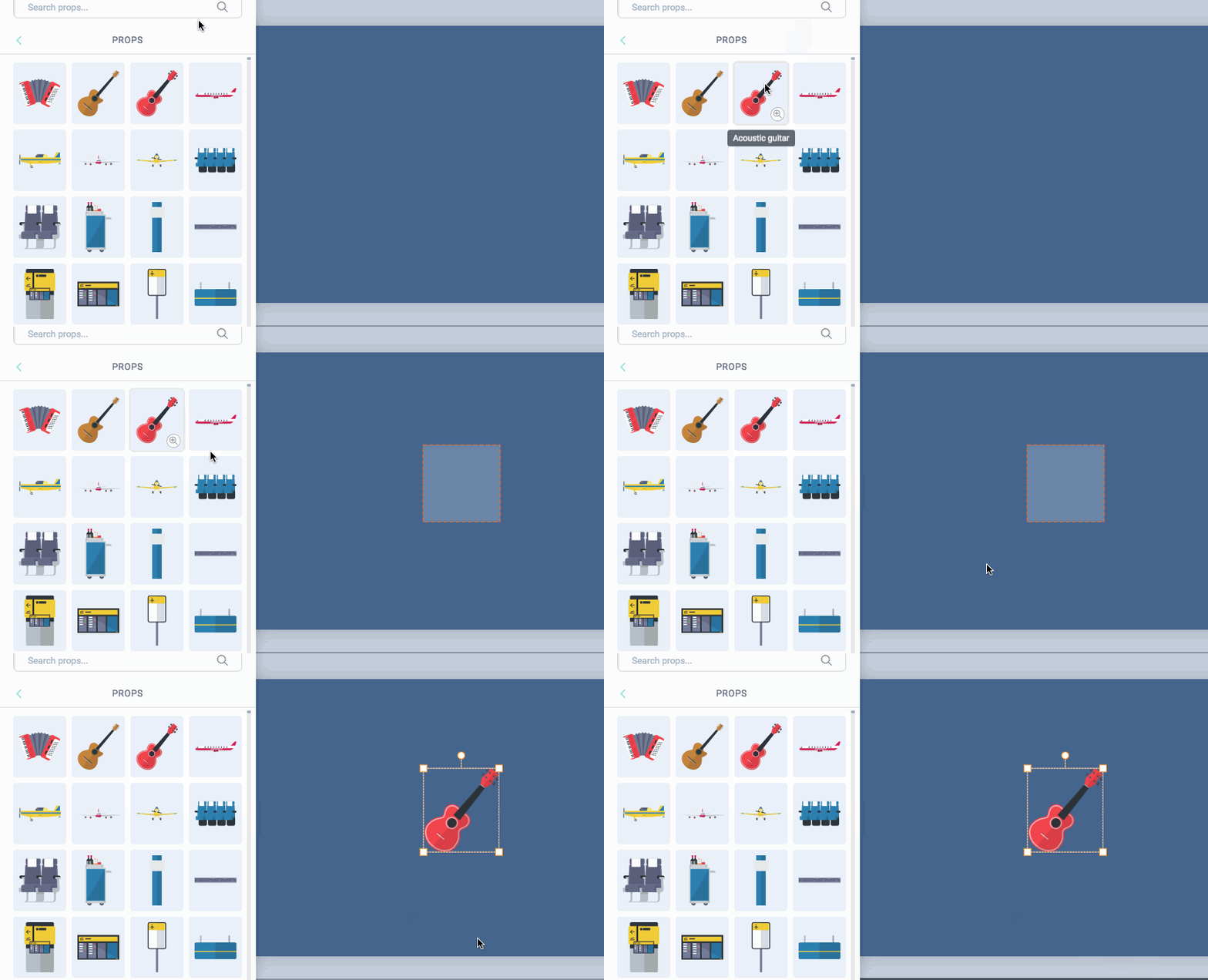
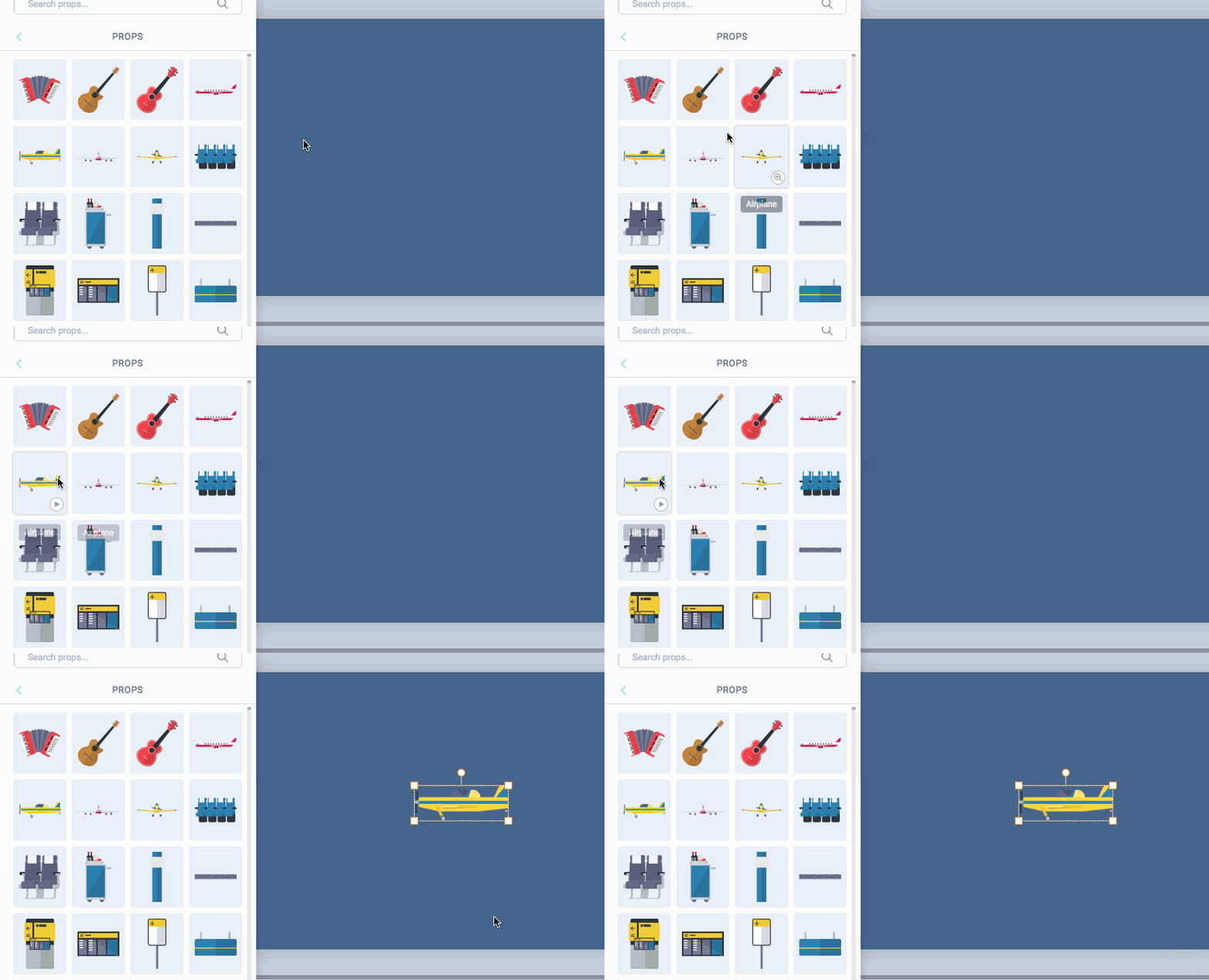
Let me show you another example. In the below UI, when user clicks an item from the left panel, the item will show up on the blank area on the right hand side.

Here is how the interaction works:

  1. Click an item from the Library.
  2. After a short loading time, the item is shown on the Stage.

Originally when you click an item, nothing happens. You will be staring at a blank canvas for 2 seconds before the item finishes loading and pop up. The delay and lack of feedback makes user feel the system is not responsive and triggers user to repeat their action. Which causes user to add multiple items unintentionally, and they have to wait even longer.

The Dream UX vs Reality

To approach this task, lets start with the dream UX, the holy-grail:

In an ideal world, when you click an item, item is shown immediately on the blank area.

This is what The Dream UX looks like, zero loading time!

Of course in the real world, items can’t appear instantly because it takes time to load them, but I don’t take “impossible” for an answer until it was proven, so I decided to ask the question:

Is it possible to render items immediately when we click on it?

The answer is yes…with a cost. Item takes time to load, if we want to have the appearance that items is shown immediately when we click on it, we have to preload the items in the backend. It is similar to when you download a big file, you decided to browse Facebook for the duration. Since you are preoccupied, you have the perception that you are not waiting for it to download, but the file is still taking its time behind the scene.

To achieve the “immediate response” effect, we need to “hide” the preload time somewhere such that users don’t feel like they are waiting for us. When user enters the Vyond app, we show them a loading screen before the app is fully loaded. Can we add this loading time to the loading screen?

Loading screen for Vyond’s Video Maker app

Yes we can! This is how we imagined the flow would look like, after the “Item loading” time has been absorbed by the “App loading” time:

The Item loading time is absorbed by the app loading time

Here is the catch, we have more than 20,000 items in our library. If we preload all these contents in the loading screen, this will take us more than 5 minutes. That’s quite a long time to wait, compared to the time to loading an item which only takes about 2–3 seconds.

Expectation vs Reality. Putting Item loading time into App loading time actually makes loading longer

Someone on our team suggested that can we preload only the items “above the fold” — items that are visible to users without them scrolling. The problem is that having instant access to those items doesn’t help us to achieve our goal of having 0 loading time, since this approach only benefit only roughly 100 items that is above the fold.

This is a time for us to pause and ask ourselves the big question —Is it worth to keep thinking about this direction?

As product designers, it is always important to keep asking yourself this question. Because you always have limited resources and a lot of problems to tackle, spending more time on this problem means you will spend less time on another problem.

In the end, we decided that we have tried our best for this 0 loading time direction and it didn’t work. Let’s find another way.

Building the gap

OK so we can’t show items instantly on the canvas, but we can try to do other tricks to mask the loading time. Below are some ideas:

Idea 1 — Real size selection box

  • When user selects an item, show its selection box but without the item inside it, the selection box has the same size as the item the user selected.
  • Display the real item when it finishes loading

What I like about this idea — It is clear that the item is loading and it helps to mask loading time

Why this idea does not work — Showing a real size selection box requires the server to load the size data of the item, this means until it can get that data, users are still staring at a blank screen and the loading time remains unchanged.

Idea 2 — Fake selection box

  • When user selects an asset, show a fake selection box. The fake selection does not represent the size of the Real item.
  • The fake box is replaced by the actual item when it finishes loading.

What I like about this idea — It gives instant feedback that the item is loading.

Why I don’t like this idea — After all, the selection box is fake and does not represent the actual size of the item being selected.

Idea 3 — Thumbnail images

When user selects an asset, show its thumbnail. Thumbnail is replaced by the real asset when it finishes loading.

What I like about this idea — It gives instant feedback and gives users a preview of the real thing as early as possible.

Why this idea was shut down — This idea seems really good on paper, however when I took this idea to the development team, I was told it would take more time to code it then we had planned. Which brings me back to the topic of this article — How to design under constrains.

Design is about trade offs. On one hand, we have and ideal solution that might deliver 90% of value to the user, but it will take 5 days to code. On the order hand, we have an Okay idea that will deliver 70% of value to the user, and takes 1 day to code.

In our case, time is limited, so we have to choose what is the best design within the constrain. Not what is the best design.

Making a choice

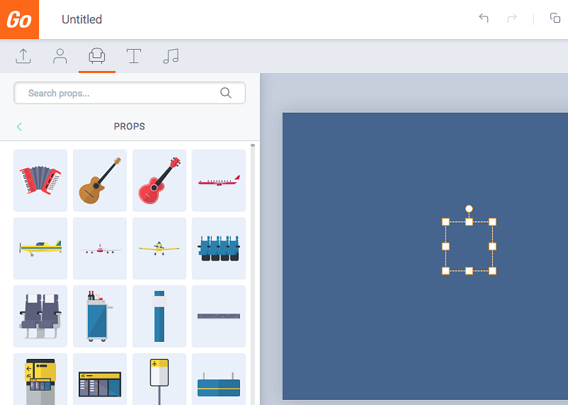
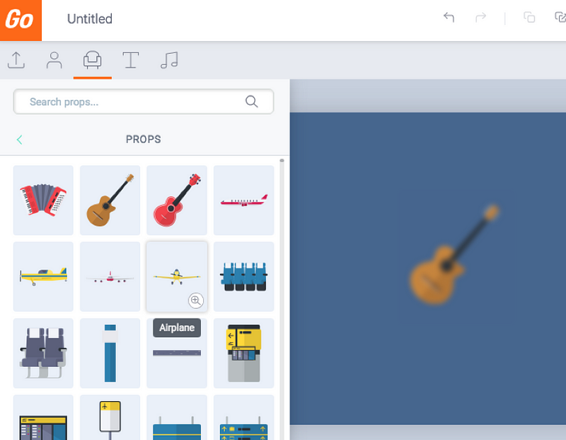
In the end, we went for Idea 2. We chose a box size that represents 80% of all item’s size. Which means that in 80% of the cases, the fake selection box is the perfect size and it represents the actual size of the item selected. I was actually surprised that it looked way better than I thought. Another reason why you should do prototype.

Here is what it looks like in the end:

Case 1: Item selected has the same size of the Fake selection box.
Case 2: Item selected does NOT have the same size with the selection box, the REAL size is rendered afterwards

The constrain of time forces us to focus on what really matters, it forces us to make a choice. We chose Idea Two that takes 1 day to code versus the other option that will take 5 days. It is the best design based on the given constrains because we want to solve customer’s problem tomorrow, not 5 days later. For us, delivering value to customers is the only thing that matters.

Sometimes we might think: “If only we had more time, we would have the perfect design”. The question is, perfect for whom? Perfect for the company? Perfect for the customer? Did customers really asked for perfect? Or is it for our own designer ego? In the end of the day, giving your friend a present on their birthday is way better than the “perfect” gift that is late. Embrace imperfection. Embrace constrains.

Conclusion

A dream design is just that — A Dream. The real world is a place full of constrains and a lot of things is beyond our control. We as designers, are problem solvers, not dreamers. The sooner we understand this, the better we will become. I would like to end this article from a quote from General Patton:

“ A good plan, violently executed now, is better than a perfect plan next week.”

The perfect design is the one that makes users pain point go away today, not tomorrow. Until next time, may your constrains helps you become a better designer 🙂


Disclaimer: I am no longer a Vyond employee and I’m not posting on behalf of Vyond.

Filed Under: Framework Tagged With: Case Study, MVP, Product Design, User Experience, UX

  • « Go to Previous Page
  • Go to page 1
  • Go to page 2
  • Go to page 3
  • Go to page 4
  • Go to page 5
  • Go to page 6
  • Go to Next Page »

Primary Sidebar

UXwanabe newsletter

About

Hi, I am Tim Chan, I want to help you get promoted as a design lead!

Previously, I lead a team of 10 at HSBC as a Product Design lead.

I share my experiences, mindset & strategies on how to climb the design ladder in my newsletter.

Recent Posts

  • Are your design policies a “House rule” or “The Law”?
  • How to choose which battle to fight as a designer
  • Why you fail to influence stakeholders as a designer
  • 2022 in Review
  • 10 Lessons I learned working in a global bank as a designer

Copyright © 2025 · Genesis Sample on Genesis Framework · WordPress · Log in