• Skip to primary navigation
  • Skip to main content
  • Skip to primary sidebar

UXwanabe

Learn the softskill of UX and grow your design career

  • Home
  • Blog
  • Podcast
  • About

User Experience

Decision log

April 16, 2020 by Tim Chan

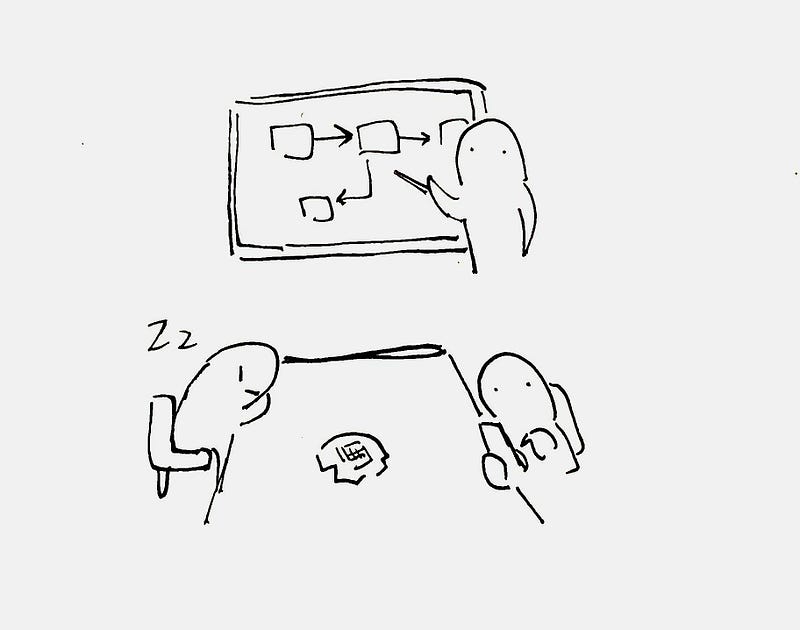
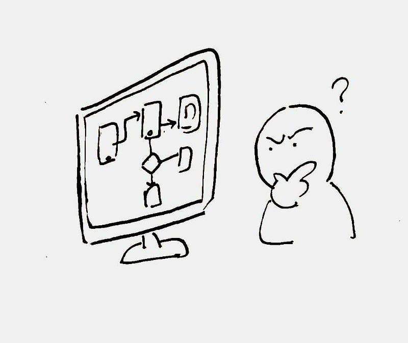
Imagine joining a UX team as the new designer wanting to learn about the product. There are two ways you can do it without taking your colleague’s time: you study the live product, or you read documentations about it. The most common form of design documentations are Wireframes. However, a wireframe only tells you part of truth, it tells you what design decisions has been made, it tells you the what, but it doesn’t tell you the why.

When we work on a project, we would have made a lot of design decisions based on user needs, stakeholder needs, research findings, time constrains, technology limitations.. the list goes on and on. If we don’t document these decisions down, we will be in a dangerous position where important project knowledge exists only in some designer’s memory. If that designer has moved on, the knowledge will be lost forever.

Without understanding the why, designers are forced to guess why things were designed that way. Every time we make a change, it is a gamble. The only solution is to systematically document project decisions, such that if future designers decides to make a change, they will have the right tools and context to help them make an informed decision. Let me introduce a tool that not only minimize design risks, but can also help you build a more mature UX organization — The Decision Log.

Benefits of a Decision Log

A decision log helps us to:

  • Remember things — When we write decisions down, we made sure we will have a reliable source of truth we can always refer back to it without forgetting it
  • Save time — By documenting what worked and what doesn’t, we made sure future designers will not waste time exploring dead-ends
  • Avoid going into circles — When we are exploring design options, it is easy to go back to square one and forget why we discarded it. When decisions is clearly documented, we made sure this won’t happen
  • Past on knowledge to others — When knowledge is written down, we are slowly building a library of knowledge where everyone can benefit and absorb it on demand

How to create a Decision Log

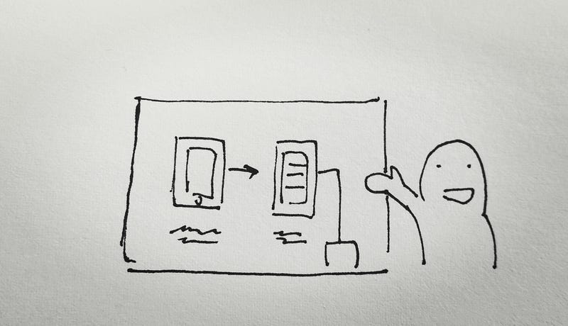
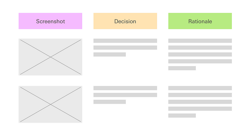
A decision log is a simple one pager document that sits inside the project folder. It has 3 components:

  • Screenshot
  • Decisions made
  • Rationale

That’s it. It really is that simple, now that every design you made is traceable and other people will no longer need to guess why you made that decision. The concept is not novel, our best friend — Developers does it all the time when they add comments to their code. Similarly, you should start writing a Decision log entry whenever a decision is made that will significantly impact the design, and you continue to do it through the project.

When in doubt, err on the side on over communication. The bad case scenario of writing something obvious is that readers ignores your sentence. The worse case scenario of not documenting a rationale is that you also forgot why you made that decision, then that information is lost forever.

Conclusion

As agile development and the introduction of Sprint has became the norm in every technology company, people seems to forget the true essence of the methodology is to learn quickly, not just do things quickly. The most efficient way to record and pass on that learning is to write it down. I hope you give this method a try and I can’t wait to hear from you the results!

Filed Under: Framework Tagged With: Product, User Experience, UX

How to design and implement a new process

April 4, 2020 by Tim Chan

Assume your normal output is x. If you want to increase your output, you need to produce x+1 kind of work. Here is the problem, if you have already reached you maximum capacity, how can you increase your output? The truth is, if all work comes through you and you are the bottleneck, you can’t. You will never increase your output this way.

The only solution is to improve the output from others around you. Why? Because while you are stuck on your maximum output, if you can increase the output from others, you are still producing x+1 kind of work. But how? If you look at human history, the answer is obvious, you must invent a machine and let others work on it.

As knowledge workers, a process is the equivalent to a machine in the information age, it help others to work more efficiently and not waste time on figuring out how to do things. The beauty of a process is that like a machine, once you set it up, it can continue to run itself even if you are not there.

Why we hate processes

Process nowadays gets a bad reputation especially for people working in technology companies where everyone is suppose to work in “Agile”. That is unfortunate, just because someone else’s process is bad, it doesn’t mean the concept of process is bad. It just means either they have designed a poor process, or they have set it up poorly.

Ultimately, people hate processes because most managers doesn’t know how to implement one in the first place. As a result, new processes gets ignored and is locked in the cupboard to never been seen again. In this article, I will talk about the foundation work you have to do in order to make your process work.

People falling asleep during process presentation

How to make a process work

The hardest part about designing a process is to get people to believe in it and to run it. A process will not work unless the following conditions are met:

  • Competence
  • Pain
  • Time
  • Buy-in

Competence

That is the competence of the individual who wants to make the change. Let’s assume that is you. You have to be good at what you do, or people would not respect you, and they will probably ignore you. Nobody wants to listen to “your ideas on how we can work better” if you are not good at your job.

If you have the power to force others to do things your way, you might think you are off to a good start, that is the wrong mindset. Yes you can get people to listen to you, but the process itself is a worthless piece of paper unless someone acts on it. To make a process work you must influence those that will be executing it.

You need to give people a good reason to do things your way, otherwise they will revert back to the old ways of doing things, and you will spend all day chasing them to follow your process.

Pain

Humans are creatures of habit, if they believe what they are doing is working, they will resist change. The easiest environment to apply a new process, therefore, is when people are frustrated, when they feel “someone should do something about this”.

Not everyone will feel pain the same way. Luckily for you, this pain is psychological and can be adjusted. Just like people in poor country doesn’t know they are living in poor conditions, you have to expose them to the reality and paint a picture of the wonderful life they could live if something changes. Once there is a comparison, people’s mind will start to change.

A person lying on top of a bed made of nails

Time

Don’t expect overnight success. A process is like a machine, it needs to warm up before it can fully function. You need time for people to discard old habit and get used to new way of doing things, and you also need time to refine the process itself. Implementing a process without the patience to see it through is a recipe for disaster. You need to set the right expectation to management and your team members.

Buy-in

Not only your peers might resist to change, people above you might also be the same. The human brain likes to choose the path with least resistance, once they have done something in the past successfully, when faced with similar problems, they tend to solve it in the exact same way they have solved it before.

Even if there is a “better” way, the brain tends to regard the new way as less efficient because learning the new way takes effort and there is a risk that you end up wasting time. This is why we tend to be reluctant to change.

Without buy-in from above and below, your process won’t work. The easiest way to sell to upper management is to get your team start doing things your way, then report it back to your bosses the changes you plan to make has already happened. That way, all management needs to do is to rubber stamp and make your process official. How to get buy-in from below? Let’s talk about this in the next section.

How to gain buy in from your team

When it comes to change, there will be 3 types of people:

  1. Early adopter
  2. Late majority
  3. The uncooperative

Start by identifying the people that feels the pain the most and is most open to try something new. This person is the early adopter, you alone is not enough to convince other people to try the new process, you need a champion, someone that will help you to sell your process to the team. Ideally, that person has certain influence among the team. Look for someone that is senior or is well respected, if you can get that person’s buy-in, you are on a good start.

Then it comes the late majority, usually these group will start to follow once they see someone in their team has already adopted to the new process, especially if that person is someone they respect.

A person carrying a dial phone to a group of people using smart phone

You will have some uncooperative, I once had a person in my team refusing to read the new process claiming it was too wordy and confusing. I brought my laptop, sat next to that person and told her it is my job to make sure the process makes everyone’s life easier and if something is not working, I will change it right there and right in front of her.

As we walked through the document we discover some areas of improvement and wordings that are ambiguous, I made the adjustment right away and share the updated procedure with everyone. I believe my commitment and enthusiasm to make things work changed her mind, and she became one my best champions. The key here is not to see the uncooperative as the enemy, but to embrace it as an opportunity to make your process even better.

How to design a process

Document what is already there

There is always a process — although not official — a way of how people work, you want to document that. Talk to each team member individually instead of having a group chat. Two reasons: 1) to give everyone a chance to speak, 2) what people think they do and how they actually do things is sometimes different, talk to people individually will help you paint a clearer picture.

Approach this from a genuine angle, right now you are only curious to find out how they do things, respect how people work and don’t be judgmental. Once you have done this, let the person read what you have written down and confirm the steps. As you go through the document, people that have a weak or no process will find themselves a little bit uncomfortable because you have exposed them, acknowledge their feelings and keep emphasizing the fact that you are just here to document things and not judging.

Walking through people’s own process is a subtle way to help people understand they are not working very efficiently without telling them directly. They might even think “oh wait, this doesn’t really make sense, why did I do that…” to themselves. This process helps you plant the seed of changes you want to make in the future.

A person talking enthusiastically while another person take notes

Ask for suggestions

As you walk through the process with each team member, ask them where they think the process can do better, put the focus on the process and not the individual. This might take a few times as some member of your team might not be that vocal, work with the people that is most vocal first. Some will rant about things or complain about management, while you may not have the power to do much, it is important that you acknowledge the comments and write it down as this helps sending the message that you care.

Prioritize

List out the problems you found and categorize it into two groups: 1) Things that you can fix and 2) Things that someone else can fix. Start with group 1 as this will give you momentum to tackle group 2, which is often more tricky. You should also invite your team members into this prioritization exercise to make them understand you are doing this for them.

Write the new process

Keep your new process simple at first, once you have wrote it, try to turn off your brain and follow the process as it is, and see do you know exactly what to do. Send it to a each team member individually and ask for comments. Once you are ready, send it to your boss and tell him this is going to be the new way of doing things. You boss should be OK if you have followed the suggestions I made in the earlier sections. Next, send out the approved process to everyone and set up a meeting to explain how the new process works and address questions.

Observe and improve

Make sure you stay humble and tell your team this process is just an hypothesis on how we can all do things better and you are learning about it as much as they do. Set up a time to review the process with the team and refine it constantly. Be open to criticism.


A process is not about A telling B what to do, it is about how the group can figure out a better way to make their life simpler, and more importantly, happier. If one wants to make a process work, one must start with understanding the people.

Filed Under: Framework Tagged With: Design Process, Management, Product Management, User Experience

How to interview for an UX position

February 1, 2019 by Tim Chan

Insights from a designer that became an interviewer.

Last week, I interviewed someone for the first time. It was for a junior UX designer position and for all my professional careers, I have been in the interviewee’s seat. Being in the opposite end of the table has been an eye opening experience for me, and I have learned few things that I wouldn’t have otherwise.

In this article, I want to share some insights I learnt that would help you interview better for an UX position, so here it goes.

Insight #1 — Your interviewer is on your side.

Look, I might have a Senior in my title, but I am just a designer that is looking for another designer to help me with my job. As an interviewer, I am not here to test you or throw you a challenge. I am actually on your side. Why? Because…

Company hires to solve a pain.

When a company decides to hire someone, they are in pain. They are at a point where they either A) Figured out putting the designers on over time just wouldn’t produce the same kind of work Bob did before he left 3 months ago or B) Needed to do something but they don ’t have the knowledge or time to do it themselves.

Hiring people costs a lot of time and money. Especially in the time where everyone can take a weekend course and slaps a “UX designer” title on their LinkedIn profile. It takes a tremendous amount of time just to figure out whether someone actually does UX or UI, or is just simply does not have a clue there is a difference.

The interviewer’s job is not to screen out people — screening out people is just a by-product. His job to find someone to fill a role that they desperately need as soon as possible, so he can get back to do his work, the work he is paid to do and hopefully get a raise he deserved.

This is were you come in.

Insight #2 —The interviewer wants you to be THE ONE.

Any decent company gets hundreds of resume sent to their mailbox when they post something on the web. By nature of normal distribution, 80 % of them are mediocre, 10% of them are terrible. The hiring manger have to sort through the pile of resumes and hopefully find those 10% that is qualified, then persuade them to work for him.

Imagine being a hiring manager. You start screening for potential match, finding and arranging time that works for both sides, coming in at 7 a.m or staying late after work because your candidate can’t take a day off, then during the interview, the candidate does not show up. Or when they do show up, they completely blew it and have no idea what they were talking about. Maybe you found someone that was really good, but you don’t have the budget for what they asked for. In other cases, after a few rounds of interviews and an offer was given — just before you think the dust is settled — the candidate turned you down and has accepted an offer from a competitor.

Most interviews takes at least an hour, realistically you can only do 3 to 4 interviews a day. Sometimes a bad interview just completely ruins your mood and you start to question whether there are still good people out there, and you can’t focus on your work for the rest of the day.

The point is, interviewing people takes a lot of energy from the hiring manager. It is exhausting. In the end of the day, the hiring manager just wants to go to his boss and say “This is our guy, give him an offer”. This means that he is secretly hoping that this interview — the one you are having right now — would be the last one he has to give. He wants you to be the one.

Why am I going so lengthy about the hiring process? Because I want you to have empathy. Hiring managers is people too, they have their own hopes, fears and dreams. As an UX designer, you should already know what empathy is don’t you? Once you start to treat your interviewer as a person and understand their pain-points, you will start to operate in a total different level.


Now off to some tips about how to interview for an UX role.

Tip #1 — Defend your work, not yourself.

When the interviewer asks you about the design decision you made on your project, it is easy to get defensive because you see it as an act to question your ability in delivering good work. You are defending you instead of your work.

In fact, I would argue you shouldn’t even defend your work. Defend implies having your guards up and fighting off anything that is coming to your way. Once you start doing that, you put yourself in a disadvantage. You are not ready for a discussion, you are ready for a fight. You are now fighting to justify why you should be in this room instead of selling why you should be right fit.

Here is a little trick to avoid being defensive: Assume good intentions. This means assuming the interviewer is genuinely interested in understanding how you make decisions.

Think of the interview process as an usability study and the interviewer is your user. Examine questions coming out from the interviewer with a scientific lens and treat this as an opportunity to improve your presentation skills. He is confused about something you said or did. Why is he confused? What doesn’t he understand? What does he mean by saying that? Why is he asking this question? Does he have other ideas about the project that you haven’t thought of?

Tip #2— Answer the question

It is easy to get defensive when the interviewer asks you about certain choice you made. When you haven’t thought about it, it puts you off guarded. You don’t want to be seen as a designer that hasn’t thought through things, so you start going in circles and making things up, but you are not really answering the question.

This puts the interviewer in a weird spot because he will start to wonder if he ever asks you to justify your decision, will it take him 15 minutes every time to get to the bottom of things?

Its OK to not have answers to things. We have all worked for someone and we understand that in the perfect world we want to do everything “properly” such as running analytics to see whether our design performs better than the old one, or run surveys to record users satisfaction about the new design.

Of course the world is not perfect and business is full of constrains, so an answer like “No we did not measure whether the new design perform better because the problem was urgent and we needed some fixes real quick. Our new design was based on our own experience and industry best practices. We hope that we can go back to revisit it when we have the budget in the future.” is sufficient in most cases.

Tip #3— Lead the interview

When the interviewer asks you to walk through your portfolio, he is asking you to lead the presentation. He is no longer leading the interview now, you are. You own the stage, so start act like a leader and act like you know what you are doing. For the next 10 minutes, the stage is yours.

Tell them what the problem was, and the kind of research you did to uncover things you didn’t know before. Tell them the surprises, then tell them the kind of designs you tried and how you picked the final winner.

This is the part you should not screw up. I will give you the benefit of the doubt when I am the one asking you questions that is not related to your portfolio, because you might not have thought about it. But questions about your portfolio? It is your work and you should know it by heart. I assume you have practiced your presentation at home. You should know your stuff inside out, you should expect when and what the interviewer is going to ask you and be able to answer any questions with confidence.

Don’t literally walk through your slides pages by page though, you should adjust your presentation based on the audience. For example, the Head of Marketing might want to focus more in the before vs after and the results, while the UX manager might focus more on the process you went through. Adopt your pitch such that you keep your interviewer engaged.

Tip #4 — Make it hard to say NO to you.

As mentioned in Tip #2, in the end of the day, the hiring manager just wants to go to his boss and say “This is our guy”. What this means is that as an interviewee, you should do everything you can to make it hard for the interviewer to say NO to you.

How?

By removing all hesitations the interviewer might have about you. As an UX designer, apply the technique you learnt from UX and treat yourself as a product, then identify your flaws and solve them one by one. Ask yourself; “If I were in the interviewer shoes, what kind of questions will the interviewer have in his mind that I need to address as soon as he meets me? What are his biggest concerns? Which part of the interview process will he likely to drop-off (decides I am a NO-GO)?

Sometimes you don’t have to be the best designer out there to get a job, you just have to be better than everyone else that came to the interview, and this simple thought exercise might give you the extra edge.

Conclusion

While we as UX designers are good at designing user experience for digital products out there, it is easy to lose sight that we are in fact a product too. And how we position ourselves, and how much we understand about our users — determine whether the product — us, will sell or not.

If you can get an opportunity to interview someone, or just simply sit-in quietly and take notes, do it. It was a truly eye-opening experience for me and I guarantee you will learn a lot about how to become better at interviews. Until next time, may you apply empathy to everyone around you.

Filed Under: Career development, Job interview, Most popular Tagged With: Interview, Product Design, User Experience, UX, UX Design

Designing bank’s money transaction UI

December 24, 2018 by Tim Chan

A while ago I worked on a redesign project of a banking website. One area of the website in particular has caught my attention. Here is what it looks like:

This is a money transaction form, the purpose of it is to allow users to transfer money to another party. First you select which account you want to transfer your money from, then to whom and how much. Finally, you select when you want to send it, which the bank calls it the Transfer schedule.

Transfer schedule comes with 3 options:

  • Now
  • Transfer on [-Specific date-]
  • Monthly transfer on every [-Date-] from [-Month-] to [-Month-]

The first 2 options seems pretty straightforward. If you want to transfer money, you can either do it now or do it later (i.e. on another date). However, the third option feels weird to me on first glance. I couldn’t say why until I put in some dummy dates and read it aloud:

I want to “Money transfer on every 5th between August and December”.

This statement is logically correct and I understand what it means. However, something doesn’t feel right. Why?

Because nobody talks like that.

This is why this form sounds weird when you read it. It slows me down and let me wonder “What does this option mean?”

I decided to fix this.

Why does this matter

You might wonder why does this matter? Can’t user figure things out eventually?

You are probably right. Users probably can figure things out on their own if you give them enough time. The thing is, this kind of things adds up, when people say a website or an app is hard to use, most of the time they are not referring to one particular feature, but with all the tiny annoyances or inconveniences such as the above example as they experienced it.

Users are here to get things done, they want to come in, do what they want to do, get out and get on with their life. Our job is to translate what the business needs into an interface that users understands, such that they can input what is needed, and get on with whatever that they wanted to do.

Lets see how we can make our user’s life a little bit easier this time.

The approach

When it comes to transaction, there are only 2 things the bank needs to know.

  1. The date
  2. Whether you want to repeat the transaction. If so, until when.

One trick I like to use is to imagine how things would happen in real-life. This helps to design the form in way that it feels more like a natural conversation. Lets say we are having a conversation with the clerk at the counter. The conversation probably goes like this:

Hi there, what do you want to do? — I want to transfer money.

How much? — $1000.

To where? — This account.

When do you want to do it? — 5th August.

Anything else? — Yes, I want to repeat the transaction until December.

The redesign

Here is my updated version on the “When” part.

Couple things is happening here. First, I added an option where users can quickly select the date of Today since it covers a majority of the use-case. Second, I added a simple checkbox that says “Repeat monthly”, once checked, it reveals another drop-down where user can select the end of the monthly repeated cycle.

The last part of the money transfer conversation becomes:

When do you want to do it? — 5th August.

Make this a monthly transaction? — Yes, until December.

Doesn’t this sound better? Feel free to comment and let me know what you think!

Filed Under: Case study Tagged With: Design, User Experience, User Experience Design

How to design for constrains

September 3, 2018 by Tim Chan

A case study on designing loading state

I like to consider design as a spectrum. On the left hand side, you have the Minimal Viable Product (MVP), the absolute bare minimum you can do to ship the product. On the other end, you have the Dream UX design, where I define it as the “If I have infinite time and resources this is what will I do” kind of design.

The challenge for every designers is to push their design towards the right hand side as much as possible while considering about the constrains. In a company, this typically means time and resources. How one can embrace this constrain and thrive in this environment is what separates novice and seasoned designers.

In today’s article, I want to walk you through how I designed loading states for Vyond, a start up I previously worked for. Where we slowly tweak our designs based on different constrains and finally coming up with something that strikes the balance between UX and available resources. Lets get right into it.

Background

When we were redesigning the Vyond product the Video Maker a year ago, we took a lot of shortcuts to hit the schedule. As a result, we didn’t create any loading states and is causing some frustrations to our users. Now that we have time, we decided to fix this.

Why is loading state important?

Loading states is a way for a system to tell users that it has received their command and is now working to make things happen for them. Without a loading state as a feedback, users won’t know what is going on and it violates one of the top 10 principles of usability design — Lost of control.

Understanding the problem — Talking to Engineers

To create good loading states, first we need to understand how things are loaded in the back-end. At this stage, you basically ask 2 questions:

  1. Can it be done?
  2. If yes, at what cost?

Here is an example, in the below UI, we are going to display a row of templates for the customer to use. We want items to load one by one from left to right. Can it be done? The short answer is yes. However, developer told us that there is no way to control which item to load first because items comes with different file size, and they will appear as soon as they are rendered. Which means item 3 might show up before item 1 if the file size is smaller.

← Expectation: we want items to load from Left to Right | Reality: items shows up in whatever order they want depending on its size→

The only way to load item from left to right visually is to wait for all items to finish loading, then displaying them one by one from left to right. This means users will spend more time waiting and staring at the blank state. This goes against one of the purpose of the loading state, which is to mask waiting time!

The importance of talking to Engineers

As you can see from the example above, understanding whether our ideas is feasible up front saves us time from designing something that will never see the light, and we can spend our time to focus on something that can actually work.

Another important thing from this exercise is helps us to have a better understanding roughly how long each component will load, so we can design appropriate on each scenario.

In case you are curious, for the above example, we decided to use skeleton loading in the end to help mask loading time.

Continue iteration

Let me show you another example. In the below UI, when user clicks an item from the left panel, the item will show up on the blank area on the right hand side.

Here is how the interaction works:

  1. Click an item from the Library.
  2. After a short loading time, the item is shown on the Stage.

Originally when you click an item, nothing happens. You will be staring at a blank canvas for 2 seconds before the item finishes loading and pop up. The delay and lack of feedback makes user feel the system is not responsive and triggers user to repeat their action. Which causes user to add multiple items unintentionally, and they have to wait even longer.

The Dream UX vs Reality

To approach this task, lets start with the dream UX, the holy-grail:

In an ideal world, when you click an item, item is shown immediately on the blank area.

This is what The Dream UX looks like, zero loading time!

Of course in the real world, items can’t appear instantly because it takes time to load them, but I don’t take “impossible” for an answer until it was proven, so I decided to ask the question:

Is it possible to render items immediately when we click on it?

The answer is yes…with a cost. Item takes time to load, if we want to have the appearance that items is shown immediately when we click on it, we have to preload the items in the backend. It is similar to when you download a big file, you decided to browse Facebook for the duration. Since you are preoccupied, you have the perception that you are not waiting for it to download, but the file is still taking its time behind the scene.

To achieve the “immediate response” effect, we need to “hide” the preload time somewhere such that users don’t feel like they are waiting for us. When user enters the Vyond app, we show them a loading screen before the app is fully loaded. Can we add this loading time to the loading screen?

Loading screen for Vyond’s Video Maker app

Yes we can! This is how we imagined the flow would look like, after the “Item loading” time has been absorbed by the “App loading” time:

The Item loading time is absorbed by the app loading time

Here is the catch, we have more than 20,000 items in our library. If we preload all these contents in the loading screen, this will take us more than 5 minutes. That’s quite a long time to wait, compared to the time to loading an item which only takes about 2–3 seconds.

Expectation vs Reality. Putting Item loading time into App loading time actually makes loading longer

Someone on our team suggested that can we preload only the items “above the fold” — items that are visible to users without them scrolling. The problem is that having instant access to those items doesn’t help us to achieve our goal of having 0 loading time, since this approach only benefit only roughly 100 items that is above the fold.

This is a time for us to pause and ask ourselves the big question —Is it worth to keep thinking about this direction?

As product designers, it is always important to keep asking yourself this question. Because you always have limited resources and a lot of problems to tackle, spending more time on this problem means you will spend less time on another problem.

In the end, we decided that we have tried our best for this 0 loading time direction and it didn’t work. Let’s find another way.

Building the gap

OK so we can’t show items instantly on the canvas, but we can try to do other tricks to mask the loading time. Below are some ideas:

Idea 1 — Real size selection box

  • When user selects an item, show its selection box but without the item inside it, the selection box has the same size as the item the user selected.
  • Display the real item when it finishes loading

What I like about this idea — It is clear that the item is loading and it helps to mask loading time

Why this idea does not work — Showing a real size selection box requires the server to load the size data of the item, this means until it can get that data, users are still staring at a blank screen and the loading time remains unchanged.

Idea 2 — Fake selection box

  • When user selects an asset, show a fake selection box. The fake selection does not represent the size of the Real item.
  • The fake box is replaced by the actual item when it finishes loading.

What I like about this idea — It gives instant feedback that the item is loading.

Why I don’t like this idea — After all, the selection box is fake and does not represent the actual size of the item being selected.

Idea 3 — Thumbnail images

When user selects an asset, show its thumbnail. Thumbnail is replaced by the real asset when it finishes loading.

What I like about this idea — It gives instant feedback and gives users a preview of the real thing as early as possible.

Why this idea was shut down — This idea seems really good on paper, however when I took this idea to the development team, I was told it would take more time to code it then we had planned. Which brings me back to the topic of this article — How to design under constrains.

Design is about trade offs. On one hand, we have and ideal solution that might deliver 90% of value to the user, but it will take 5 days to code. On the order hand, we have an Okay idea that will deliver 70% of value to the user, and takes 1 day to code.

In our case, time is limited, so we have to choose what is the best design within the constrain. Not what is the best design.

Making a choice

In the end, we went for Idea 2. We chose a box size that represents 80% of all item’s size. Which means that in 80% of the cases, the fake selection box is the perfect size and it represents the actual size of the item selected. I was actually surprised that it looked way better than I thought. Another reason why you should do prototype.

Here is what it looks like in the end:

Case 1: Item selected has the same size of the Fake selection box.
Case 2: Item selected does NOT have the same size with the selection box, the REAL size is rendered afterwards

The constrain of time forces us to focus on what really matters, it forces us to make a choice. We chose Idea Two that takes 1 day to code versus the other option that will take 5 days. It is the best design based on the given constrains because we want to solve customer’s problem tomorrow, not 5 days later. For us, delivering value to customers is the only thing that matters.

Sometimes we might think: “If only we had more time, we would have the perfect design”. The question is, perfect for whom? Perfect for the company? Perfect for the customer? Did customers really asked for perfect? Or is it for our own designer ego? In the end of the day, giving your friend a present on their birthday is way better than the “perfect” gift that is late. Embrace imperfection. Embrace constrains.

Conclusion

A dream design is just that — A Dream. The real world is a place full of constrains and a lot of things is beyond our control. We as designers, are problem solvers, not dreamers. The sooner we understand this, the better we will become. I would like to end this article from a quote from General Patton:

“ A good plan, violently executed now, is better than a perfect plan next week.”

The perfect design is the one that makes users pain point go away today, not tomorrow. Until next time, may your constrains helps you become a better designer 🙂


Disclaimer: I am no longer a Vyond employee and I’m not posting on behalf of Vyond.

Filed Under: Framework Tagged With: Case Study, MVP, Product Design, User Experience, UX

There are no quick fixes in product design

August 22, 2017 by Tim Chan

Throughout my years in product design, I had been through numerous occasions where supposed “quick” or “small fixes” turns out to be complete scope creep, or they created problems that drains time in the future because of hasty decisions made in the past. It is a nightmare.

What is a quick fix

A quick fix is whenever one faces with a problem — without close examination — decided that the problem is a small one and thus gave it little time to work on. Sometimes one even made up a solution on the spot without consulting matter experts (aka Design by meetings).

So what is wrong with doing things quickly when you knew the problem was small? The problem is this exact “this must be a small problem” mindset.

Let’s break down why this is bad thinking.

1. You assume you understand the problem

Problem comes in many forms. Often, you need to spend some time to carefully study them in order to reveal their true nature. When you are just look at the problem from the surface and try to come up with a solution, it is like trying to finish someone’s sentence without understanding the context. You are no better than guessing.

The quick fix mindset makes you stop digging to the root cause of the problem and makes you jump right into the solution. It forces you to believe that you know it all, and prevents you from looking deeper.

2. You believe the quick answer is the right answer

Let’s just say the problem — is in fact — a small one. You want to find an elegant answer that takes the minimum effort to implement. That doesn’t mean that you would be able to find the solution quickly.

Since you already skipped ahead and decided that this will be a quick fix, you assumed that there must be a quick answer. You jump right to the first answer you came up with and assume it will work. You want it to work.

The problem here is that design is ambiguous; there might be many right answers — all depending on what you are looking for. But if you think there’s only one right answer, then you stop looking as soon as you find one. You can’t see the good ideas behind you by looking twice as hard at what’s in front of you.

3. You decided that everything is going to be okay

Now that you have picked a solution to work on, the next step is to execute it — the standard creating wire-frame and writing specification stuff. The problem now you see, is that since you already decided that you solution is the answer to the problem, it has to work for you. You became overly optimistic or even, tunnel visioned.

Should we talk to the developers to see whether our idea is feasible or not? Nah…my design is simply and shouldn’t be that hard to implement, there is no time for that. What if users do x instead of going through the desired path? Nah… I don’t think user will do that, it is an edge case.

You are likely to make bad calls with this way of thinking. You won’t see the damage you have made. Not today, not tomorrow, but when it is time to pay your debt, it will hit you hard.

4. You create design debt

The shortcuts you took and the little things you ignored will pile up. They became debts to be paid in the future. Since each components is intertwined with each other, the time it takes to solve a problem in the future is not linear, it is exponential.

Quick design almost always means there is a lack of documentation, both on describing how the feature is suppose to work, and more importantly, why the feature was designed that way. No matter how nonsense it seems now, the old logic exists for a reason. You have to be very cautious in adding new stuff while making sure you understand how the old stuff works, and if you choose to ignore the old design, you are very likely to walk into trouble.

Design debt — once accumulated — becomes a bad debt, one that is possible to pay. This is how a legacy system becomes untouchable. Touching one feature means going through the documentations of 10 other features. If you did not fully document how each these features work and why they were designed that way, chances are, the risk of changing it is too high and you are forced to stay away from them.

5. Your crappy design is permanent

If you messed up and the design doesn’t work, your crappy design is going to be permanent. Why? Because you have already worked on it. Your team, or even you would believe that you would improve it in the future. This won’t be the case.

The further away the promise, the easier it is to make. And the more painful it is to ultimately deliver. When the time comes to fulfill the promise, employees would rather be working on newer, cooler ideas rather than old promises. No one wants to put aside progress to make up for the past.

This thing has already been worked on, so it will get shuffled to the bottom of the to-do list. To your users, your crappy design is permanent.

Something cooler

Why do we like quick fixes

What is going on in our mind that makes us like quick fixes so much? I believe there are 3 main reasons.

We want peace of mind

When problem arises that wasn’t something we anticipated, we felt uncomfortable about it. Our first reaction is to find a quick way to make it disappear.

One way to do this is to trick yourself into believing everything is going to be okay. The logic goes “I don’t want to deal with this right now, so whatever came up is going to be a small task”. Hence, we became overly optimistic in both the severity of the problem and our ability to resolve it. It didn’t really matter how big the problem really was, as long as you can get away from it.

We want to work on something cooler

We tend to pay attention to things we care about (Don’t we all?). Small problems always comes with an unattractive batch on them. It feels small, it feels redundant. It feels like we were not going to have a fun time solving it.

More importantly, we are not going to gain much credit on fixing small issues. You might even want to hide the fact that the problem exists, because they shouldn’t exist in the first place if your designs were good. We would chose to ignore the small problems it if we were given the choice.

We are tight on schedule

This is most common reason. There is a deadline and the resources is tight, then this problem came up and it seems that you have to squeeze some time to fix it. You compromise for quality and tell yourself there won’t be next time, of course, there is always a next time.

Conclusion

There is nothing wrong with wanting to fix a problem with the minimum amount of effort if possible, that is what we should strive for. However, do not mistake you intention of using small effort to fix a problem translates to the problem being small.

Slow down. Fight the impulse of jumping to conclusion right away. Spend some time to investigate, bring in the expertise from different employees and discuss together.

If you are really in a rush, time box the time needed to investigate. It is better to spend some time to understand the problem now, than to realize a few months down the road your design doesn’t solve the real problem.

And if you really don’t have time to do all this, know that you are trading quality for speed. Your bad design will always come back to haunt you in the future. Know your debts and plan for it.

Filed Under: Framework Tagged With: Product Design, Startup, User Experience, UX

  • « Go to Previous Page
  • Go to page 1
  • Go to page 2
  • Go to page 3
  • Go to Next Page »

Primary Sidebar

UXwanabe newsletter

About

Hi, I am Tim Chan, I want to help you get promoted as a design lead!

Previously, I lead a team of 10 at HSBC as a Product Design lead.

I share my experiences, mindset & strategies on how to climb the design ladder in my newsletter.

Recent Posts

  • Are your design policies a “House rule” or “The Law”?
  • How to choose which battle to fight as a designer
  • Why you fail to influence stakeholders as a designer
  • 2022 in Review
  • 10 Lessons I learned working in a global bank as a designer

Copyright © 2025 · Genesis Sample on Genesis Framework · WordPress · Log in