• Skip to primary navigation
  • Skip to main content
  • Skip to primary sidebar

UXwanabe

Learn the softskill of UX and grow your design career

  • Home
  • Blog
  • Podcast
  • About

Design

How to design your own UX process

August 7, 2020 by Tim Chan

If you search for “UX process”, you can find thousands of articles written on this topic. As a new UX person joining a team with no established process, you might be struggled on whom process to follow. I have been there before, and it was confusing.

The problem with following someone else’s framework is that it hardly sticks in your mind and it is easy to misuse it if you don’t fully understand it (As everyone worked in an “Agile” environment can testify). Since each company’s internal process and its UX maturity is different, it is hard to just pick one popular UX process and follow it.

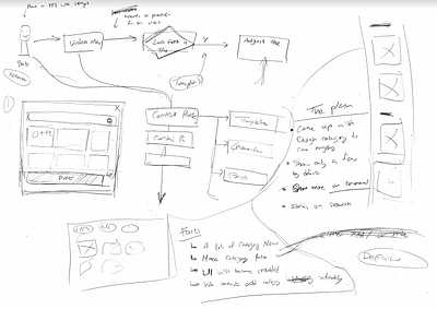
In this article, I am going to walk you through a list of questions you should ask yourself in order to lead a design project from start to finish, and also explain why these questions are important. Based on these questions, you can form your own process that will suit yourself and your company.

Lets deep dive into this.

What problems are we solving?

Before you start designing anything, you need to understand WHY are you doing what you are being asked to do. If you don’t know what you are trying to solve, you can’t judge whether your design solves the problem or not.

Sometimes we are scared to ask why, the environment might make us feel like it is not politically correct to do so because it feels like we are questioning decision from higher up. Our boss might say or think “Why are you asking why? Do you think I made the wrong call? Can’t you just do as I say?”

Decorative image on: Consider what are you trying to solve

The problem with the word “Why” is that it is not welcoming, it feels like an interrogation. It focuses on questioning the person that made the request instead of the intention of the task. Instead, I advocate for using the word “What”. Consider the following:

1. Why are you using blue?

2. What are you trying to achieve by using blue?

“Why” seems like you are questioning someone’s decision, it can be interpreted as “Blue is a bad choice” where “What” invites for participation, it is a discussion: “What is your goal and how does blue help you achieve it?”. Now that we are comfortable asking What, here are some things you should ask when a task is handed to you:

  • What problem are we trying to solve and for whom? What are the pain-points?
  • What do users currently do without our solution? Did they invent some workarounds? This is an important question because if your problem is real and painful enough, people will try to find a workaround for it. Conversely, if you don’t see a workaround, the problem probably is not painful enough. Microsoft Excel does this really well. They basically look at what popular micro is being created and added it to their next release. This exercise helps you eliminate the imaginary problem like “some people might find this annoying” and give you a glimpse on how your design might end up. Sometimes your user’s hacky workaround is a great solution that requires minor modification.
  • What triggers us to solve this problem now? Understand the thought process of your boss will help you greatly as you can tie it to how you present your work. When you understand your boss better, you can feel his frustration or her urgency, and it helps you to avoid presenting a solution that takes 3 months to build when what you boss wants is a hot fix in 2 weeks.

Output

By the end, you should produce some sort of documentation that outline:

  • Why this project exists
  • What are the requirements

I like to add this knowledge into a document called a Project brief and keep it in a share drive such that there is a single source of truth, and I would also email stakeholders as well to keep everyone on the same page. Surprisingly, once it is written down, things become more concrete, and stakeholders are less likely to change their mind.

What is the scope?

Nothing gets done if there is no deadline. There is always room for improvement, there is always the next “minor polishing”. This article itself is also a product of setting a deadline and just hit the publish button whether I like it or not.

Decorative image on: Schedule

I can always come back for the typo or add a picture or two, but if I don’t publish anything, no one can read it, and I can’t add value to anyone’s life. For your project, get everyone involved and ask:

  • How much time do we have? Are we expecting a quick-win or a total redesign? There is no point in designing the perfect solution that takes 2 months if you only have 2 weeks to work on it. Instead, spend your time coming up with a perfect 2 weeks solution.
  • What does good enough look like? When do we know when to stop? At a minimum, your design should satisfy some bare-bone goals. i.e. The user should be able to add items to their cart. Any other good to have stuff like “comparison feature” or “add to my favorite” are Good-to-haves.
  • What use-cases or target user is not covered as part of this project? Having alignment on what you are not doing is just as important as knowing what needs to be done. Make sure this is well communicated to your stakeholders to avoid an unpleasant surprise in the future. e.g. Boss: I thought we are also curing cancer with this release and have already told the higher-ups, now I need to get everybody OT to work on this!

Output: MVP documentations, Out of scope documentation

Has anyone solved this problem before?

There is always more problems to solve than time available, as a smart designer, you want to avoid reinventing the wheel. First, you need to find out has the wheel already been invented. This means:

  • Look inward. Internally, has any teams within your organization faced this problem and solved this? Is it applicable to your case? Is there something we can reuse? Failure to do this step is how inconsistent designs, duplicated pattern and wasted effort occurs. If you company is big enough, someone else from another department has probably solved this before. Make sure they are aware your project exist and talk to them.
  • Externally, how did other companies solve this problem? This goes without saying, if you work in a FinTech, look for what other Fintech company is doing, if you work in e-commerce, look at what other similar company is doing and so on. What can we learn from them? What can we apply to our case? What are they not doing well that should we avoid?

Output: Case-study, Lesson-learned

How does the existing stuff work?

If you are adding a new feature on top of an existing design, you better know how the thing works inside out, or you might break things. Look at existing documentations, play around with the live site, and speak to developers to find out about any tricky logic, interactions or quick fix from the past that has been put together that is vulnerable to big changes.

Decorative image on: Two guys discussing on a document

What is our solution?

Now we start to design the actual thing. You can create sketches, lo-fi wireframe or hi-fi designs, prototypes…etc. It really depends on what you think is best for your company. During this process, consider:

  • What are the different scenarios and use cases? What would your design look in other languages? What does it look like on different screen sizes? Different platforms?
  • What happens when users don’t follow “the right way?” Have we covered all edge cases? If users can add one item to the basket, can they add 300? What does it look like if they do that? Do we allow it? If not, how does the UI convey that to the user? How long are items stored in the basket? Do we need to tell that information to the user? Why or Why not?
  • What are our rationales to make certain decisions? Throughout the design process, we are going to learn a lot of things and make a lot of decisions, are we just going to let that sit in our brain or are we going to make the effort to document it such that other designers and future generations can benefit from our lessons?
  • If we propose this design, does it also impact other areas of the existing design? Who needs to know about this? Other designers? Other developers? Other product managers? Do they have resource to support you?

Output: End-to End user flow, High-level sketch, Decision log, Interactive prototype

How do we know our solution works?

A design proposal is considered feasible when it, at a minimum:

  • Achieves the business goal
  • Can be built within a reasonable time-frame
  • Can be understood by the user

This means two types of people need to look at our work:

  • Internal people — Stakeholders
  • External people — Customers/Users
Decorative image on: A women thinking

Has our internal people agreed to this?

Do developers thinks your design is feasible? Does it require a big change to existing code base? How long would it take? Are there other simpler way to achieve 80% of the result but can take much less time?

Do other designers think we are following the established guidelines? If the design is not part of the guideline, do we need to update the guidelines?.

Do product people think the design achieved their goal? Do brand people think the design is on brand? If you are working on FinTech or highly regulated industry, have you consulted Subject Matter Experts or Legal or any relevant people to make sure your design complies to regulations? e.g. Can you create a One-click to order button?

How much time does the approval process take from all of these people mentioned above? Did the project plan take into account the back and forth? One of the major reason for project slip is that project plan failed to recognize that takes time for people to come into consensus. This won’t happen to you as a smart designer, you will make sure to bring this up during meetings and talk to the right people.

Output: Review session, approval log

Do customers understand our design?

Normally, we want to make sure the answer is Yes to this question before the product goes live. Until we test our designs to the real people who are going to use it, the designs are not validated and we are living in our own bubbles.

In a lot of companies, testing is always thought as a luxury, but the nature of it doesn’t change. Users has to test it no matter what. If you don’t test the design before launch, the shift just became after launch. We are testing the live product to real customers instead of prototypes. Anyway, if we are commit to test before launch, we need to figure out:

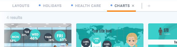
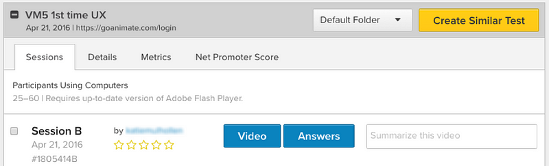
  • What format do we want to test? Sketches? Lo-fi/Hifi wireframes? Prototype?
  • Who to test? How long does the recruiting takes? How many people do we need? Who runs the test?
  • How much time does it take for us to organize the findings? How do we present our findings? In what format? To whom? What do we expect to do with our findings?

Output: Usability testing

What do people downstream need?

Now that our designs are ready, it is time to send it to someone else to work on it. Branding people might want to pick the right images, copywriters need to know which area needs copy. In an ideal case, everybody required to make the project happen are involved during the inception of design, if not, we need to spend some time to explain to them how the thing works.

Decorative image on: People discussing around a document

Consider: When will they need it? In what format? Are there enough time for them to review the design and ask questions? For example, you need to tell them:

  • For Copywriter, this area needs a new copy, and we are trying to tell the user about how x works
  • For Branding people, this area needs some stock photo, and we are trying to do y
  • For Developers, this area we are re-using existing component and this area requires new ones, and this is how the animation should work

In some companies, someone else is charged of figuring this out for you, but if that someone does not exist, it is on you. In essence, make sure people downhill knows what it is expected of them and in a format that they understand.

Output: Final UX & UI specifications.

How do you know the design is properly implemented?

Once developers has build something, how are you going to find out it looks and works as you specified? Do you communicate with QA people on what to look out for?

If you are going you review the build, how will you do it? Are you going to eye-ball it? Or use Chrome Developers tools to look at the elements? What if it is a mobile app? What tools should you use than?

How much time do you need for the review? Where do you report the bugs? How do you report the bugs? Are everything tracked and documented?


That’s everything I can think of that requires you to think about when you want to see through a design from beginning to launch. Hope this article helps you in your process and please leave a comment if you have any questions.

p.s. I am aware that product development is a continuous cycle and the design shouldn’t stop when a product is launched. But as the scope of this article is about seeing through from start to launch, what after launch is out of scope.

Filed Under: Framework, Most popular Tagged With: Design, Process, User Experience, UX, Ux Process

Designing bank’s money transaction UI

December 24, 2018 by Tim Chan

A while ago I worked on a redesign project of a banking website. One area of the website in particular has caught my attention. Here is what it looks like:

This is a money transaction form, the purpose of it is to allow users to transfer money to another party. First you select which account you want to transfer your money from, then to whom and how much. Finally, you select when you want to send it, which the bank calls it the Transfer schedule.

Transfer schedule comes with 3 options:

  • Now
  • Transfer on [-Specific date-]
  • Monthly transfer on every [-Date-] from [-Month-] to [-Month-]

The first 2 options seems pretty straightforward. If you want to transfer money, you can either do it now or do it later (i.e. on another date). However, the third option feels weird to me on first glance. I couldn’t say why until I put in some dummy dates and read it aloud:

I want to “Money transfer on every 5th between August and December”.

This statement is logically correct and I understand what it means. However, something doesn’t feel right. Why?

Because nobody talks like that.

This is why this form sounds weird when you read it. It slows me down and let me wonder “What does this option mean?”

I decided to fix this.

Why does this matter

You might wonder why does this matter? Can’t user figure things out eventually?

You are probably right. Users probably can figure things out on their own if you give them enough time. The thing is, this kind of things adds up, when people say a website or an app is hard to use, most of the time they are not referring to one particular feature, but with all the tiny annoyances or inconveniences such as the above example as they experienced it.

Users are here to get things done, they want to come in, do what they want to do, get out and get on with their life. Our job is to translate what the business needs into an interface that users understands, such that they can input what is needed, and get on with whatever that they wanted to do.

Lets see how we can make our user’s life a little bit easier this time.

The approach

When it comes to transaction, there are only 2 things the bank needs to know.

  1. The date
  2. Whether you want to repeat the transaction. If so, until when.

One trick I like to use is to imagine how things would happen in real-life. This helps to design the form in way that it feels more like a natural conversation. Lets say we are having a conversation with the clerk at the counter. The conversation probably goes like this:

Hi there, what do you want to do? — I want to transfer money.

How much? — $1000.

To where? — This account.

When do you want to do it? — 5th August.

Anything else? — Yes, I want to repeat the transaction until December.

The redesign

Here is my updated version on the “When” part.

Couple things is happening here. First, I added an option where users can quickly select the date of Today since it covers a majority of the use-case. Second, I added a simple checkbox that says “Repeat monthly”, once checked, it reveals another drop-down where user can select the end of the monthly repeated cycle.

The last part of the money transfer conversation becomes:

When do you want to do it? — 5th August.

Make this a monthly transaction? — Yes, until December.

Doesn’t this sound better? Feel free to comment and let me know what you think!

Filed Under: Case study Tagged With: Design, User Experience, User Experience Design

A beginner’s guide to Microinteraction

June 26, 2017 by Tim Chan

If you are working in digital products, chances are you’ve heard about the term Microinteraction, but what is it and why is it important to us? If you are new to microinteraction or want to have a better idea of what it is about, read on.

What is a Microinteraction?

Microinteractions are “invisible” designs that help users to complete their tasks seamlessly. The word “Invisible” is in quotes to convey they are not really invisible. Most of the time microinteractions has minimal UI, and when it was done right, users should rarely notice it existed because they will be so focused on their task. You will recognize a microinteraction when you see it, famous examples includes: Autocomplete, Autocorrect and Drag & drop.

Why is Microinteraction important to us?

As Charles Eames once said:

The details are not details. They make the product.

Microinteractions are, despite their small size and near-invisibility, incredibly important. The difference between a product you love and a product you tolerate is often the microinteractions you have with it. They can make our lifes easier, more fun, and just more interesting if done well.

In this article, I am going to walk you through — step by step — on how I designed micro-interactions for GoAnimate. Let’s get right into it!


Case study : Designing interactions to resize objects in GoAnimate

Suppose you are working on a graphical software, something like Photoshop. You want to make this circle just a little bit bigger, how do you do it?

How do you make this circle bigger?

Most people would say “Easy! Click on the circle and drag its corners”. Let’s break this down, there are actually 2 steps involved in here.

1. First, you knew that if you click on the circle, you would probably see something that looks like this:

Click on the circle to reveal some boxes and lines

2. Then, you knew that dragging the boxes on the corner will make the circle bigger or smaller.

Drag on the boxes on the corner will resize the object

Wait, how do you know all this stuff? How did you know how to control this circle without reading a menu on how it is supposed to work?

You knew what to do because you have seen or done something similar before. Within a split-second, your brain quickly recognizes the pattern and tells you what to do, it becomes “intuitive” to you.

Why is it important to understand this?

There is no such thing as “intuitive”

The truth is, there is no such thing as “intuitive” in digital design. For something to be intuitive — by definition — it has to be something that you knew what to do instinctively without being taught.

Nobody knew how to use a mouse when they first saw it because the thing that makes it useful (the cursor) only exists on a digital screen, there is no cursor in the real world. Once you are trained, controlling a mouse becomes natural and intuitive to you.

Let me introduce our first principle for designing microinteractions:

Principle # 1 — Don’t start from zero

Always start with what users already know. This is important because it saves you time from reinventing the wheel, helps you to reduce the design complexity, and also lowers the learning curve for the user.


Designing the interaction

Let’s go back to the resizing circle example I gave earlier. We can break down what most people would expect on how to resize the circle in the following steps:

  1. Click on the shape to display its control points.
  2. To resize the shape, drag any control points.

These are the basic rules from the user’s perspective. For us, that is all we want the user to know. Anything beyond that is too complicated for the user. However, on our side, we have a lot of details to think through. Let’s zoom in to point 2 together:

To resize the circle, drag any control points.

How does this work exactly?

Decision #1 — Resize in real time or not?

Do you resize the circle while you drag or do we resize the circle after you finished dragging (Continue to show the original size of the circle before you mouse up)?

For GoAnimate, we considered 2 things: a) Since we are not a graphical design tool, we see little value of showing the original size of the object. b) resizing in real time feels more responsive. So, this is what we went for in the end.

We now have our updated rules:

  1. Click on the shape to display its control points.
  2. To resize the shape, drag any control points.
  3. The shape is resized in real-time.

Decision #2 — Should the object be resized proportionally?

In most applications, users can hold the Shift key while they resize to retain the proportion of the object. Otherwise, the object can be resized freely and can be distorted. This kind of interaction has become a convention.

Example of free resizing

If we go with that, the rule becomes:

  1. Click on the shape to display its control points.
  2. To resize the shape, drag any control points.
  3. The shape is resized in real-time.
  4. To retain proportion, hold Shift while you drag.

Most of the time we will err on the side to follow conventions. However in our case, since GoAnimate provides a library of pre-made content to our users (such as Characters), those contents look pretty bad when they are distorted. There is also no strong use case to support the claim that distorted content will be useful in helping our users to tell stories. So, we broke the convention of holding Shift to scale proportionally, instead, we did the opposite: By default, all objects resize proportionally, and hold Shift to resize freely.

Here are the updated rules:

  1. Click on the shape to display its control points.
  2. To resize the shape, drag any control points.
  3. The shape is resized in real-time.
  4. The shape resizes proportionally unless you hold Shift while you drag.

We have considered that holding Shift to distort an object may be hard to discover. However, we are okay with it because our primary goal is to help users resize proportionally. This is one of the choices we got to make in order to make the interaction customize to our primary use case.

Decision #3 — How does the drag interaction works?

Our goal here is to figure out what kind of interaction feels the most comfortable and natural to the user. Here is what I immediately came up:

Since the control point exists in the corners, drag in 45 degrees to resize.

To make it easier to drag, let’s make the drag-able area 20px, meaning as long as your cursor is within that area, we count that as a dragging action. Now we have something like this:

Needless to say, this is going to cause some serious usability problems because the limited draggable zone is going to cause a hard time for most motor functions. Users will probably be expected to do something like this when they want to enlarge the circle:

This makes more sense. Can we do better?

Let’s try the following:

To resize the circle, drag any corner outwards enlarges it, dragging it inwards shrinks it.

All we need to do now is to define where is in and where is out. It should behave something like this:

The idea is that whenever the user drags the corner, we are going to draw an invisible line perpendicular to the corner. If the cursor is then moved “outside” of this line, the shape enlarges, when it is moved “inside”, the shape shrinks.

If we add all these up, our final rules become:

  1. Click on the shape to display its control points.
  2. To resize the shape, drag any control points.
  3. An invisible line is drawn perpendicular to the control points, if the cursor is in the outer area of the line, enlarge the shape. If it is in the inner area, shrink the shape.
  4. The shape is resized in real-time.
  5. The shape resizes proportionally unless you hold Shift while you drag.
Final resize interaction

As you can see, resizing a shape might just be simply “Dragging the corners” to the user, but behind the scene, there are 5 rules working closely together to make this happen. This brings us to our next principle:

Principle # 2 — Absorb complexity

Remember 2 things, a) people didn’t come here to use your product, they came here to get something done. Learning how your tool works were not part of that goal, and b) user cannot read the rules of the microinteraction you designed. The only way they can understand the rule is to take an action, see what happens through the feedback, and adjust their mental model accordingly.

In the case study I provided, you can see that although there is a lot of logic going on behind the scene, all the users need to know to resize an object is boiled down to 2 rules:

  1. Click on the shape to display its control points.
  2. Drag any control points to resize.

As designers, it is our job to absorb the complexity of our product and enable users to do the things they need to do without having to think about how to do them. The more we can absorb, the more the users can focus on their goals.

Conclusion

Well, this has been a long article to talk about the basics of microinteraction. Making something intuitive takes hard work, but in the end, it is the little things that separate an okay product and a great product.

If you are interested in learning more about microineraction, I strongly recommend you check out the book by Dan Saffer, the title — unsurprisingly — is Microinterations. Even if you don’t see yourself designing mircointeractions anytime soon, this book will give you a fresh view on how to approach design problems and I guarantee you will learn something from it.

Until next time, may your microinteractions be intuitive.

Disclaimer: I am no longer a GoAnimate employee and I’m not posting on behalf of GoAnimate.

Filed Under: Case study, Most popular, UX Design Tagged With: Design, Microinteractions, User Experience, UX

UX review for League of Legend’s screensaver app

January 4, 2017 by Tim Chan

League of Legends has created a Screensaver App. I personally had a few experiences downloading artwork from games and I understand it is a very cumbersome process (Right click, save, repeat..) and an app to help people download everything at once seems like a cool idea. I am curious to find out how it works.

League of Legend’s screensaver app

Part 1 — Testing the Discoverability of the app

Let’s start from the beginning, is this app discoverable? In order to use this app, first users have to find it.

To answer this question, we can look at how well it fits into the user journey. Every journey has a goal, and this is what I defined as the user’s goal, from their perspective:

I want to find cool artworks and make them my screensaver.

With a clear goal in mind, we can start with picturing the common user journey that most people have from downloading cool artworks.

I thought of 2 journeys on top of my head.

Journey #1 — Search focused:

Go on Google and type “LOL artwork”.

The first result lands me to this page. This page is a sub-page under Media, which I will talk about it in a bit.

League of Legend’s artwork page, under Media.

To my surprise, the screensaver app cannot be found here, so the discoverabilty of this app failed in this journey.

Let’s look at the second journey.

Journey #2 — Browse focused:

1. Go to the game’s website.

2. Look for a section called Media, usually there is where the artworks and game video lives.

I expect to find a section called Media because it has long been a convention for a lot of game websites, were they put all the game play videos, in-game graphics and conceptional arts under this place.

Example of how various game website put their screenshots and graphics under the “Media” section

Not so successful here, there are multiple sections on the main navigation of the website and non of them directly gets me to artworks. Here is the list of the navigation headers in the home page:

  1. News
  2. Game
  3. Universe
  4. Nexus
  5. E-sports
  6. Boards
  7. University
  8. Support
  9. Merchandise

Where would you expect to find the artworks from the name of the headers?

Game? Nexus? Nope. None of them leads you to their artworks. The problem here is that some of the navigation names have very weak information scent (the extent to which users can predict what they will find if they pursue a certain path through a website) and there is no way to know what is behind the link before you click on it.

For example, what does Nexus mean? Is that related to the game’s universe?What does Boards mean? The rank ladder board? Job board or the community feedback board?

As I continue to look for a section called Media, it turns out they do have a Media section (Search “LOL media” on Google) where I honestly don’t know how to get to this page if I had started from the Homepage.

League of Legend’s Media page. Cannot be access from Home page.

As mentioned, this page does not include the screensaver app. Which I think is a huge miss-opportunity because this would be the most natural place for it to live.

Both user journey failed to discover the screensaver app.

The main reason?

The app can only be found on a separate landing page (http://screensaver.na.leagueoflegends.com/en_US), and it has no hyper link that connects to the Media section. You can find the screensaver app if you search “LOL screensaver” on Google.

Recommendations

Here is how I envision the ideal journey would look like:

1. Go to the game’s website

2. Look for a section called Media, usually there is where the artworks and game video lives.

3. If I navigate to Media > Artwork, I can see the screensaver app. It tells me I don’t have to right click and save every image one by one and can download all artworks at once, awesome!

I understand there might be some legit business reasons for the company to decided that Media is not important enough to go on the Top navigation, so as a compromise, I would recommend to put Media as a subcategory under Game or Universe to make it more discoverable.

Of course, the way we structure the contents doesn’t have to be final as we can run user tests and card sorting exercises to see whether our choice makes sense.

Furthermore, I would also recommend to put the screensaver app under the Media or Artworks section such that it shows up naturally when people needs it.

Part 2 — Testing the app experience

Since this article is about reviewing the app experience, I would just skip the download and install part because these are pretty standard stuff.

Launching the app

To set LOL’s artworks as your screensaver, you have to select the option “League of Legends” in your screensaver menu. Although I do wish after the app is installed this step is done automatically for me, there might be some technical constrains that would prevent that from happening. Otherwise, this would be a pretty streamlined process if it is achievable.

The screensaver app is launched once you select “League of Legends” as your screensaver and hit “Settings”. It replaces the OS “Settings” menu that would have pop-up normally. It looks like this:

League screensaver home screen

Immediately 2 questions came to my mind:

1.Why is there a back button? The backward arrow ( ←) signals that I can go back, but there is nothing to go back because this is a pop-up menu. What further confuses me is that having a Back button implies I might have missed some steps along the way. The arrow is labelled “Exit” which makes no sense to me because this is a pop-up menu, if I want to close it, I will click the big “x” on the menu itself.

2. Why do I have to name my own playlist? I mean, assuming if I do want to spend time to create my own list at all, wouldn’t it be better to just let me get started right away, and pick the cool artworks ASAP? I never remembered the last time I have to name my screensaver list. I have been forced to stop what I am doing and make a decision. It requires me to think, which is bad.

Why is it bad?

Thinking is work and most people hate work.

To be more precious, people hate unnecessary work.

By asking me to give the list a name in this early stage, the app forces me to pay attention to the app itself instead of letting me focusing on what is more important to me, which is to setup the screensaver list.

A better flow would be first letting the user select what goes into the list, then ask them to name it after they are done. Give them the option to skip the naming part if they don’t feel like it, and if they do, give them smart names as defaults such as List 01,02..etc. Even better, don’t require them to name it at all because who the hell wants to give their screensaver a name?

Selecting artworks

Let’s move on and see how does the rest of the experience looks like. After I give my screensaver list a name, I enter this page.

Champion category page

I am under a tab called Champions. This tab contains the artworks of different champions and each thumbnail acts as a category. Click on the thumbnail brings us down a layer where it reveals more artwork of that champion.

Click a champion thumbnail reveals more artworks from this Champion

Two comments about the experience of selecting artworks:

  1. After you selected the artworks inside a category, if you wish to move on or go back, you will have a tough time to exit this category. The exit button is not easy to find. You have to scroll all way way Up and click on the Downward arrow (↓) in order to exit.
  2. There is no UI where you can have a clear overview on which artworks you have already selected, apparently, you have to click Next if you want to get an overview. To me, Next means I am ready to move on, but I am not ready to move on because I need to see have items I have selected first. Online stores have learned that naming the last step “View items and check out” is better that just calling it “Check out” because user feels more secure to have a final chance to look at their items. Applying that to here, maybe calling it “View selections” will make user feel more comfortable.

Below is the overview UI after I clicked “Next”.

Click on “Create” generates a screensaver list

The final UI shows the list I created in a list format:

Overview of screensaver lists.

Now it became apparent that the reason for requiring users to name the list as the first step of their journey is because the app allows users to create multiple screensaver list.

My question is that how many people would actually do that? Can you imaging someone creating multiple lists and switching every few weeks given that fact that screensaver is not seen very often? If people are bored at what they are seeing, won’t they just go to the existing list and adjust it? How helpful is the multiple list feature in this case?

I have reached the end of my UX review of this app, but along the journey, I felt that this app focuses too much on letting users to create and customize and multiple lists, without fully understanding whether this is in the best interest for them. Should creating a custom screensaver list be the centralized experience for the users? I am not convinced.

How can we improve this?

I think the best way to improve something is to start by questioning whether every feature has earned its place to be there, and ask questions, lots of them. For example, I would put myself into the user’s perspective and ask something like…

As a user,

  1. Do I care which piece of artwork goes into my screensaver? (For me, I don’t really care as long as it looks cool enough. Maybe a few from my favorite champions but other champ works too).
  2. Do I want to create my own screensaver list? (Yea, that sounds cool)
  3. Follow from #2, do I want to spend time creating my own screensaver list? (Not really…)
  4. Do I want to create multiple screensaver list? (I don’t really see why that would be useful for me, maybe someone else might find it useful)
  5. Follow from #4, how often do I want to change my list? (Why would I do that, can’t I just update the already existed list?)

You can see that if I were the only user for this app, the current version would totally suck for me (I don’t want to create my own list, I just want some cool enough artworks and I don’t see the point of having multiple screensaver list).

Of course, I am not designing for myself and I shouldn’t take my own opinion as the answer. The above questions is best answered by interviewing the target users and understand their motivations, and this would give us good insights on where the design direction should go.

Think about how to delight the users

Delight is often achieved by guessing correctly what people want and provide it as defaults. To come up with these defaults we can start with what we know.

What we know

  1. Person who download this screensaver app has a really high chance that they are a League of Legends player.
  2. Most players are impatient.

Base on the above, we can start to brainstorm ideas that can delight users and save them time.

  • Wouldn’t it be awesome if we can extract the game’s data and generate a screensaver list based on player’s most used champion? There is a high chance they want to see their beloved champion on the screensaver right?
  • What if we pre-generated a list with cool artworks for users, such that users don’t have to do it if they chose not to? What if they can open the app and click on a button that says “Randomize artwork for me”?
  • If users want to create their own list, would it be easier for them to edit existing ones instead of starting from scratch?

Conclusion

While it is easy to poke holes on someone else’s work, it is much harder to give concrete and actionable insights. As a designer myself, I understand the complexity of product design and I tried my best to provide possible solutions along the way such that this will not be a typical critique but no answers piece.

Overall, the visual appearance of the app looks pretty good and it resonate well with League of Legend’s brand, and I do understand sometimes, not every aspect of the company can get the resources and care as one wishes it to be. I hope in the near future, as the company continues to grow it can cater the user experience on different areas because to a user, every touch point matters.

Thank you for reading.

Filed Under: Case study Tagged With: Design, League of Legends, Portfolio, Usability, UX

Case study — Redesign Template feature for GoAnimate

October 17, 2016 by Tim Chan

GoAnimate is an online platform that enables people to create professional-looking videos — from scratch — using drag and drop tools. It helps businesses and consumers to tell their stories in an engaging and cost-effective way.

In GoAnimate, there is a feature called “Template” where user can drag & drop a ready made scene with backgrounds and characters included in it. This saves users time to create a scene from scratch.

A Sample of GoAnimate templates for the HR category

Since the launch of the Template feature, we were happy to find out that a lot of users quickly adapted to use Templates to help them create videos more quickly. However, through watching user testing videos, we have identified a few usability issues we would like to address.

My role

I was the lead UX designer for this project, and worked along side with another UX designer and one engineer. I executed user-testing sections, interaction desgins, user journeys, wireframes, prototypes and design specs.

The Process

Understanding the problem

We ran 6 rounds of user testing sections through Usertesting.com, below is a summary of usability issues we identified based on user testing sections:

1. Lack of visual hierarchy. Since Templates and assets (individual items such as props and characters) were grouped together visually, some users had mistakenly identified certain Templates as an asset to be added on the stage.

Text templates and text components (3d icon from right) were put together which confused one of our testers.

For example, one user has mistaken a Text template as a way to add text to the scene. Hence, when they click on that template, everything that is currently shown on the scene is replaced by that Text template. Although this the correct behavior for selecting a Template, but not what the user was expecting. As we can hear verbally from the user how confused she was.

2.Difficult to navigate between Templates categories. With the old UI, users had to choose a Template category very carefully, because if they cannot find what they need in one category, the only way to browse another category is to click the Back button and select another category.

Current design of Templates, user had to choose a category carefully or they will be force to hit Back multiple times.

Imagine you were on hunting mode, where you really wanted to find something urgently, and you had to hit Back multiple times because each category you clicked did not contain what you want. It starts to become irritating very quickly. In short, the old deign has high interaction cost which a good design should always try to avoid.

Understanding stake-holder needs

Apart from serving our user needs, it is also important to take into account different stake-holder needs. Our marketing team said that they wanted a way to promote certain templates based on seasonal (e.g. Christmas specific) or user’s job roles in order to give users a more personalized experience. With that in mind, I sketched out the user and marketing needs on a whiteboard and shared that with the team.

Stake-holders need brain storm section

Setting the North Star

Before we started to work on anything, we needed some guiding principles that everyone can agree upon. This helps us to evangelize ideas, gain alignment and drive decision making.

When we asked our users why they chose to use our tool instead of our competitors, many pointed out that “Using Goanimate is much quicker”. Indeed speed is a feature on its own. We quickly decided that speed is the number one thing that we should care the most.

Everything that we were going to work on will be about helping users to create their first video in a shortly manner. Our design must be able to promote featured templates without slowing the user down.

Sketching out the User Journey

We want to understand what challenges a new user might face when they first came to our tool, sketching the joruney out helps us to identify area that users might need help with. These helps may came in any form (micro copy, contextual help..etc)

A user journey on what a user might went through

Brain storming ideas

It took us a long time to find the right solution because every sketch I made seems to not satisfy our goal, which was to:

  1. Have a clear Hierarchy.
  2. Easy to navigate between templates.
  3. Able to promote certain templates.

In the end, something sticks. We took queue on browsers tabs designs, where the tabs will be our categories. It is easy to navigate between tabs and we can pin certain tabs just like in browser to promote some templates.

A collection of sketches to brain-storm the template idea

Paper prototype & Interaction design

We quickly jumped into creating a paper prototype to test out our ideas. We cut out the pieces to help us understand where the template menu should belong in terms of structure and layers, where it would come from when summoned and where it would go..etc.

Paper prototype illustrating structures and layers

Interaction design

I used Atomic to create an interaction design prototype and presented it to the team to communicate how the template menu should behave. I collected feedback and did a few variations. Below is the final design:

Template menu summoning interactions

Functional prototype

We worked alongside with our engineers to create a working prototype. We presented this prototype to our stake-holders, including our CEO, while explaining the problems we are trying to solve and how this designing is the right solution. Once we got everyone on board, we then moved on to create the real thing.

A functional prototype to communicate our design direction

https://youtu.be/HH9c-UHnsKs

Functional specifications

At this stage I prepared a document called “Functional specifications”, it documents how the feature is suppose to behave and also the design decisions we made along the way.

Some designers advocate on not writing specs and prefer to use wire-frames and prototypes as the final spec. I am also not a big fan of heavy spec, however I find the process of writing the spec forces to me to think about the problem more clearly. Flawed logic is also easier to discover when you put the interactions into words because you are not distracted by anything fancy.

The final product

Below is the final product and the problem it addressed:

1. Clear Hierarchy

We have moved the Template menu to the bottom of the UI, shown when user clicks the Add scene button or click the Swap scene button. With this new UI, the case where users mistreat Template as an asset and accidentally replacing the current scene will no longer happen.

Putting Templates at the bottom makes the adding scene interaction much more intuitive because users are most likely to want to see templates when they want to add a new scene (Triggered by clicking on the Adds scene button). The Template menu now show up when users need it and stay out of their way when it is not.

New UI for selecting templates

2. Easy to navigate between categories

We have introduced a Tab feature that works very similar to a browser tab, users can easily navigate between categories they care without the speed bump from the old design. They can also customize their work space to show only Template categories that are relevant to them, and hide those that are not.

Tab design for easy browsing between categories
User can customize what categories to shown

3. Addressed the marketing need

We don’t want first time users to be overwhelmed by the number of Template categories out there. Hence, by default, we only show a few starter categories, or categories for promotion to help users quickly get started. This approach helps to promote certain categories without coming as too “salesy”.

A set of starter categories helps users to get start quickly

User testing follow up

We ran a few more user testing follow ups to see how well the new design went compared to the old one. We were happy to see that all users were able to distinguish the difference between templates and other assets. The starter templates helped the users to easily get started and they had no difficulties navigating between templates.

Running user testing sections to test out the new template design

Results

While I cannot show you the sales number, one of the things that made me proud of my job is seeing how customer appreciate the work we put out there. Below are some of the praise that we receive since the launch of this project.

“Sweet mercy the new editor is AMAZING! The level of fine-grain control that we have over elements now is fantastic, and the intuitiveness and responsiveness of the interface is fantastic as well!”

“I’m liking the new alpha video maker format. Particularly the time line which makes it easier to visualize the sequence of actions than the older format.”

“Just by the interface alone it is night and day better…”

“ know using it is at our own peril since it’s Alpha, but I’m already using it for production level videos because of how much more streamlined and powerful the new editor is. Fantastic job GoAnimate, you’ve raised the bar once more!”

“I have so much to say! So many things! I’ve been using new UI/UX for about an hour and overall I’m in love! … Anyway, The timeline improvements are huge.”

“User friendly, clear extra simple, but still great quality & tools”

“Hi, congratulation for created great new platform design for testing, which is more light, easy and well organized timeline.”

Lesson learned

Confession time: we actually created the North star (or the design vision) after we started designing the UI. I decided to put it this way in the portfolio because it is easier to follow.

At first, I thought the requirements were very clear and there is no need for a design vision. It didn’t take us long to hit a bottle neck, as the design was going nowhere. Non of us were happy about our sketches because it couldn’t address all our requirements.

It is until we went through a lot of debates and it became apparent we must align our vision. Things started to go smoothly afterwards and we can finally come up with a design that everyone is happy about.

In short: Never cut corners or you will always suffer in the end!


Thank you for reading.

Filed Under: Case study Tagged With: Design, Interaction Design, Portfolio, Product Design, UX

10 steps to become an UX designer, guaranteed

September 21, 2016 by Tim Chan

April’s fool special

Let’s face it, nowadays anyone can become an UX designer, even your grandma. For those that hasn’t make it yet, no offence, but you just need to try harder. Alternatively, you can learn from pros who made it (that’s me btw). If you are fresh out and want to become an UX designer quickly, this guide is for you.

1.Stop reading “UX books”. Most website says there a few must reads if you want to become an UX designer, I say screw that, books are for old people and losers. We want to become an UX designer fast and we ain’t got no time to learn these crap. We are looking for quick wins here. That’s why we should…

2. Join any UX course. The beauty of UX courses is that it covers a lot of keywords, such as Wireframe, Persona, User journey…etc. Those keywords are exactly what our future employers are looking for. It doesn’t matter whether the course is well recognized or not. The UX field is too new to be judged by anyone, simply joining a course sends the message to our potential hire that we are serious about this shit.

3.Create a portfolio out of thin-air. Another great thing of joining an UX course is that you always end up creating a portfolio as a deliverable. In terms of what kind of project you should do, a simple rule of thumb is to pick a well recognized website and do a redesign for it. Whether the current website has any problem or not is irrelevant, just redesign it anyway.

4. Create a visually appealing portfolio. Some so-called UX guru said that UX ≠UI. Don’t listen to that nonsense. We all know UX and UI are the same thing. That’s why we are going to spend a lot of time making the portfolio look as graphically appealing as possible. If you are stuck on how to make it look great, here is a tip: Change the fonts to Helvetica Neue. You can thank me later.

5. Use fake persona. Since all our time were spent on making the portfolio look pretty, we don’t really have time to talk to users and do this Persona thing. To get around this, we use one of the greatest tool mankind has ever invented — Imagination. All you need to do is to imagine your user’s needs and goals, and voila! You just made yourself a Persona, it is that easy.

6. Print a name card and call yourself Freelance UX designer. Believe it or not — by definition — anyone who has a portfolio that contains a wireframe is regarded as an UX designer. Which means you are legit now. This is the part where you need to start printing name cards and let everyone know that the big boy(or girl) is in town.

7. Update your LinkedIn title into Freelance UX designer. This is a no-brainer. Just like any romantic relationships, you are not official until you are “Facebook official”. You are not a real freelance UX designer until you have updated your LinkedIn profile.

8. Go to meetups. Everyone knows that networking is important. Ignore the fact that half of the people there whines about their jobs all the time while the other half are unemployed. This is the price to pay to become part of the cool and vibrant design community. Plus, it gives you a great opportunity to expand your network by handing out the 500 name cards you printed earlier to anyone you meet.

9. Apply to any jobs with the word UX attached to it. Since our goal is to become an UX designer quickly. What the company does or whether they understand UX is irrelevant. Some company are obviously looking for UI designers when they said they are looking for UX designers. Because we know that UX and UI is the same thing, this makes us a perfect fit.

10. Throw keywords out during the interview. This is the easy part, as mentioned, UX is a very new field. The hiring manager probably has no idea what your job duty is, so all you have to do is to tell him how much you care about the user. If he is not impressed yet, toss keywords such as: User centric design, Wireframes, User Research, Persona…etc. The hiring manager will be amazed on how knowledgeable you are. After that, it is just a matter of time they will call you for an offer.

So class, this concludes our 10 simple steps to become an UX designer, hope that helps and good luck!

Filed Under: Funny Tagged With: Design, Job Hunting, UX, UX Design, Ux Strategy

Primary Sidebar

UXwanabe newsletter

About

Hi, I am Tim Chan, I want to help you get promoted as a design lead!

Previously, I lead a team of 10 at HSBC as a Product Design lead.

I share my experiences, mindset & strategies on how to climb the design ladder in my newsletter.

Recent Posts

  • Are your design policies a “House rule” or “The Law”?
  • How to choose which battle to fight as a designer
  • Why you fail to influence stakeholders as a designer
  • 2022 in Review
  • 10 Lessons I learned working in a global bank as a designer

Copyright © 2025 · Genesis Sample on Genesis Framework · WordPress · Log in