• Skip to primary navigation
  • Skip to main content
  • Skip to primary sidebar

UXwanabe

Learn the softskill of UX and grow your design career

  • Home
  • Blog
  • Podcast
  • About

Most popular

How to design your own UX process

August 7, 2020 by Tim Chan

If you search for “UX process”, you can find thousands of articles written on this topic. As a new UX person joining a team with no established process, you might be struggled on whom process to follow. I have been there before, and it was confusing.

The problem with following someone else’s framework is that it hardly sticks in your mind and it is easy to misuse it if you don’t fully understand it (As everyone worked in an “Agile” environment can testify). Since each company’s internal process and its UX maturity is different, it is hard to just pick one popular UX process and follow it.

In this article, I am going to walk you through a list of questions you should ask yourself in order to lead a design project from start to finish, and also explain why these questions are important. Based on these questions, you can form your own process that will suit yourself and your company.

Lets deep dive into this.

What problems are we solving?

Before you start designing anything, you need to understand WHY are you doing what you are being asked to do. If you don’t know what you are trying to solve, you can’t judge whether your design solves the problem or not.

Sometimes we are scared to ask why, the environment might make us feel like it is not politically correct to do so because it feels like we are questioning decision from higher up. Our boss might say or think “Why are you asking why? Do you think I made the wrong call? Can’t you just do as I say?”

Decorative image on: Consider what are you trying to solve

The problem with the word “Why” is that it is not welcoming, it feels like an interrogation. It focuses on questioning the person that made the request instead of the intention of the task. Instead, I advocate for using the word “What”. Consider the following:

1. Why are you using blue?

2. What are you trying to achieve by using blue?

“Why” seems like you are questioning someone’s decision, it can be interpreted as “Blue is a bad choice” where “What” invites for participation, it is a discussion: “What is your goal and how does blue help you achieve it?”. Now that we are comfortable asking What, here are some things you should ask when a task is handed to you:

  • What problem are we trying to solve and for whom? What are the pain-points?
  • What do users currently do without our solution? Did they invent some workarounds? This is an important question because if your problem is real and painful enough, people will try to find a workaround for it. Conversely, if you don’t see a workaround, the problem probably is not painful enough. Microsoft Excel does this really well. They basically look at what popular micro is being created and added it to their next release. This exercise helps you eliminate the imaginary problem like “some people might find this annoying” and give you a glimpse on how your design might end up. Sometimes your user’s hacky workaround is a great solution that requires minor modification.
  • What triggers us to solve this problem now? Understand the thought process of your boss will help you greatly as you can tie it to how you present your work. When you understand your boss better, you can feel his frustration or her urgency, and it helps you to avoid presenting a solution that takes 3 months to build when what you boss wants is a hot fix in 2 weeks.

Output

By the end, you should produce some sort of documentation that outline:

  • Why this project exists
  • What are the requirements

I like to add this knowledge into a document called a Project brief and keep it in a share drive such that there is a single source of truth, and I would also email stakeholders as well to keep everyone on the same page. Surprisingly, once it is written down, things become more concrete, and stakeholders are less likely to change their mind.

What is the scope?

Nothing gets done if there is no deadline. There is always room for improvement, there is always the next “minor polishing”. This article itself is also a product of setting a deadline and just hit the publish button whether I like it or not.
Decorative image on: Schedule

I can always come back for the typo or add a picture or two, but if I don’t publish anything, no one can read it, and I can’t add value to anyone’s life. For your project, get everyone involved and ask:

  • How much time do we have? Are we expecting a quick-win or a total redesign? There is no point in designing the perfect solution that takes 2 months if you only have 2 weeks to work on it. Instead, spend your time coming up with a perfect 2 weeks solution.
  • What does good enough look like? When do we know when to stop? At a minimum, your design should satisfy some bare-bone goals. i.e. The user should be able to add items to their cart. Any other good to have stuff like “comparison feature” or “add to my favorite” are Good-to-haves.
  • What use-cases or target user is not covered as part of this project? Having alignment on what you are not doing is just as important as knowing what needs to be done. Make sure this is well communicated to your stakeholders to avoid an unpleasant surprise in the future. e.g. Boss: I thought we are also curing cancer with this release and have already told the higher-ups, now I need to get everybody OT to work on this!

Output: MVP documentations, Out of scope documentation

Has anyone solved this problem before?

There is always more problems to solve than time available, as a smart designer, you want to avoid reinventing the wheel. First, you need to find out has the wheel already been invented. This means:

  • Look inward. Internally, has any teams within your organization faced this problem and solved this? Is it applicable to your case? Is there something we can reuse? Failure to do this step is how inconsistent designs, duplicated pattern and wasted effort occurs. If you company is big enough, someone else from another department has probably solved this before. Make sure they are aware your project exist and talk to them.
  • Externally, how did other companies solve this problem? This goes without saying, if you work in a FinTech, look for what other Fintech company is doing, if you work in e-commerce, look at what other similar company is doing and so on. What can we learn from them? What can we apply to our case? What are they not doing well that should we avoid?

Output: Case-study, Lesson-learned

How does the existing stuff work?

If you are adding a new feature on top of an existing design, you better know how the thing works inside out, or you might break things. Look at existing documentations, play around with the live site, and speak to developers to find out about any tricky logic, interactions or quick fix from the past that has been put together that is vulnerable to big changes.
Decorative image on: Two guys discussing on a document

What is our solution?

Now we start to design the actual thing. You can create sketches, lo-fi wireframe or hi-fi designs, prototypes…etc. It really depends on what you think is best for your company. During this process, consider:

  • What are the different scenarios and use cases? What would your design look in other languages? What does it look like on different screen sizes? Different platforms?
  • What happens when users don’t follow “the right way?” Have we covered all edge cases? If users can add one item to the basket, can they add 300? What does it look like if they do that? Do we allow it? If not, how does the UI convey that to the user? How long are items stored in the basket? Do we need to tell that information to the user? Why or Why not?
  • What are our rationales to make certain decisions? Throughout the design process, we are going to learn a lot of things and make a lot of decisions, are we just going to let that sit in our brain or are we going to make the effort to document it such that other designers and future generations can benefit from our lessons?
  • If we propose this design, does it also impact other areas of the existing design? Who needs to know about this? Other designers? Other developers? Other product managers? Do they have resource to support you?

Output: End-to End user flow, High-level sketch, Decision log, Interactive prototype

How do we know our solution works?

A design proposal is considered feasible when it, at a minimum:

  • Achieves the business goal
  • Can be built within a reasonable time-frame
  • Can be understood by the user

This means two types of people need to look at our work:

  • Internal people — Stakeholders
  • External people — Customers/Users
Decorative image on: A women thinking

Has our internal people agreed to this?

Do developers thinks your design is feasible? Does it require a big change to existing code base? How long would it take? Are there other simpler way to achieve 80% of the result but can take much less time?

Do other designers think we are following the established guidelines? If the design is not part of the guideline, do we need to update the guidelines?.

Do product people think the design achieved their goal? Do brand people think the design is on brand? If you are working on FinTech or highly regulated industry, have you consulted Subject Matter Experts or Legal or any relevant people to make sure your design complies to regulations? e.g. Can you create a One-click to order button?

How much time does the approval process take from all of these people mentioned above? Did the project plan take into account the back and forth? One of the major reason for project slip is that project plan failed to recognize that takes time for people to come into consensus. This won’t happen to you as a smart designer, you will make sure to bring this up during meetings and talk to the right people.

Output: Review session, approval log

Do customers understand our design?

Normally, we want to make sure the answer is Yes to this question before the product goes live. Until we test our designs to the real people who are going to use it, the designs are not validated and we are living in our own bubbles.

In a lot of companies, testing is always thought as a luxury, but the nature of it doesn’t change. Users has to test it no matter what. If you don’t test the design before launch, the shift just became after launch. We are testing the live product to real customers instead of prototypes. Anyway, if we are commit to test before launch, we need to figure out:

  • What format do we want to test? Sketches? Lo-fi/Hifi wireframes? Prototype?
  • Who to test? How long does the recruiting takes? How many people do we need? Who runs the test?
  • How much time does it take for us to organize the findings? How do we present our findings? In what format? To whom? What do we expect to do with our findings?

Output: Usability testing

What do people downstream need?

Now that our designs are ready, it is time to send it to someone else to work on it. Branding people might want to pick the right images, copywriters need to know which area needs copy. In an ideal case, everybody required to make the project happen are involved during the inception of design, if not, we need to spend some time to explain to them how the thing works.
Decorative image on: People discussing around a document

Consider: When will they need it? In what format? Are there enough time for them to review the design and ask questions? For example, you need to tell them:

  • For Copywriter, this area needs a new copy, and we are trying to tell the user about how x works
  • For Branding people, this area needs some stock photo, and we are trying to do y
  • For Developers, this area we are re-using existing component and this area requires new ones, and this is how the animation should work

In some companies, someone else is charged of figuring this out for you, but if that someone does not exist, it is on you. In essence, make sure people downhill knows what it is expected of them and in a format that they understand.

Output: Final UX & UI specifications.

How do you know the design is properly implemented?

Once developers has build something, how are you going to find out it looks and works as you specified? Do you communicate with QA people on what to look out for?

If you are going you review the build, how will you do it? Are you going to eye-ball it? Or use Chrome Developers tools to look at the elements? What if it is a mobile app? What tools should you use than?

How much time do you need for the review? Where do you report the bugs? How do you report the bugs? Are everything tracked and documented?


That’s everything I can think of that requires you to think about when you want to see through a design from beginning to launch. Hope this article helps you in your process and please leave a comment if you have any questions.

p.s. I am aware that product development is a continuous cycle and the design shouldn’t stop when a product is launched. But as the scope of this article is about seeing through from start to launch, what after launch is out of scope.
Filed Under: Framework, Most popular Tagged With: Design, Process, User Experience, UX, Ux Process

How to interview for an UX position

February 1, 2019 by Tim Chan

Insights from a designer that became an interviewer.

Last week, I interviewed someone for the first time. It was for a junior UX designer position and for all my professional careers, I have been in the interviewee’s seat. Being in the opposite end of the table has been an eye opening experience for me, and I have learned few things that I wouldn’t have otherwise.

In this article, I want to share some insights I learnt that would help you interview better for an UX position, so here it goes.

Insight #1 — Your interviewer is on your side.

Look, I might have a Senior in my title, but I am just a designer that is looking for another designer to help me with my job. As an interviewer, I am not here to test you or throw you a challenge. I am actually on your side. Why? Because…

Company hires to solve a pain.

When a company decides to hire someone, they are in pain. They are at a point where they either A) Figured out putting the designers on over time just wouldn’t produce the same kind of work Bob did before he left 3 months ago or B) Needed to do something but they don ’t have the knowledge or time to do it themselves.

Hiring people costs a lot of time and money. Especially in the time where everyone can take a weekend course and slaps a “UX designer” title on their LinkedIn profile. It takes a tremendous amount of time just to figure out whether someone actually does UX or UI, or is just simply does not have a clue there is a difference.

The interviewer’s job is not to screen out people — screening out people is just a by-product. His job to find someone to fill a role that they desperately need as soon as possible, so he can get back to do his work, the work he is paid to do and hopefully get a raise he deserved.

This is were you come in.

Insight #2 —The interviewer wants you to be THE ONE.

Any decent company gets hundreds of resume sent to their mailbox when they post something on the web. By nature of normal distribution, 80 % of them are mediocre, 10% of them are terrible. The hiring manger have to sort through the pile of resumes and hopefully find those 10% that is qualified, then persuade them to work for him.

Imagine being a hiring manager. You start screening for potential match, finding and arranging time that works for both sides, coming in at 7 a.m or staying late after work because your candidate can’t take a day off, then during the interview, the candidate does not show up. Or when they do show up, they completely blew it and have no idea what they were talking about. Maybe you found someone that was really good, but you don’t have the budget for what they asked for. In other cases, after a few rounds of interviews and an offer was given — just before you think the dust is settled — the candidate turned you down and has accepted an offer from a competitor.

Most interviews takes at least an hour, realistically you can only do 3 to 4 interviews a day. Sometimes a bad interview just completely ruins your mood and you start to question whether there are still good people out there, and you can’t focus on your work for the rest of the day.

The point is, interviewing people takes a lot of energy from the hiring manager. It is exhausting. In the end of the day, the hiring manager just wants to go to his boss and say “This is our guy, give him an offer”. This means that he is secretly hoping that this interview — the one you are having right now — would be the last one he has to give. He wants you to be the one.

Why am I going so lengthy about the hiring process? Because I want you to have empathy. Hiring managers is people too, they have their own hopes, fears and dreams. As an UX designer, you should already know what empathy is don’t you? Once you start to treat your interviewer as a person and understand their pain-points, you will start to operate in a total different level.


Now off to some tips about how to interview for an UX role.

Tip #1 — Defend your work, not yourself.

When the interviewer asks you about the design decision you made on your project, it is easy to get defensive because you see it as an act to question your ability in delivering good work. You are defending you instead of your work.

In fact, I would argue you shouldn’t even defend your work. Defend implies having your guards up and fighting off anything that is coming to your way. Once you start doing that, you put yourself in a disadvantage. You are not ready for a discussion, you are ready for a fight. You are now fighting to justify why you should be in this room instead of selling why you should be right fit.

Here is a little trick to avoid being defensive: Assume good intentions. This means assuming the interviewer is genuinely interested in understanding how you make decisions.

Think of the interview process as an usability study and the interviewer is your user. Examine questions coming out from the interviewer with a scientific lens and treat this as an opportunity to improve your presentation skills. He is confused about something you said or did. Why is he confused? What doesn’t he understand? What does he mean by saying that? Why is he asking this question? Does he have other ideas about the project that you haven’t thought of?

Tip #2— Answer the question

It is easy to get defensive when the interviewer asks you about certain choice you made. When you haven’t thought about it, it puts you off guarded. You don’t want to be seen as a designer that hasn’t thought through things, so you start going in circles and making things up, but you are not really answering the question.

This puts the interviewer in a weird spot because he will start to wonder if he ever asks you to justify your decision, will it take him 15 minutes every time to get to the bottom of things?

Its OK to not have answers to things. We have all worked for someone and we understand that in the perfect world we want to do everything “properly” such as running analytics to see whether our design performs better than the old one, or run surveys to record users satisfaction about the new design.

Of course the world is not perfect and business is full of constrains, so an answer like “No we did not measure whether the new design perform better because the problem was urgent and we needed some fixes real quick. Our new design was based on our own experience and industry best practices. We hope that we can go back to revisit it when we have the budget in the future.” is sufficient in most cases.

Tip #3— Lead the interview

When the interviewer asks you to walk through your portfolio, he is asking you to lead the presentation. He is no longer leading the interview now, you are. You own the stage, so start act like a leader and act like you know what you are doing. For the next 10 minutes, the stage is yours.

Tell them what the problem was, and the kind of research you did to uncover things you didn’t know before. Tell them the surprises, then tell them the kind of designs you tried and how you picked the final winner.

This is the part you should not screw up. I will give you the benefit of the doubt when I am the one asking you questions that is not related to your portfolio, because you might not have thought about it. But questions about your portfolio? It is your work and you should know it by heart. I assume you have practiced your presentation at home. You should know your stuff inside out, you should expect when and what the interviewer is going to ask you and be able to answer any questions with confidence.

Don’t literally walk through your slides pages by page though, you should adjust your presentation based on the audience. For example, the Head of Marketing might want to focus more in the before vs after and the results, while the UX manager might focus more on the process you went through. Adopt your pitch such that you keep your interviewer engaged.

Tip #4 — Make it hard to say NO to you.

As mentioned in Tip #2, in the end of the day, the hiring manager just wants to go to his boss and say “This is our guy”. What this means is that as an interviewee, you should do everything you can to make it hard for the interviewer to say NO to you.

How?

By removing all hesitations the interviewer might have about you. As an UX designer, apply the technique you learnt from UX and treat yourself as a product, then identify your flaws and solve them one by one. Ask yourself; “If I were in the interviewer shoes, what kind of questions will the interviewer have in his mind that I need to address as soon as he meets me? What are his biggest concerns? Which part of the interview process will he likely to drop-off (decides I am a NO-GO)?

Sometimes you don’t have to be the best designer out there to get a job, you just have to be better than everyone else that came to the interview, and this simple thought exercise might give you the extra edge.

Conclusion

While we as UX designers are good at designing user experience for digital products out there, it is easy to lose sight that we are in fact a product too. And how we position ourselves, and how much we understand about our users — determine whether the product — us, will sell or not.

If you can get an opportunity to interview someone, or just simply sit-in quietly and take notes, do it. It was a truly eye-opening experience for me and I guarantee you will learn a lot about how to become better at interviews. Until next time, may you apply empathy to everyone around you.

Filed Under: Career development, Job interview, Most popular Tagged With: Interview, Product Design, User Experience, UX, UX Design

A beginner’s guide to Microinteraction

June 26, 2017 by Tim Chan

If you are working in digital products, chances are you’ve heard about the term Microinteraction, but what is it and why is it important to us? If you are new to microinteraction or want to have a better idea of what it is about, read on.

What is a Microinteraction?

Microinteractions are “invisible” designs that help users to complete their tasks seamlessly. The word “Invisible” is in quotes to convey they are not really invisible. Most of the time microinteractions has minimal UI, and when it was done right, users should rarely notice it existed because they will be so focused on their task. You will recognize a microinteraction when you see it, famous examples includes: Autocomplete, Autocorrect and Drag & drop.

Why is Microinteraction important to us?

As Charles Eames once said:

The details are not details. They make the product.

Microinteractions are, despite their small size and near-invisibility, incredibly important. The difference between a product you love and a product you tolerate is often the microinteractions you have with it. They can make our lifes easier, more fun, and just more interesting if done well.

In this article, I am going to walk you through — step by step — on how I designed micro-interactions for GoAnimate. Let’s get right into it!


Case study : Designing interactions to resize objects in GoAnimate

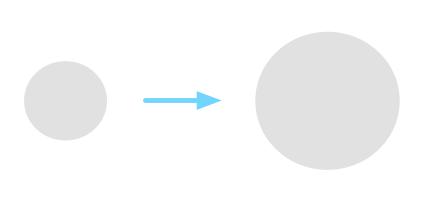
Suppose you are working on a graphical software, something like Photoshop. You want to make this circle just a little bit bigger, how do you do it?

How do you make this circle bigger?

Most people would say “Easy! Click on the circle and drag its corners”. Let’s break this down, there are actually 2 steps involved in here.

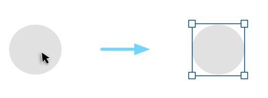
1. First, you knew that if you click on the circle, you would probably see something that looks like this:

Click on the circle to reveal some boxes and lines

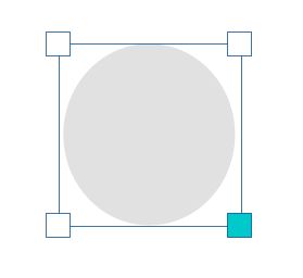
2. Then, you knew that dragging the boxes on the corner will make the circle bigger or smaller.

Drag on the boxes on the corner will resize the object

Wait, how do you know all this stuff? How did you know how to control this circle without reading a menu on how it is supposed to work?

You knew what to do because you have seen or done something similar before. Within a split-second, your brain quickly recognizes the pattern and tells you what to do, it becomes “intuitive” to you.

Why is it important to understand this?

There is no such thing as “intuitive”

The truth is, there is no such thing as “intuitive” in digital design. For something to be intuitive — by definition — it has to be something that you knew what to do instinctively without being taught.

Nobody knew how to use a mouse when they first saw it because the thing that makes it useful (the cursor) only exists on a digital screen, there is no cursor in the real world. Once you are trained, controlling a mouse becomes natural and intuitive to you.

Let me introduce our first principle for designing microinteractions:

Principle # 1 — Don’t start from zero

Always start with what users already know. This is important because it saves you time from reinventing the wheel, helps you to reduce the design complexity, and also lowers the learning curve for the user.


Designing the interaction

Let’s go back to the resizing circle example I gave earlier. We can break down what most people would expect on how to resize the circle in the following steps:

  1. Click on the shape to display its control points.
  2. To resize the shape, drag any control points.

These are the basic rules from the user’s perspective. For us, that is all we want the user to know. Anything beyond that is too complicated for the user. However, on our side, we have a lot of details to think through. Let’s zoom in to point 2 together:

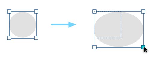
To resize the circle, drag any control points.

How does this work exactly?

Decision #1 — Resize in real time or not?

Do you resize the circle while you drag or do we resize the circle after you finished dragging (Continue to show the original size of the circle before you mouse up)?

For GoAnimate, we considered 2 things: a) Since we are not a graphical design tool, we see little value of showing the original size of the object. b) resizing in real time feels more responsive. So, this is what we went for in the end.

We now have our updated rules:

  1. Click on the shape to display its control points.
  2. To resize the shape, drag any control points.
  3. The shape is resized in real-time.

Decision #2 — Should the object be resized proportionally?

In most applications, users can hold the Shift key while they resize to retain the proportion of the object. Otherwise, the object can be resized freely and can be distorted. This kind of interaction has become a convention.

Example of free resizing

If we go with that, the rule becomes:

  1. Click on the shape to display its control points.
  2. To resize the shape, drag any control points.
  3. The shape is resized in real-time.
  4. To retain proportion, hold Shift while you drag.

Most of the time we will err on the side to follow conventions. However in our case, since GoAnimate provides a library of pre-made content to our users (such as Characters), those contents look pretty bad when they are distorted. There is also no strong use case to support the claim that distorted content will be useful in helping our users to tell stories. So, we broke the convention of holding Shift to scale proportionally, instead, we did the opposite: By default, all objects resize proportionally, and hold Shift to resize freely.

Here are the updated rules:

  1. Click on the shape to display its control points.
  2. To resize the shape, drag any control points.
  3. The shape is resized in real-time.
  4. The shape resizes proportionally unless you hold Shift while you drag.

We have considered that holding Shift to distort an object may be hard to discover. However, we are okay with it because our primary goal is to help users resize proportionally. This is one of the choices we got to make in order to make the interaction customize to our primary use case.

Decision #3 — How does the drag interaction works?

Our goal here is to figure out what kind of interaction feels the most comfortable and natural to the user. Here is what I immediately came up:

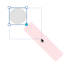
Since the control point exists in the corners, drag in 45 degrees to resize.

To make it easier to drag, let’s make the drag-able area 20px, meaning as long as your cursor is within that area, we count that as a dragging action. Now we have something like this:

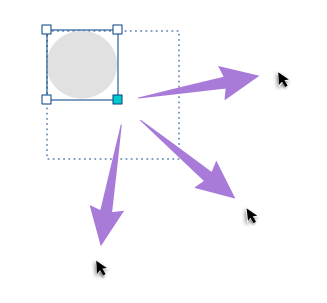
Needless to say, this is going to cause some serious usability problems because the limited draggable zone is going to cause a hard time for most motor functions. Users will probably be expected to do something like this when they want to enlarge the circle:

This makes more sense. Can we do better?

Let’s try the following:

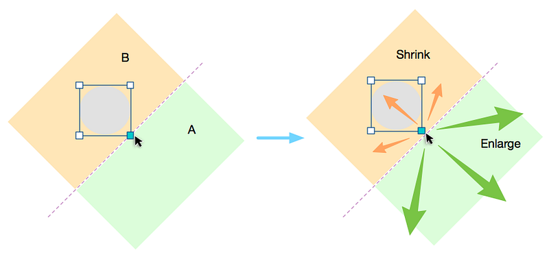
To resize the circle, drag any corner outwards enlarges it, dragging it inwards shrinks it.

All we need to do now is to define where is in and where is out. It should behave something like this:

The idea is that whenever the user drags the corner, we are going to draw an invisible line perpendicular to the corner. If the cursor is then moved “outside” of this line, the shape enlarges, when it is moved “inside”, the shape shrinks.

If we add all these up, our final rules become:

  1. Click on the shape to display its control points.
  2. To resize the shape, drag any control points.
  3. An invisible line is drawn perpendicular to the control points, if the cursor is in the outer area of the line, enlarge the shape. If it is in the inner area, shrink the shape.
  4. The shape is resized in real-time.
  5. The shape resizes proportionally unless you hold Shift while you drag.
Final resize interaction

As you can see, resizing a shape might just be simply “Dragging the corners” to the user, but behind the scene, there are 5 rules working closely together to make this happen. This brings us to our next principle:

Principle # 2 — Absorb complexity

Remember 2 things, a) people didn’t come here to use your product, they came here to get something done. Learning how your tool works were not part of that goal, and b) user cannot read the rules of the microinteraction you designed. The only way they can understand the rule is to take an action, see what happens through the feedback, and adjust their mental model accordingly.

In the case study I provided, you can see that although there is a lot of logic going on behind the scene, all the users need to know to resize an object is boiled down to 2 rules:

  1. Click on the shape to display its control points.
  2. Drag any control points to resize.

As designers, it is our job to absorb the complexity of our product and enable users to do the things they need to do without having to think about how to do them. The more we can absorb, the more the users can focus on their goals.

Conclusion

Well, this has been a long article to talk about the basics of microinteraction. Making something intuitive takes hard work, but in the end, it is the little things that separate an okay product and a great product.

If you are interested in learning more about microineraction, I strongly recommend you check out the book by Dan Saffer, the title — unsurprisingly — is Microinterations. Even if you don’t see yourself designing mircointeractions anytime soon, this book will give you a fresh view on how to approach design problems and I guarantee you will learn something from it.

Until next time, may your microinteractions be intuitive.

Disclaimer: I am no longer a GoAnimate employee and I’m not posting on behalf of GoAnimate.

Filed Under: Case study, Most popular, UX Design Tagged With: Design, Microinteractions, User Experience, UX

  • « Go to Previous Page
  • Go to page 1
  • Go to page 2

Primary Sidebar

UXwanabe newsletter

About

Hi, I am Tim Chan, I want to help you get promoted as a design lead!

Previously, I lead a team of 10 at HSBC as a Product Design lead.

I share my experiences, mindset & strategies on how to climb the design ladder in my newsletter.

Recent Posts

  • Are your design policies a “House rule” or “The Law”?
  • How to choose which battle to fight as a designer
  • Why you fail to influence stakeholders as a designer
  • 2022 in Review
  • 10 Lessons I learned working in a global bank as a designer

Copyright © 2025 · Genesis Sample on Genesis Framework · WordPress · Log in