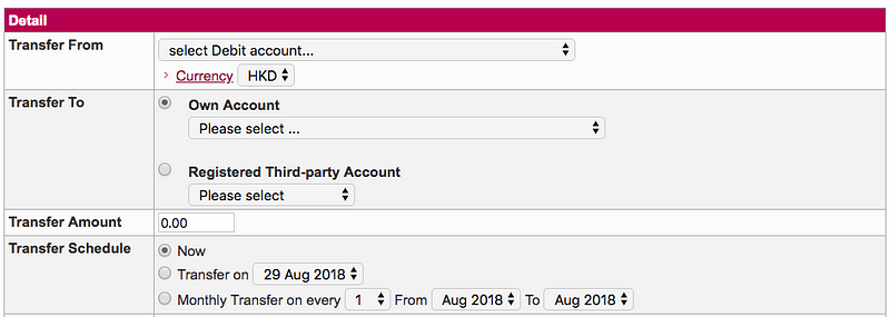
A while ago I worked on a redesign project of a banking website. One area of the website in particular has caught my attention. Here is what it looks like:

This is a money transaction form, the purpose of it is to allow users to transfer money to another party. First you select which account you want to transfer your money from, then to whom and how much. Finally, you select when you want to send it, which the bank calls it the Transfer schedule.
Transfer schedule comes with 3 options:
- Now
- Transfer on [-Specific date-]
- Monthly transfer on every [-Date-] from [-Month-] to [-Month-]
The first 2 options seems pretty straightforward. If you want to transfer money, you can either do it now or do it later (i.e. on another date). However, the third option feels weird to me on first glance. I couldn’t say why until I put in some dummy dates and read it aloud:
I want to “Money transfer on every 5th between August and December”.
This statement is logically correct and I understand what it means. However, something doesn’t feel right. Why?
Because nobody talks like that.
This is why this form sounds weird when you read it. It slows me down and let me wonder “What does this option mean?”
I decided to fix this.
Why does this matter
You might wonder why does this matter? Can’t user figure things out eventually?
You are probably right. Users probably can figure things out on their own if you give them enough time. The thing is, this kind of things adds up, when people say a website or an app is hard to use, most of the time they are not referring to one particular feature, but with all the tiny annoyances or inconveniences such as the above example as they experienced it.
Users are here to get things done, they want to come in, do what they want to do, get out and get on with their life. Our job is to translate what the business needs into an interface that users understands, such that they can input what is needed, and get on with whatever that they wanted to do.
Lets see how we can make our user’s life a little bit easier this time.
The approach
When it comes to transaction, there are only 2 things the bank needs to know.
- The date
- Whether you want to repeat the transaction. If so, until when.
One trick I like to use is to imagine how things would happen in real-life. This helps to design the form in way that it feels more like a natural conversation. Lets say we are having a conversation with the clerk at the counter. The conversation probably goes like this:
Hi there, what do you want to do? — I want to transfer money.
How much? — $1000.
To where? — This account.
When do you want to do it? — 5th August.
Anything else? — Yes, I want to repeat the transaction until December.
The redesign
Here is my updated version on the “When” part.

Couple things is happening here. First, I added an option where users can quickly select the date of Today since it covers a majority of the use-case. Second, I added a simple checkbox that says “Repeat monthly”, once checked, it reveals another drop-down where user can select the end of the monthly repeated cycle.
The last part of the money transfer conversation becomes:
When do you want to do it? — 5th August.
Make this a monthly transaction? — Yes, until December.
Doesn’t this sound better? Feel free to comment and let me know what you think!