GoAnimate is an online platform that enables people to create professional-looking videos — from scratch — using drag and drop tools. It removes the pain of traditional time-consuming production process by providing pre-made props and templates.
With 10,000+ props in their library that were categorized poorly and with very basic search capability, GoAnimate users had a hard time looking for what they want. GoAnimate needed a better way to organize their contents and improve their search experience, this is were I came in.

My role
Research and design information architecture, produce tagging and metadata guidelines for content creators, and designed functional spec on improving the searching experience. I was the lead UX designer for this project, and collaborated closely with the content team and one engineer.
The Process
Understanding the existing system
Before I start, I wanted to fully understand why the problem existed in the first place. I did in-depth interviews with the content team to gain a better understanding on how they work.
The biggest problem I uncovered was that there were no guidelines on how contents should be categorized. Each team member will organize contents based on their own feelings. No wonder why contents are scattered along the place. On top of that, the search engine only supported search by file names, which was a really limited experience.
Break down the problem
There are 3 big problems I need to answer:
- When should a concept become a category? For example, for an Office table, should it belong to a category called Office or Corporate? Why and why not? What about Furniture?
- How to make the categorizaton scheme scalable? I want to create a scheme that not only support what we have currently, but can also support new contents in the future.
- How can I make an item retrievable by using multiple keywords? For example, I want to find a Macbook. If I search Mac, Laptop, Electronics or Apple I expect to be to find my Macbook. How do I make that happen?
Research — Understand how human organize information
I knew my problem was not unique, the challenge of organzing information has existed way before I became an UX designer. I decided to do some research on how other people has solved this problem.
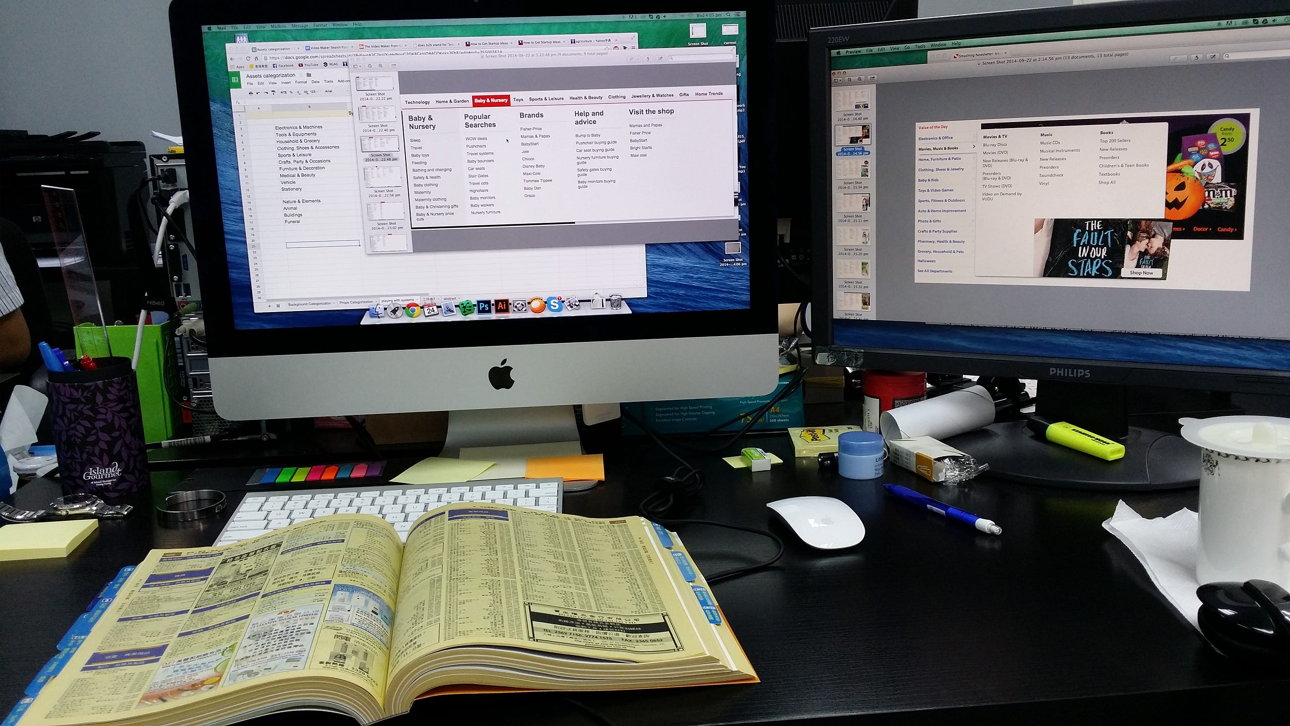
Since our library covers a lot of concepts, my research needed to cover a wide range of topics as well. I looked at product based categorisation systems such as ebay, Amazon, Walmart…etc, and activity based such as Meetup.com. I also looked at library classification schemes across the world to have a better understanding on how human classify knowledges. Lastly, I also looked at government websites, yellow page and other recruiting website to understand how we categorize job functions.
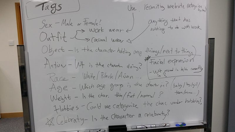
I decided that item exists in multiple categories would make most sense to our tool. For concepts that does not have the privilege to become a category, we will use them as tags for search engine retrieval. Below is a sketch on how I was brain-storming how we can categorize a character:
Research part 2— Conduct card sorting exercise
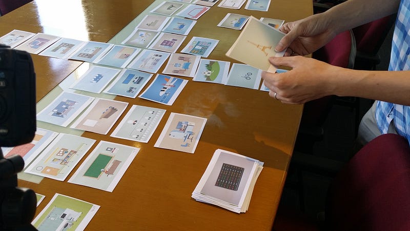
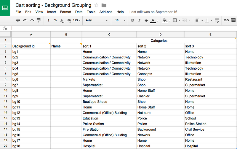
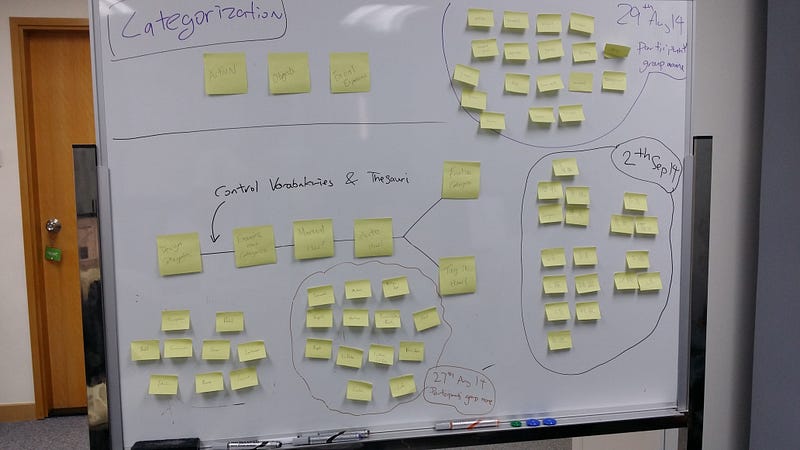
We invited test 3 participants to our office for Open-ended card sorting exercises. We observe how they group things logically together and asked a lot of questions to understand why they chose to group things a certain way. I noted there are similarities between the participants and used that as a guide to create the categorization scheme.
Create categorization guideline
Based on the results from the card sorting exercise, I created a categorization guideline internally on how to categorize items inside our library. The guideline went through a few changes afterwards to cover more topics and make the wordings more clear.

This guideline gives us a unify understanding on how contents should be categorized. Instead of debating which content should go under which category, it saves time for the content team to do things that is their expertise — to create remarkable contents.
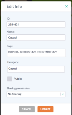
We also worked with the development team to design an admin UI that allows the admin user to easily assign categories:
Search
Reusing left-overs
As we are only interested to offer user no more than 30 categories to avoid overwhelming them with choices, not every category name we came up with made it to the final cut.
Those categories names exists because that there is more than one way to categories something, which means that those terms is perfect for us to use as tags which will help us with the search.
Tagging
Search engine retrieves information through meta-data, also known as tags (e.g. hash-tag # in Instagram). It helps the search engine to understand that an item carries multiple meaning. Fundamentally, tag is a category.
It is easy to tag 1 or 2 items, but when you are tagging 10,000+ items, things start to become tricky. You will start to miss some important tags or you will start to over tag, either way, the process is not efficient.
Importance of guidelines
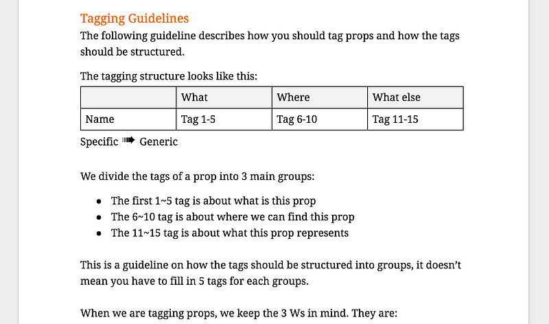
To ensure that each item has good quality tags, I came up with a set of guidelines on how we should tag items, the team has to consider 3 questions for every items:
- What is this item.
- Where can you find this item.
- What does it represents.
The tags will start from specific concepts and gradually move towards more generic ideas. For example, and “Office chair” will have tags the looks something like: Chair → Office → Work…
Other considerations — Variance terms
Language is a tricky thing, there are different words that actually mean the same thing. For example, Cell phone or Mobile Phone refers to that thing you can call people while walking down the street.
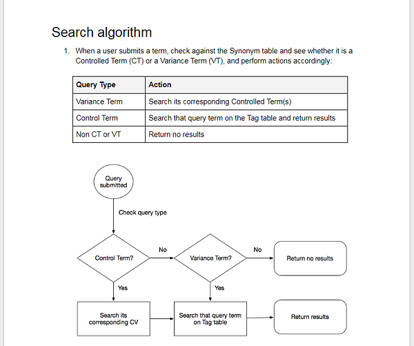
To avoid spending time to come up with variations of terms duplicate tagging, we grouped words with similar concept or meanings together. We chose one term — the Controlled term — as the tag we will used internally. Other variations are called Variance terms.
The control term table is very simple spreadsheet file. One column is the control term, and the other columns are the variance terms:
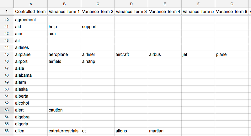
Now when user search the variance terms, since variance terms and controlled terms are linked, we will be able to return results.
Improving the search experience — Front end level
After I have designed how we can come up with tags and how it would work in the backend, I started to look for some micro-interactions that can improve the search experience. Below are interactions I added:
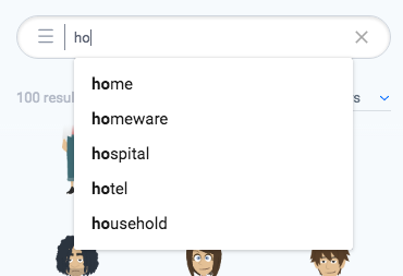
- As users types in the search box, provide suggestions based on what he is typing. This helps us to a) educate the user what items we have and b) save the user’s time by making him typing less. Also added arrow keyboard shortcut to help user easily navigate between the suggestions.
- Offer typo tolerance such that users do not have to worry if they misspelled something.
- Bold the matched text.
Documentation
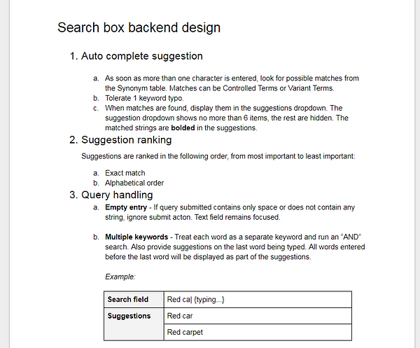
At this stage, I created a detail document that describes how the search engine works both in the font-end and in the back-end (The algorithm). I worked with the development team to refining the wording multiple times and make sure there is no ambiguity in how we want to make this project work.
The result
The project didn’t just end just because I shipped the feature. Good search experience requires continuous fine-tune and follow up. I set up a review cycle every 2 weeks to understand how well we were doing for the new search engine. We were mostly interested in 2 things:
- Search term that is “valid” but returning 0 results. This means that the term should return results since the item exist in the library.
- Search term that was used a lot but return 0 results because the item searched doesn’t exist in the library.
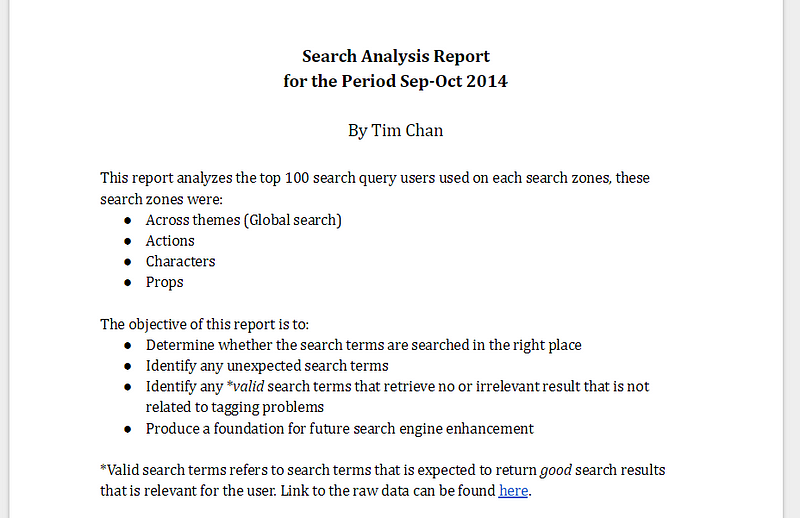

Based on the search log, I was able to make some fine-tune on the search experience. For example, we were able to identify items that were searched a lot but was not tagged and also identify the need to add more contents since users were looking for it.
What we planned to do in the future
We had plans to do the following tasks, which I think is going to bring the search experience to a higher level, but in the end I have to drop the features due to time-constrains.
- Auto ranking adjustment. Create an automatic system such that, when an item is more popular than others, we will give that item more weight, so it will show up closer to top in the search results.
- Create a thesaurus library. A thesaurus library defines the closeness of each terms. Which means apart from the regular search results we show to our users, we can also present relative search results, something very common in the e-commerce world. E.g. “You may be interested to this…”
Reflection and lesson learned
Through out this project, my biggest learning was to understand the concept of Controlled Terms and Variance Terms.
As I was working side by side with the content team, we faced the challenge of constantly thinking of variations of a concept, and try to put all those variations as tags. Things starts to become messy as some items will have like 30 tags because of the team trying to cover every possible keyword we can think of.

It is after I picked up the book: Information Architecture for the World Wide Web — aka, the polar bear book which taught me the concept of Controlled Terms and Variance Terms and the art of organizing information, things start to change and went more smoothly.
My biggest take away is that, although some books are really boring, sometimes you just need to bite the bullet and read it. After all, knowledge is power!
Thank you for reading.