League of Legends has created a Screensaver App. I personally had a few experiences downloading artwork from games and I understand it is a very cumbersome process (Right click, save, repeat..) and an app to help people download everything at once seems like a cool idea. I am curious to find out how it works.
Part 1 — Testing the Discoverability of the app
Let’s start from the beginning, is this app discoverable? In order to use this app, first users have to find it.
To answer this question, we can look at how well it fits into the user journey. Every journey has a goal, and this is what I defined as the user’s goal, from their perspective:
I want to find cool artworks and make them my screensaver.
With a clear goal in mind, we can start with picturing the common user journey that most people have from downloading cool artworks.
I thought of 2 journeys on top of my head.
Journey #1 — Search focused:
Go on Google and type “LOL artwork”.
The first result lands me to this page. This page is a sub-page under Media, which I will talk about it in a bit.
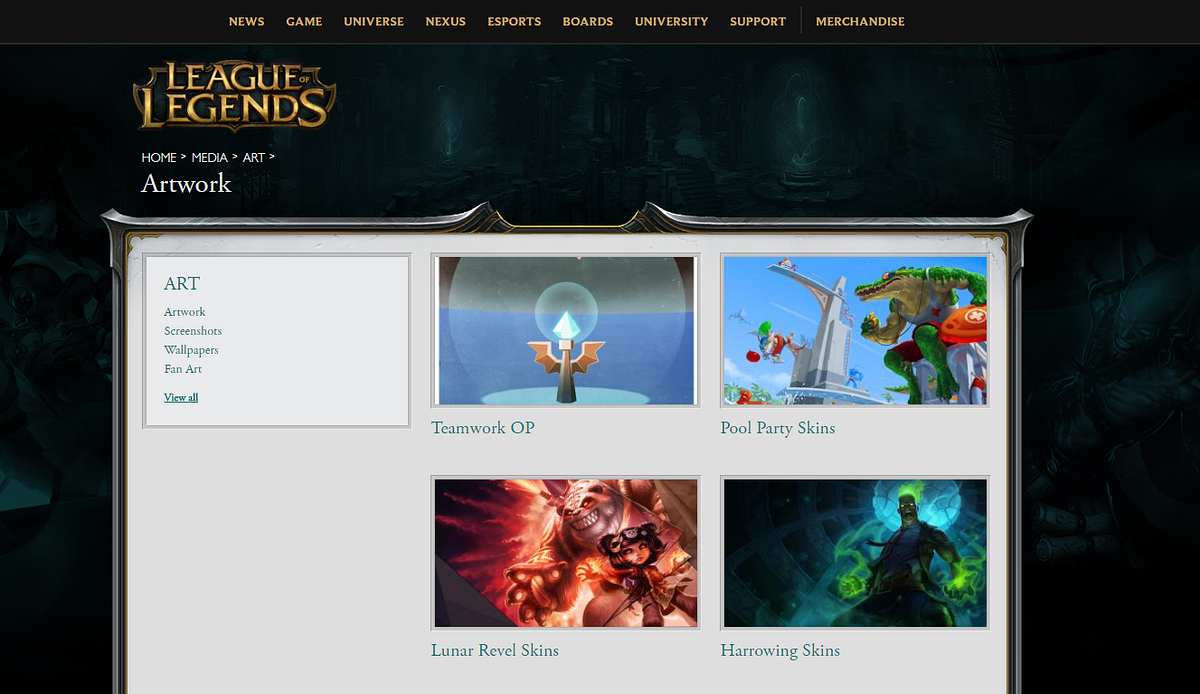
To my surprise, the screensaver app cannot be found here, so the discoverabilty of this app failed in this journey.
Let’s look at the second journey.
Journey #2 — Browse focused:
1. Go to the game’s website.
2. Look for a section called Media, usually there is where the artworks and game video lives.
I expect to find a section called Media because it has long been a convention for a lot of game websites, were they put all the game play videos, in-game graphics and conceptional arts under this place.
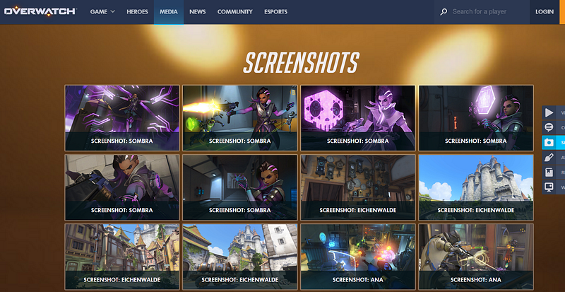
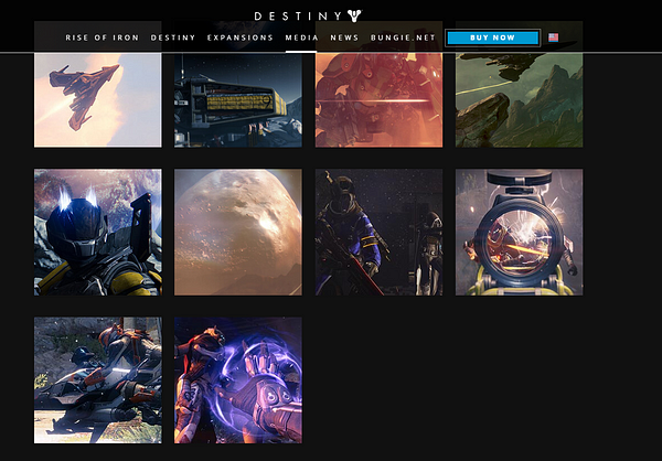
Not so successful here, there are multiple sections on the main navigation of the website and non of them directly gets me to artworks. Here is the list of the navigation headers in the home page:
- News
- Game
- Universe
- Nexus
- E-sports
- Boards
- University
- Support
- Merchandise
Where would you expect to find the artworks from the name of the headers?
Game? Nexus? Nope. None of them leads you to their artworks. The problem here is that some of the navigation names have very weak information scent (the extent to which users can predict what they will find if they pursue a certain path through a website) and there is no way to know what is behind the link before you click on it.
For example, what does Nexus mean? Is that related to the game’s universe?What does Boards mean? The rank ladder board? Job board or the community feedback board?
As I continue to look for a section called Media, it turns out they do have a Media section (Search “LOL media” on Google) where I honestly don’t know how to get to this page if I had started from the Homepage.
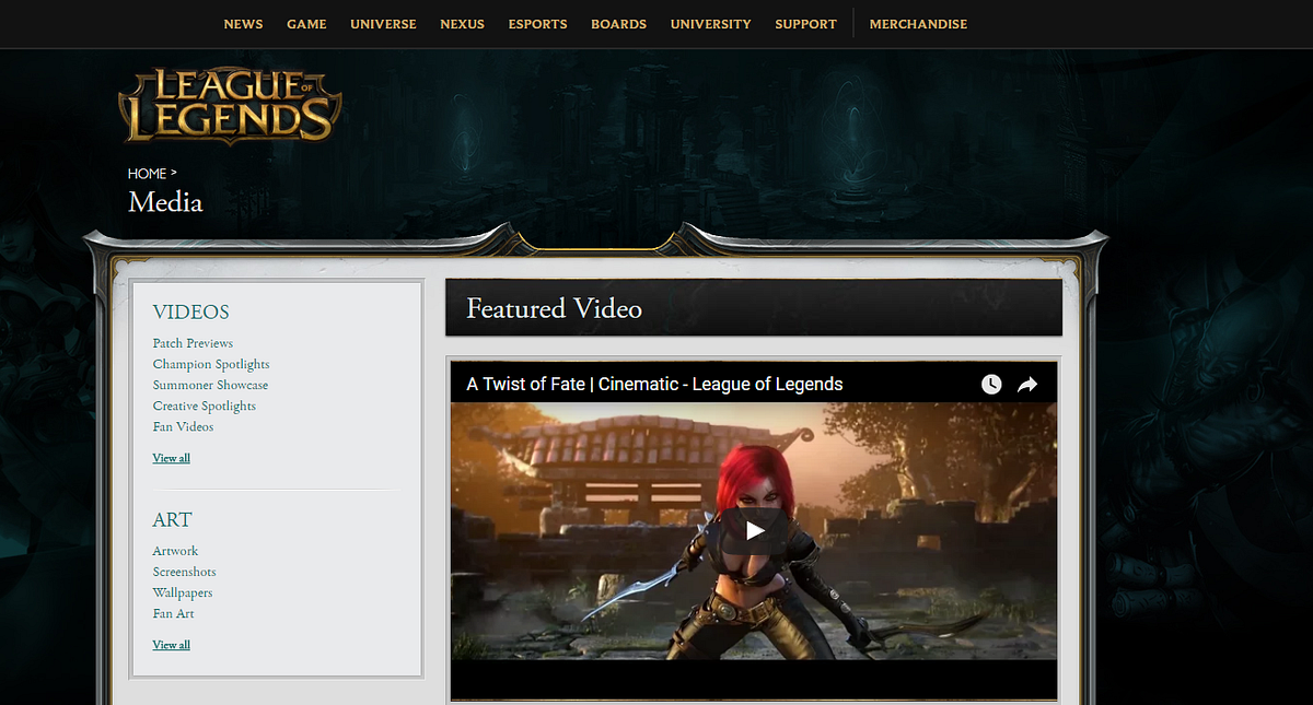
As mentioned, this page does not include the screensaver app. Which I think is a huge miss-opportunity because this would be the most natural place for it to live.
Both user journey failed to discover the screensaver app.
The main reason?
The app can only be found on a separate landing page (http://screensaver.na.leagueoflegends.com/en_US), and it has no hyper link that connects to the Media section. You can find the screensaver app if you search “LOL screensaver” on Google.
Recommendations
Here is how I envision the ideal journey would look like:
1. Go to the game’s website
2. Look for a section called Media, usually there is where the artworks and game video lives.
3. If I navigate to Media > Artwork, I can see the screensaver app. It tells me I don’t have to right click and save every image one by one and can download all artworks at once, awesome!
I understand there might be some legit business reasons for the company to decided that Media is not important enough to go on the Top navigation, so as a compromise, I would recommend to put Media as a subcategory under Game or Universe to make it more discoverable.
Of course, the way we structure the contents doesn’t have to be final as we can run user tests and card sorting exercises to see whether our choice makes sense.
Furthermore, I would also recommend to put the screensaver app under the Media or Artworks section such that it shows up naturally when people needs it.
Part 2 — Testing the app experience
Since this article is about reviewing the app experience, I would just skip the download and install part because these are pretty standard stuff.
Launching the app
To set LOL’s artworks as your screensaver, you have to select the option “League of Legends” in your screensaver menu. Although I do wish after the app is installed this step is done automatically for me, there might be some technical constrains that would prevent that from happening. Otherwise, this would be a pretty streamlined process if it is achievable.
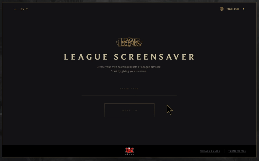
The screensaver app is launched once you select “League of Legends” as your screensaver and hit “Settings”. It replaces the OS “Settings” menu that would have pop-up normally. It looks like this:
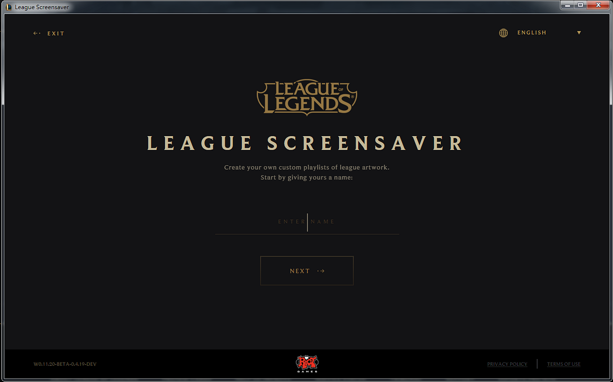
Immediately 2 questions came to my mind:
1.Why is there a back button? The backward arrow ( ←) signals that I can go back, but there is nothing to go back because this is a pop-up menu. What further confuses me is that having a Back button implies I might have missed some steps along the way. The arrow is labelled “Exit” which makes no sense to me because this is a pop-up menu, if I want to close it, I will click the big “x” on the menu itself.
2. Why do I have to name my own playlist? I mean, assuming if I do want to spend time to create my own list at all, wouldn’t it be better to just let me get started right away, and pick the cool artworks ASAP? I never remembered the last time I have to name my screensaver list. I have been forced to stop what I am doing and make a decision. It requires me to think, which is bad.
Why is it bad?
Thinking is work and most people hate work.
To be more precious, people hate unnecessary work.
By asking me to give the list a name in this early stage, the app forces me to pay attention to the app itself instead of letting me focusing on what is more important to me, which is to setup the screensaver list.
A better flow would be first letting the user select what goes into the list, then ask them to name it after they are done. Give them the option to skip the naming part if they don’t feel like it, and if they do, give them smart names as defaults such as List 01,02..etc. Even better, don’t require them to name it at all because who the hell wants to give their screensaver a name?
Selecting artworks
Let’s move on and see how does the rest of the experience looks like. After I give my screensaver list a name, I enter this page.
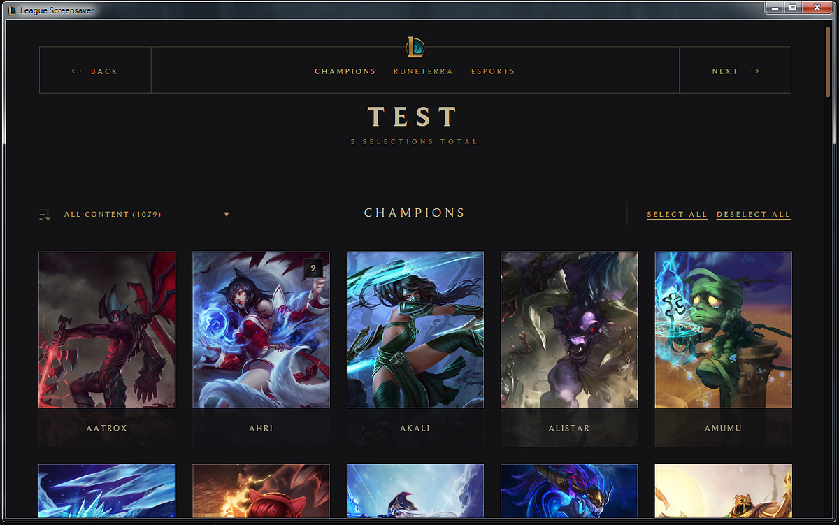
I am under a tab called Champions. This tab contains the artworks of different champions and each thumbnail acts as a category. Click on the thumbnail brings us down a layer where it reveals more artwork of that champion.
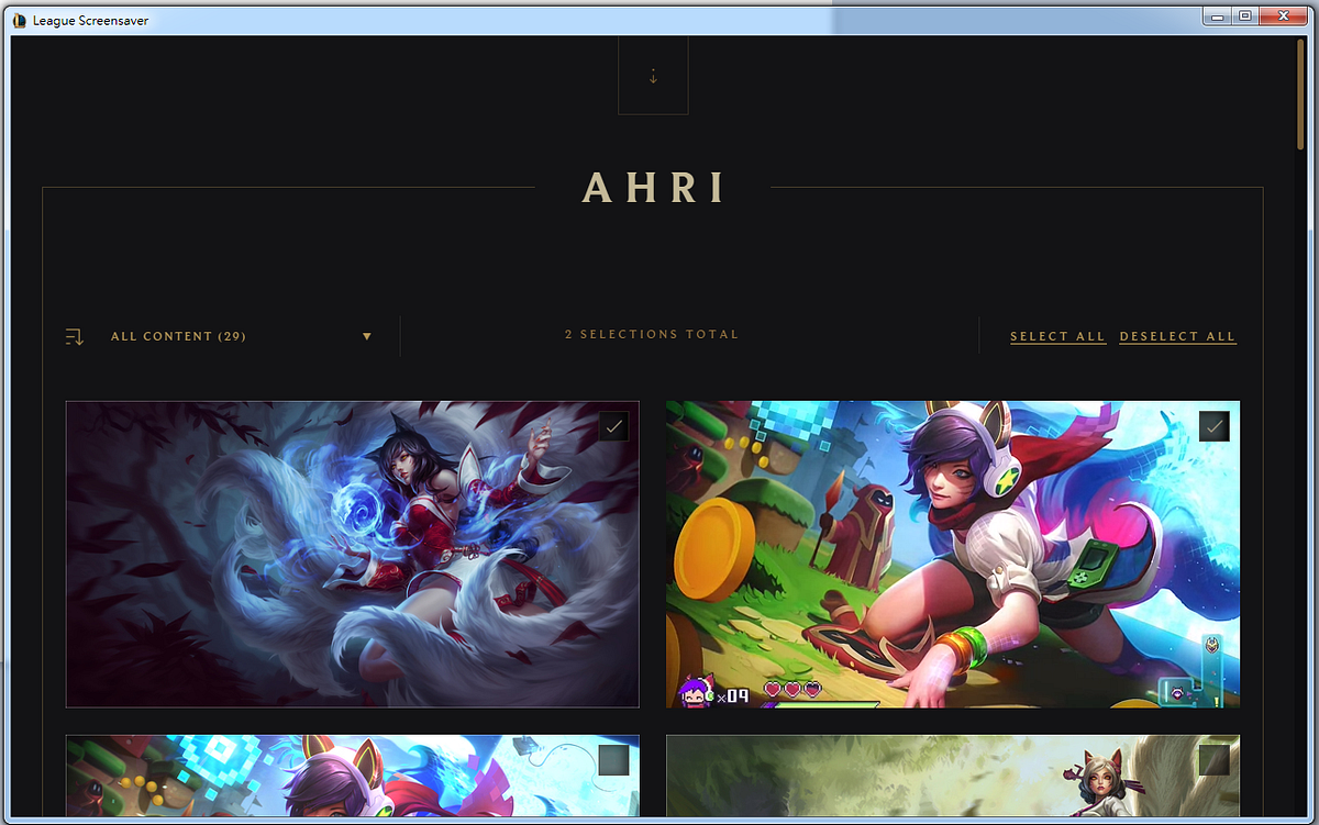
Two comments about the experience of selecting artworks:
- After you selected the artworks inside a category, if you wish to move on or go back, you will have a tough time to exit this category. The exit button is not easy to find. You have to scroll all way way Up and click on the Downward arrow (↓) in order to exit.
- There is no UI where you can have a clear overview on which artworks you have already selected, apparently, you have to click Next if you want to get an overview. To me, Next means I am ready to move on, but I am not ready to move on because I need to see have items I have selected first. Online stores have learned that naming the last step “View items and check out” is better that just calling it “Check out” because user feels more secure to have a final chance to look at their items. Applying that to here, maybe calling it “View selections” will make user feel more comfortable.
Below is the overview UI after I clicked “Next”.
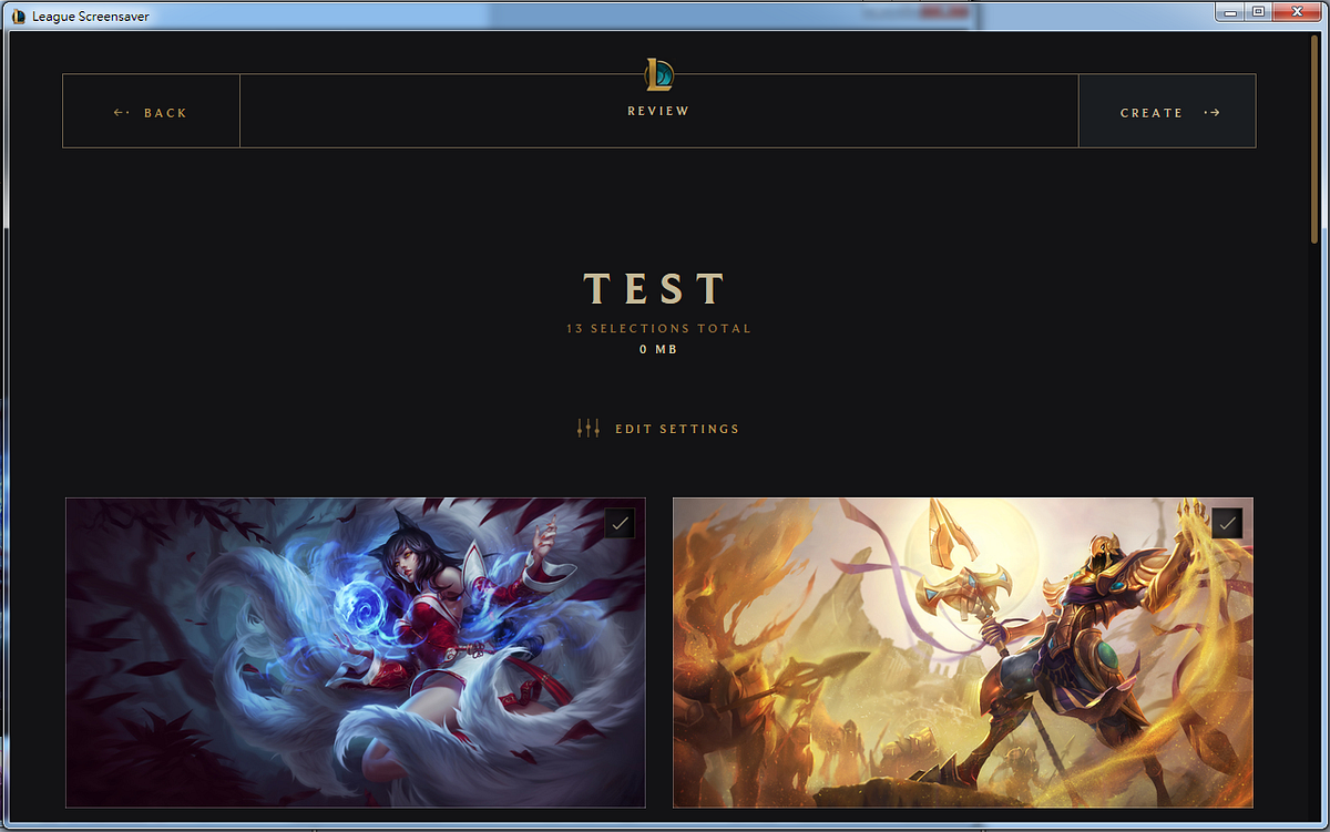
The final UI shows the list I created in a list format:
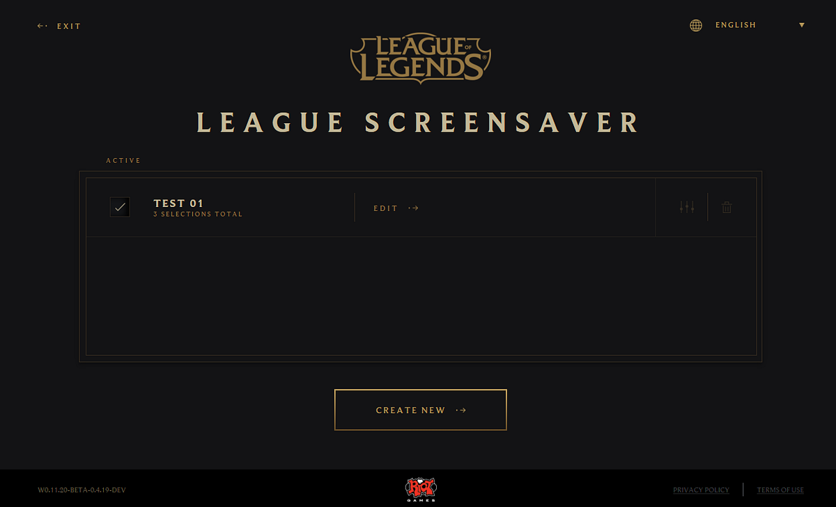
Now it became apparent that the reason for requiring users to name the list as the first step of their journey is because the app allows users to create multiple screensaver list.
My question is that how many people would actually do that? Can you imaging someone creating multiple lists and switching every few weeks given that fact that screensaver is not seen very often? If people are bored at what they are seeing, won’t they just go to the existing list and adjust it? How helpful is the multiple list feature in this case?
I have reached the end of my UX review of this app, but along the journey, I felt that this app focuses too much on letting users to create and customize and multiple lists, without fully understanding whether this is in the best interest for them. Should creating a custom screensaver list be the centralized experience for the users? I am not convinced.
How can we improve this?
I think the best way to improve something is to start by questioning whether every feature has earned its place to be there, and ask questions, lots of them. For example, I would put myself into the user’s perspective and ask something like…
As a user,
- Do I care which piece of artwork goes into my screensaver? (For me, I don’t really care as long as it looks cool enough. Maybe a few from my favorite champions but other champ works too).
- Do I want to create my own screensaver list? (Yea, that sounds cool)
- Follow from #2, do I want to spend time creating my own screensaver list? (Not really…)
- Do I want to create multiple screensaver list? (I don’t really see why that would be useful for me, maybe someone else might find it useful)
- Follow from #4, how often do I want to change my list? (Why would I do that, can’t I just update the already existed list?)
You can see that if I were the only user for this app, the current version would totally suck for me (I don’t want to create my own list, I just want some cool enough artworks and I don’t see the point of having multiple screensaver list).
Of course, I am not designing for myself and I shouldn’t take my own opinion as the answer. The above questions is best answered by interviewing the target users and understand their motivations, and this would give us good insights on where the design direction should go.
Think about how to delight the users
Delight is often achieved by guessing correctly what people want and provide it as defaults. To come up with these defaults we can start with what we know.
What we know
- Person who download this screensaver app has a really high chance that they are a League of Legends player.
- Most players are impatient.
Base on the above, we can start to brainstorm ideas that can delight users and save them time.
- Wouldn’t it be awesome if we can extract the game’s data and generate a screensaver list based on player’s most used champion? There is a high chance they want to see their beloved champion on the screensaver right?
- What if we pre-generated a list with cool artworks for users, such that users don’t have to do it if they chose not to? What if they can open the app and click on a button that says “Randomize artwork for me”?
- If users want to create their own list, would it be easier for them to edit existing ones instead of starting from scratch?
Conclusion
While it is easy to poke holes on someone else’s work, it is much harder to give concrete and actionable insights. As a designer myself, I understand the complexity of product design and I tried my best to provide possible solutions along the way such that this will not be a typical critique but no answers piece.
Overall, the visual appearance of the app looks pretty good and it resonate well with League of Legend’s brand, and I do understand sometimes, not every aspect of the company can get the resources and care as one wishes it to be. I hope in the near future, as the company continues to grow it can cater the user experience on different areas because to a user, every touch point matters.
Thank you for reading.